Product Design
8 Months
Pehchaan — AI Talent Intelligence
Reimagining hiring beyond resumes through an AI-powered talent intelligence platform — transforming isolated hiring signals into one continuous evidence system for candidates and recruiters alike.
How might we help recruiters understand candidates before asking them to judge them?
The Opportunity
Recruitment doesn't have a talent problem. It has an information problem. Recruitment software evolved a lot over the last decade — ATSs got faster, interviews went remote, AI started screening resumes — yet recruiters still make life-changing decisions on surprisingly little evidence.
During discovery, instead of mapping workflow problems across candidates, recruiters, and hiring managers, we searched for the moments where recruiter confidence disappeared. Three recurring patterns emerged.
Candidates struggle to communicate true capability
A resume summarizes experience but rarely reflects communication skill, problem-solving ability, or learning potential. Candidates spend years building expertise but only seconds convincing someone to read about it.
Recruiters evaluate people from fragmented signals
Information is distributed across resumes, assessments, interviews, notes, and emails. Each interaction answers a different question, but nothing connects the answers into one coherent story.
AI creates recommendations without creating trust
Most recruitment platforms display a score. Very few explain why it exists. Without transparency, automation is difficult to trust.
The challenge: How might we help recruiters understand candidates before asking them to judge them? That question became the foundation of the product.
Product Vision — From Static Screening to Continuous Intelligence
Pehchaan was conceived to replace the single static resume check with a living talent intelligence ecosystem. Instead of forcing recruiters to guess candidate potential from bullet points, Pehchaan builds a continuous evidence trail across automated screening, skill assessments, AI interviews, and growth plans.
For candidates, it turns job applications from a black hole into an active preparation engine. For recruiters, it elevates decision-making from subjective impressions to transparent, explainable evidence.
My Role — Designing an End-to-End Hiring Ecosystem
Pehchaan required designing an ecosystem from the ground up rather than contributing to individual modules. As Senior Product Designer, I worked across the full product lifecycle — from early product strategy to interaction design and design system thinking — alongside the founder, product, AI engineers, frontend engineers, backend engineers, and design.
Product Strategy
Defined the experience vision alongside founders and product stakeholders. Mapped candidate and recruiter journeys. Translated ambiguous ideas into product direction.
Experience Architecture
Designed the information architecture connecting candidates, AI, and recruiters. Established navigation, content hierarchy, and reusable interaction patterns across products.
Candidate Experience
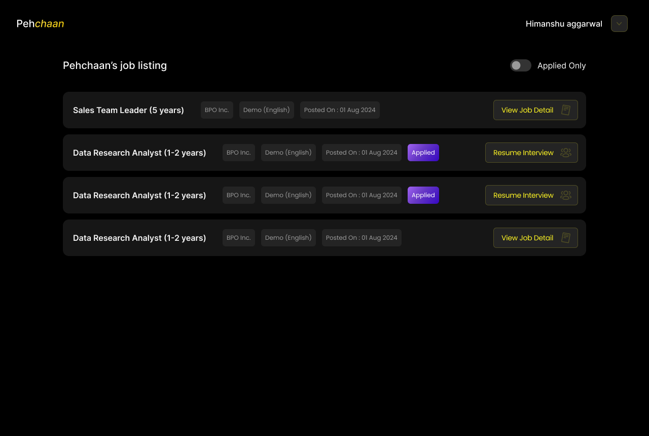
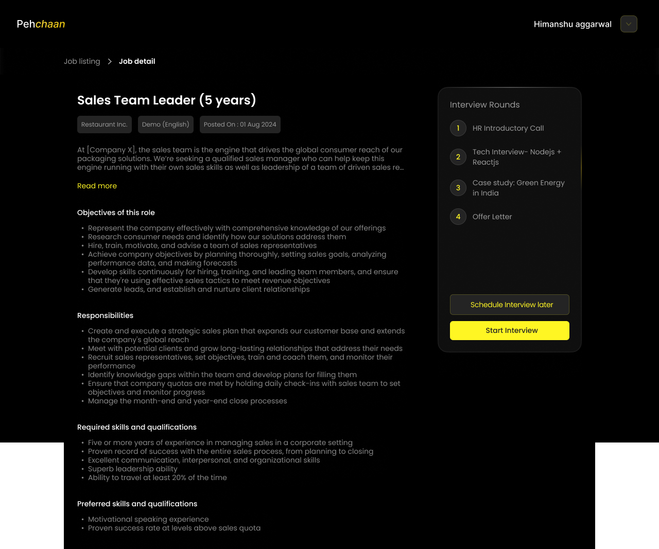
Designed onboarding, profile building, resume intelligence, assessments, AI interviews, growth plans, and job discovery — focused on reducing friction while increasing evidence quality.
Recruiter Experience
Designed recruiter dashboards, hiring pipelines, candidate profiles, AI reports, comparisons, and hiring workflows — focused on decision support rather than information presentation.
Explainable AI
Designed interaction patterns that made AI recommendations transparent through structured evidence, transcripts, and question-level reasoning.
Design Systems
Established reusable patterns, interaction principles, and scalable components across candidate and recruiter products.
Objectives
Candidate Experience Objectives
Reduce onboarding friction
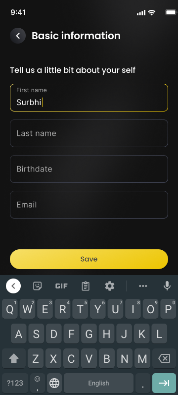
Let candidates build professional identity progressively instead of front-loading every field before they see any value.
Make the resume a starting point, not the product
Turn uploaded resumes into structured, editable professional identity instead of static PDFs.
Create value beyond applying
Give candidates a reason to return between job searches through continuous, evidence-building growth.
Reduce interview anxiety
Help candidates feel comfortable enough to be themselves in front of an AI interview.
Recruiter Experience Objectives
Reduce time to the next meaningful action
Shrink the gap between opening the dashboard and identifying who or what needs attention next.
Organize around decisions, not metrics
Prioritize jobs and candidates needing review over analytics and reporting widgets.
Replace scores with explanations
Make every AI recommendation traceable back to specific evidence, not a bare percentage.
Preserve human judgement
Keep AI in an advisory role — organizing and surfacing evidence — while recruiters retain the final decision.
Designing the Candidate Home
The problem wasn't navigation. It was uncertainty. People don't abandon products because they can't find features — they abandon them because they don't know what to do next.
Our first pass looked like every other recruitment platform's dashboard: Recent Applications, Notifications, Recommended Jobs, Resume Status, Profile Completion, Messages, Activity Feed. It looked comprehensive. It failed one usability test — "what should I do next?" Every card competed equally for attention, so candidates clicked around without moving meaningfully closer to being interview-ready.
From "what information should we show" to "what's the single most valuable next action"
We organized the interface around candidate maturity instead of product modules: Resume → Assessment → Growth Plan → AI Interview → Jobs. Resume establishes identity, Assessment validates capability, Growth Plan identifies improvement, AI Interview captures communication, and Jobs become the outcome — not the starting point.
The homepage should answer "what's next?" in under five seconds. Most job platforms optimize for applications; Pehchaan optimizes for readiness.
Resume Intelligence
Why we didn't treat the resume as the product. "The resume introduces the candidate. It should never define them."
Traditional platforms treat resumes as static documents — candidates upload PDFs, recruiters download PDFs, nothing changes — despite the document already containing structured knowledge: education, experience, skills, projects. Recruiters don't actually need a resume; they need answers. A PDF forces them to find those answers manually.
The resume became the starting point for identity generation
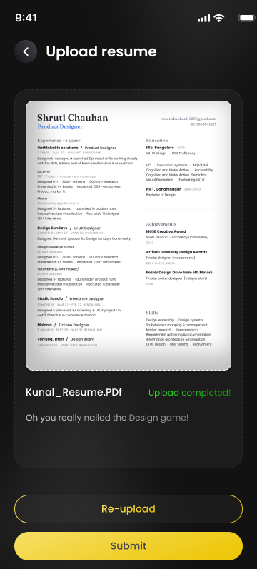
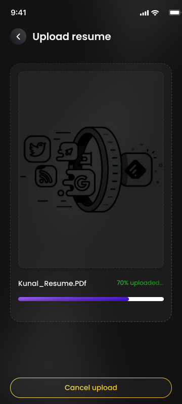
On upload, AI extracts structured information and pre-fills the candidate profile. Candidates type less, recruiters search less, and AI gains richer context for assessments and interviews downstream — one interaction creating value across the whole ecosystem.
Editable structured data over immutable resume storage. Candidates stay in control; AI accelerates the process; neither replaces the other.
Growth Plan
The most important feature wasn't about getting a job. It was about becoming ready for one.
Candidates usually disappear after completing their profile and return only when they need another job — a purely transactional relationship. Instead of "apply to more jobs," the platform asks: "What can you improve before your next opportunity?" That shift turns the product from a recruitment tool into a professional development platform. Every completed recommendation strengthens the profile, and growth directly becomes evidence recruiters can see.
Recruitment shouldn't reward only experience — it should reward improvement. Create long-term value before asking users to return.
Designing the AI Interview
Replacing first impressions with first evidence. "The biggest challenge wasn't AI. It was helping candidates feel comfortable enough to be themselves."
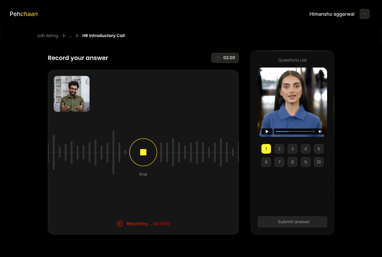
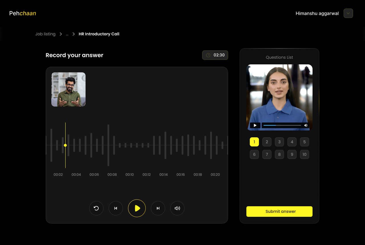
The phrase "AI Interview" immediately creates anxiety — being judged by a machine, saying the wrong thing, running out of time. Before evaluating communication, we first needed to reduce fear.
Countdown timers, large recording controls, long instructions
Everything emphasized recording. Very little emphasized confidence. Internal reviews immediately flagged the problem: the interface felt like an exam.
Preparing candidates to succeed, not just to record
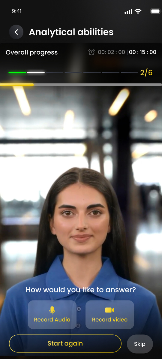
The interview introduction answered "how many questions," "how much time," "can I prepare," "what happens next," and "how is this evaluated" before candidates had to ask. Reducing uncertainty significantly improved confidence before the first recording even began.
Modular interview rounds instead of one long session
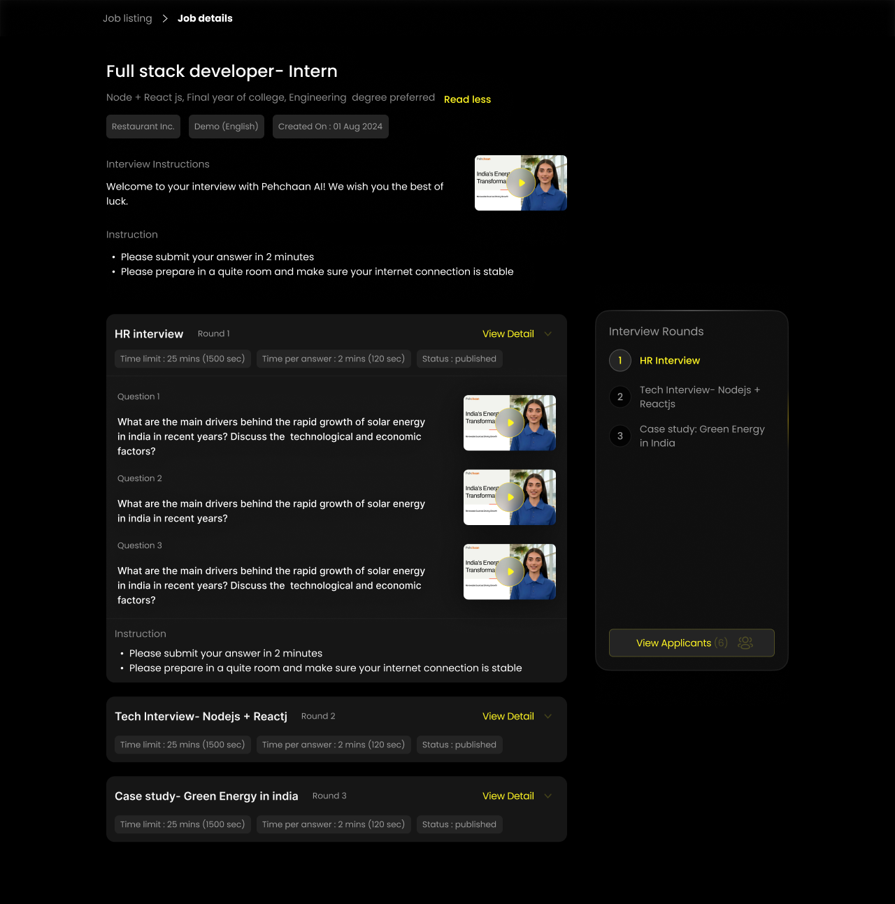
Most platforms combine behavioural, technical, and communication questions into one lengthy session. Instead, companies could assemble interview journeys based on role requirements — the platform adapts to hiring, hiring doesn't adapt to the platform.
Designing the Recruiter Dashboard
Recruiters don't need more data. They need better decisions. "The dashboard wasn't designed to monitor hiring. It was designed to reduce uncertainty."
A recruiter manages dozens of open roles and hundreds of applications at once. The challenge was never a lack of information — it was the cost of finding the right information. Every extra click and tab switch adds cognitive load to a decision.
Objective: reduce the time between opening the dashboard and identifying the next meaningful action.
The familiar enterprise reporting pattern
Total Applications, Active Jobs, Interview Statistics, Hiring Funnel, Team Activity, Recruitment KPIs. It looked comprehensive and impressive — and it behaved like a reporting tool. Recruiters don't come to the platform to study analytics; they come to hire people.
Reframed around decisions, not metrics
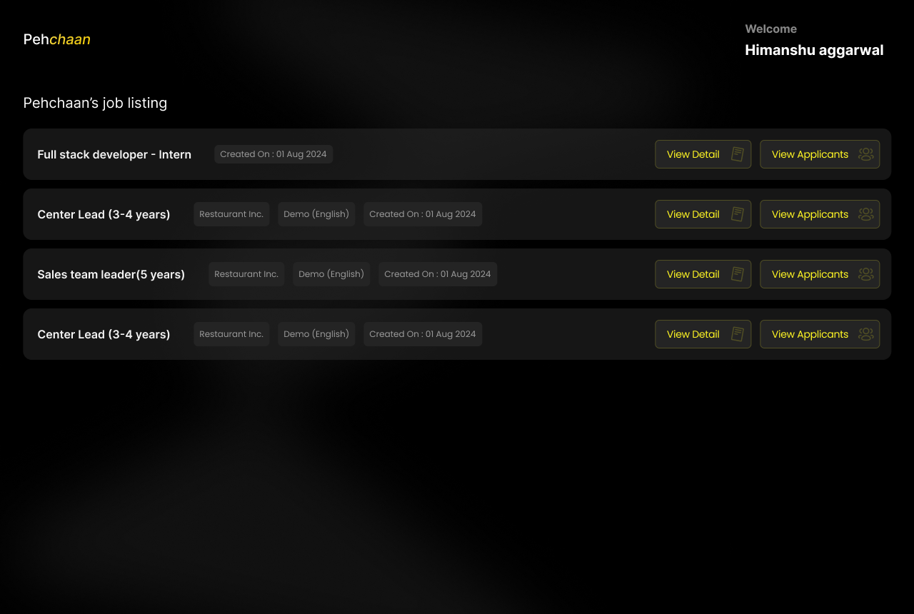
Jobs Requiring Attention → Candidates Awaiting Review → Interview Progress → Pipeline Status → Reports & Analytics. Reports didn't disappear — they simply stopped outranking action, turning the dashboard from an information center into a decision center.
Every widget must justify one recruiter decision, or it doesn't belong on the page. We deliberately reduced the number of visible charts — executives care about trends, recruiters care about what to do next.
The Candidate List
Why we rejected the traditional ATS table. "Lists store information. Hiring interfaces should surface understanding."
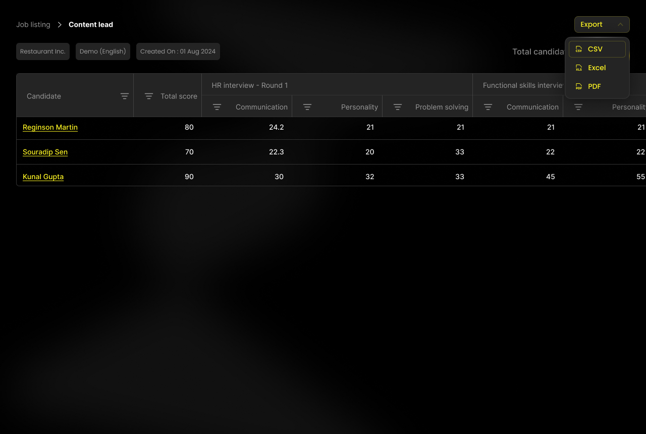
Most ATSs present candidates as table rows — name, email, experience, status — forcing recruiters to open profile after profile to work out who deserves an interview. The guiding question: what should a recruiter know before opening a profile? Every row needed to communicate four things at a glance: identity, progress, capability, and priority.
| Level | What it shows |
|---|---|
| Level 1 | Quick scan |
| Level 2 | Profile summary |
| Level 3 | Detailed evidence |
| Level 4 | Question-level analysis |
Design principle: don't show everything — show what the next decision requires.
Designing Explainable AI
Why we chose evidence before scores. "Trust isn't built by intelligent systems. It's built by understandable systems."
An early AI report prototype led with "Overall Score: 86% — Strong Hire." Technically it worked; psychologically it failed — every review asked the same question, "why 86?" The report gave an answer without a reason. The AI became the authority, and recruiters became observers — not the relationship we wanted.
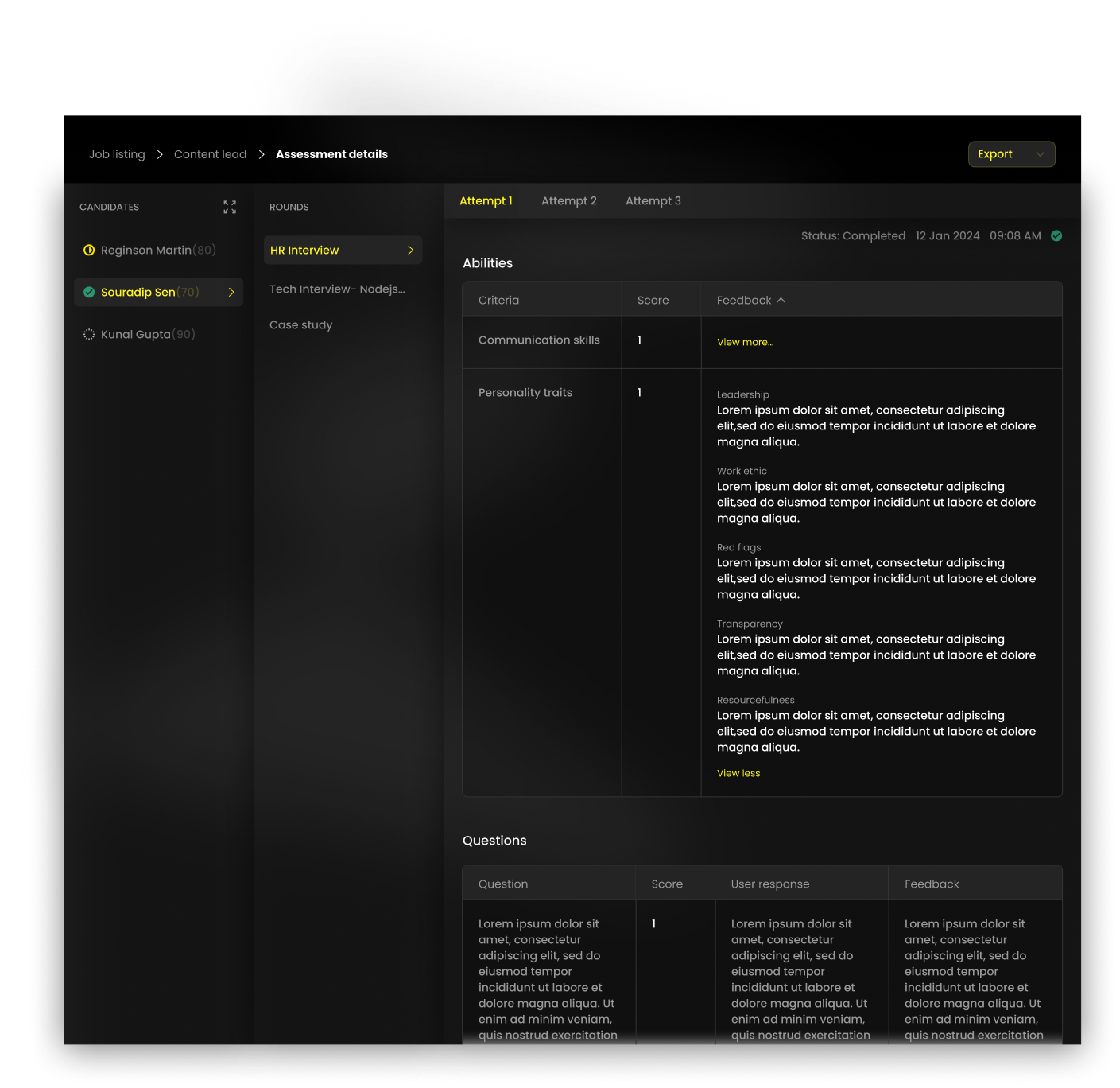
Candidate Summary → Strengths → Areas for Improvement → Question-by-Question Evaluation → Transcript → Supporting Evidence → Overall Recommendation. By the time recruiters reach the recommendation, they already understand the reasoning behind it — the score becomes a conclusion, not a headline.
Explain before recommending. Every observation ties back to evidence, every competency to actual responses, every recommendation stays traceable.
Designing Human–AI Collaboration
AI assists, humans decide. "The most important design decision wasn't what AI should do. It was what AI should never do."
Recruitment involves context, judgment, culture fit, and potential — not just pattern recognition — so we drew a clear boundary between what AI does and what stays with recruiters.
| AI | Recruiters |
|---|---|
| Analyze responses | Interpret context |
| Identify communication patterns | Evaluate team fit |
| Summarize interviews | Conduct follow-up interviews |
| Highlight strengths, surface concerns | Balance trade-offs |
| Organize evidence | Make the final hiring decision |
Many AI products optimize for replacement. Pehchaan optimizes for partnership — the product never asks recruiters to trust AI, it asks AI to earn that trust through transparency.
Designing Through Trade-offs
Good design is choosing the right compromise. Every great product is defined more by what it doesn't build.
| Trade-off | What we rejected | What we chose |
|---|---|---|
| Onboarding | Complete every field upfront before platform access | Progressive identity — unlock the next interaction with minimum info |
| Candidate Home | A dashboard of applications, notifications, analytics | A roadmap from identity → capability → opportunity |
| AI trust | Candidate → AI Score → Hire | AI organizes evidence; humans decide |
| Dashboard density | More metrics and reporting, as stakeholders requested | Dashboard simplified around actionable priorities |
| Feature scope | Networking, communities, social feeds, gamification | Stayed narrow — every feature must increase confidence |
Design Evolution
The product changed because our understanding changed — the first version of Pehchaan solved workflows; the final version solved confidence.
| Area | V1 | V2 |
|---|---|---|
| Candidate Home | Dashboard — everything visible, unclear where to start | Roadmap — clear progression, higher clarity |
| AI Reports | Overall Score — recruiters questioned the number | Evidence → Explanation → Recommendation |
| Candidate Profiles | Resume-centric | Identity-centric — assessment, interview, growth, recommendations combined |
| Recruiter Dashboard | Reporting | Decision support |
Design principle: every iteration should improve understanding, not just appearance.
High-Fidelity Interface Showcase
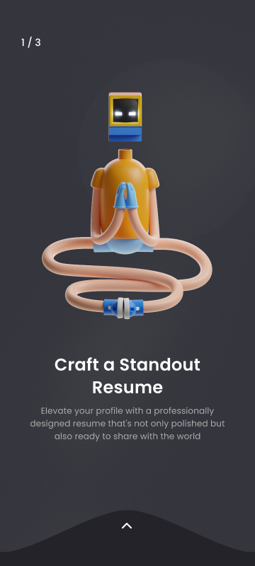
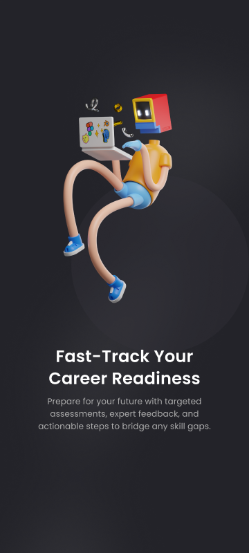
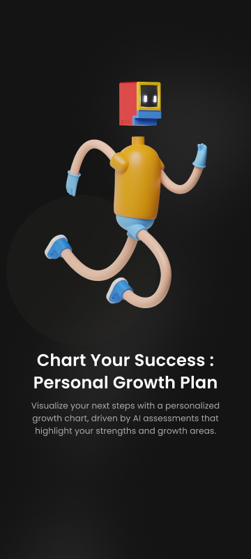
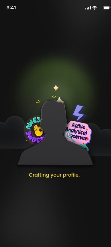
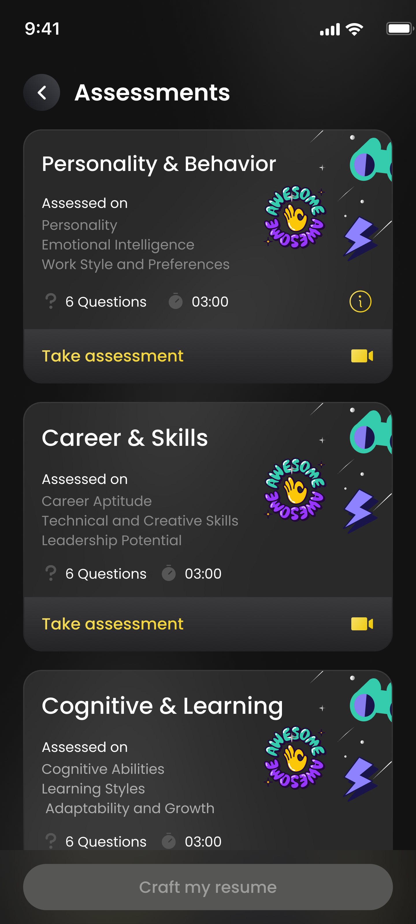
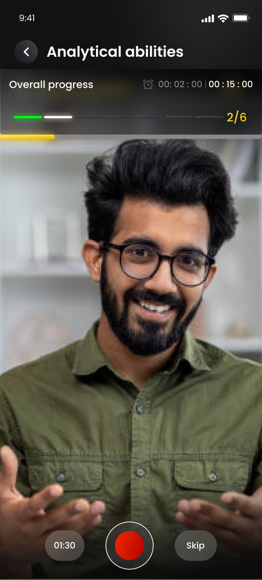
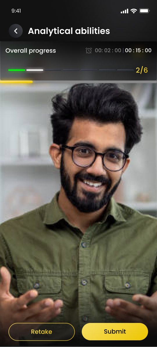
A comprehensive visual showcase of all interface designs, mobile candidate flows, skill assessment modules, AI interview journeys, and recruiter talent intelligence screens built across the Pehchaan ecosystem.
01. Candidate Onboarding & Authentication Flow
02. Resume Extraction & Candidate Identity Building
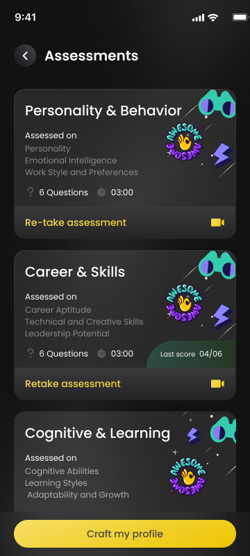
03. Skill Assessments & Growth Plan Journey
04. AI Interactive Interview Web Journey
Recruiter Workflow & Stage Breakdown
Impact
A hiring product isn't measured by how it looks — it's measured by whether it helps people make better decisions. We evaluated design against four outcomes.
Candidate Experience
- Reduced onboarding friction through progressive identity
- Created continuous engagement beyond job applications
- Encouraged candidates to improve rather than simply apply
Recruiter Experience
- Reduced time spent navigating disconnected hiring artifacts
- Provided structured evidence instead of fragmented information
- Improved confidence through explainable AI
Product
- Established a scalable hiring ecosystem connecting candidates, AI, and recruiters
- Created reusable interaction patterns supporting future expansion
- Designed a system rather than isolated workflows
Design
- Shifted from interface design toward systems thinking
- Showed how AI can strengthen human decision-making without replacing it
- Created a design language capable of scaling across multiple products
Reflection
I started this project thinking I was designing a hiring platform. I wasn't — I was designing a decision-making system, and that distinction changed how I approached AI, enterprise UX, and information architecture.
A successful interface isn't one that looks modern. It's one that helps people make better decisions with more confidence — a lesson that extends well past recruitment, into healthcare, investment platforms, and education systems: any complex product that asks users to trust something.
If I had to summarize Pehchaan in one sentence: we didn't redesign recruitment — we redesigned how confidence is built before a hiring decision is made.