UX DESIGN
iOS/ANDROID APP
Diabetes Care Plan
Sixty-eight people, one meeting room, and a card that kept failing in a different way each week — until it stopped.
The whole thing, before the detail
1mg had a diabetes membership worth real money to the people buying diabetes medicine. Almost none of them ever saw it.
The answer turned out not to be a better card. It was dimming the page behind it, giving people an explicit way into the detail, and moving product cross-sell off the membership surface entirely — decisions I made across ten documented rounds of testing in four weeks.
- Problem
- A ₹199 membership that saved diabetic households real money was invisible at the only moment it could be proven — inside the medicine purchase itself.
- My role
- The only designer on the initiative. Brief, problem framing, wireframes, high-fidelity design, testing, iteration and documentation. Anand Jha, VP of Design, gave oversight and critique.
- Team
- Cross-functional. Product, Engineering, and leadership including Gaurav, CEO.
- Scope
- iOS/Android App — product detail page and cart. Plan discovery, evaluation, add-to-cart and the post-purchase member state.
- Process
- ≈68 participants across 12 iterations, 10 documented here in full. One variable changed per round, prototype rebuilt between each.
- Outcome
- 6 → ~1,000 plan orders/day over the following year, and up to 3× QoQ conversion growth from experiments. Programme-level; my contribution was the cross-sell surface.
Order and conversion figures: Data Analytics team · Attribution set out in full under Outcomes
A membership, not a discount
In October 2018, 1mg launched a beta of the Diabetes Care Plan — a six-month membership against a condition that bills a household every month.
The proposition was sound. The timing was the problem: the plan only makes sense to someone already buying diabetes medicine — and that person is thirty seconds from checkout.
One payment
₹199
Six months
- 25%off every prescription medicine order
- Freediabetes lab tests at your doorstep
- Freepremium doctor & diet consultations
- ₹0shipping on every order
Benefits as documented in the 2019 deck and the Business Standard report of 16 July 2019
Three problems wearing one hat
Cross-selling a membership is not cross-selling a product.
A product rides on the intent already in the basket. A membership asks the person to pause, do arithmetic, and commit to six months — mid-task, often in a hurry.
Existing diabetes behaviour
Diabetes medicine, reordered
HbA1c, fasting & PP tests
Recurring visits to 1mg
Existing intent
A basket the plan can be priced against
What actually happened
Not seen. Or seen and misread as a coupon.
Business
The plan needed a distribution surface
A membership that lives only on its own landing page reaches nobody. It had to be sold inside the purchase — the one place its value is provable.
User
An interruption has to earn its place
Noticed, understood, and accepted or dismissed in seconds — often by someone buying for a parent or a spouse.
Design
Which surface, and in what state?
PDP or cart. On landing or on action. Collapsed or expanded. Banner or interruption. Every combination changes what gets noticed.
There was no way to reason our way to this. The variables were attentional, and attention only shows up in observation.
The designer on this project
UX / Product Design · end to end
I was the only designer on the Diabetes Care Plan initiative — from understanding the brief through wireframes, high-fidelity design, usability testing, iteration and documentation.
I didn't receive a finished problem and draw the screens. I sat in the meetings where the opportunity was still ambiguous, questioned the requirements, turned them into a design problem, tested my own assumptions against real users, and changed my mind on the evidence — eleven times in four weeks.
Design — end to end
Me
Product
Product Manager
Brief, requirements, prioritisation. Framed the opportunity with me.
Engineering
Engineering team
Constraints and feasibility. Partner for moving the design toward build.
Leadership
Gaurav, CEO, and stakeholders
Business context and direction. I presented the study into these discussions.
Design oversight
Anand Jha, VP of Design — critique across multiple feedback cycles. Reviewing the work, not producing it.
The process I owned, brief to documentation
01
Brief
Meetings with Product, leadership and Engineering.
02
Problem framing
Requirements into a stated design problem.
03
Exploration
Wireframes and interaction concepts.
04
High fidelity
Concepts into UI and flows.
05
Prototyping
A testable build, rebuilt each round.
06
User testing
Moderated sessions — observing behaviour.
07
Synthesis
What the evidence said had to change.
08
Iteration
One variable changed, then retested.
09
Documentation
Findings and decisions, written up.
Steps 06 → 07 → 08 repeated ten documented times. 2019 — no mature Figma, no AI: every prototype rebuilt by hand, printed, cut up, taped to a table.
I personally did
- Understanding the brief with Product, Engineering and leadership
- Framing the ambiguous opportunity into a design problem
- Wireframes and interaction concepts
- High-fidelity UI and interactive flows
- Every prototype iteration, rebuilt between rounds
- Research planning, task design and session facilitation
- Moderated usability testing across all documented rounds
- Synthesis of findings into each round's decision
- Cross-sell information architecture — which surface carries the plan
- Documenting findings, iterations and decisions
- Presenting the study and resolved architecture to leadership
Owned by others
- Product requirements and prioritisation — Product
- Pricing and the membership benefit structure — Product / business
- Front-end development and release — Engineering
- Analytics instrumentation and measurement — Data Analytics
- The wider Diabetes Care Plan programme roadmap — leadership
- Design critique and oversight — Anand Jha, VP of Design
Every screen shown here is a prototype state I designed and tested. Prices and cart contents in them are prototype values, not production data.
Source artifact — LinkedIn, September 2020.
We did multiple iterations and feedback cycles in one of the workflows being designed by her. She responded well to the feedback and asked critical questions before she accepted the changes.
Anand Jha, VP of Design, TATA 1mg
One task, run eleven times
One prototype, roughly seven people, then rebuild. Guerrilla testing was the only method fast enough to answer an attentional question inside four weeks.
Recruitment had to answer two different questions, so it drew on two different groups. Would people with a recurring diabetes relationship with 1mg recognise what the plan was worth? And could an ordinary 1mg user understand the proposition with no product-team context at all?
Every session used the same open-ended scenario — buy a Glycomet medicine — phrased so it never mentioned the plan. If someone noticed the card, the design made them notice it.
Who we tested, and why
Question 01
Would people already living with the cost recognise the plan's value?
Question 02
Could an ordinary user understand it with no product context at all?
Group 01
Existing 1mg users
People already showing recurring diabetes-related behaviour on the platform — the actual context the plan had to be discovered in.
- Repeatedly booked diabetes tests — HbA1c, fasting, PP
- Ordered diabetes medicines through 1mg
- An ongoing diabetes-management relationship with the platform
Group 02
Fresh 1mg users
Recruited inside the 1mg office from non-technical teams — ordinary users of the platform, with no product or design context.
- Customer care, finance, labs and other non-technical teams
- Not designers, product managers or engineers
- Ordered diabetes medicines or booked tests — for themselves or for family
Result →
The same prototype was read from two directions at once: someone who already lives with the cost the plan reduces, and someone meeting the proposition cold. A card that only worked for the first group would have been a card that only worked for people we'd already convinced.
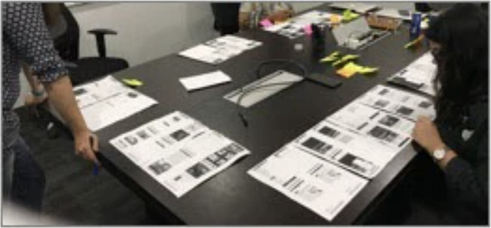
Every round was printed and laid out in task order. Comparing iterations meant physically walking the table.
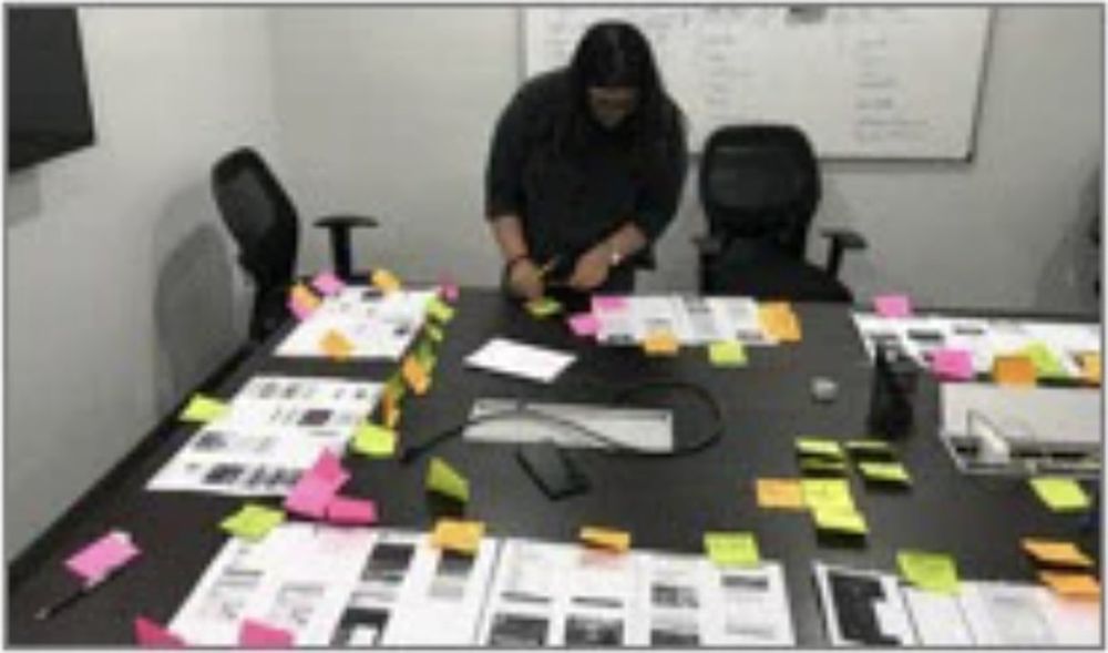
Clustering observations into issue buckets — the step that produced each round's participant board.
The anatomy of one round — repeated ten documented times
Question
One thing the last round left unanswered.
One change
A single variable moved, so the result is attributable.
Same task
Buy a Glycomet medicine. The plan is never mentioned.
Observe
What people did, in the order they did it.
Board
Steps and verbatim words, clustered per participant.
Decide
What the evidence forces — and the next question.
↺ Rebuild the prototype, return to 01
The three questions, unchanged for four weeks
Are users able to discover the card?
Unprompted noticing, recorded before any follow-up question was asked.
Is the interface predictable, for new and returning users?
Did people correctly guess what would happen when they tapped?
What changes the flow, what breaks it, what has to be learnt?
Anything a user had to be taught was a cost the design was quietly paying.
After every round we wrote down the chronological steps each person took, then their issues and their own words, then sorted them into buckets. Those boards appear throughout this case study exactly as written in 2019 — original spelling included. They are the primary evidence, and tidying them would be editing the record.
A limitation worth stating. This was guerrilla testing built for speed, not a representative sample. Roughly seven people per round is enough to see a pattern in behaviour, not enough to size an effect — and participants recruited inside the office are not a statistical stand-in for the full target population. Not everyone tested was diabetic; several were buying medicine or booking tests for a parent or a spouse, which is itself a real and common purchase context. Every finding here is directional, and the decisions it drove were made on that understanding.
Ten rounds, in order
Twelve design iterations were tested. Ten are documented in the 2019 deck with their full participant boards, and those ten appear here in the exact order they happened.
The order is the argument. Each round exists because the previous one failed in a specific way, and the failures move through three distinct problems — which is how I now read the whole sprint in hindsight.
Rounds 01 – 05
Getting seen
Five rounds spent on a card nobody noticed. I moved it, tinted it, separated it — none of it worked until I stopped changing the card and changed the page behind it.
Shift → the problem was attentional, not visual
Rounds 06 – 08
Getting understood
Once people saw it, they wanted to inspect it and couldn't. I tested the calm alternative, tested the checkout moment, then fixed what was actually broken: the way in.
Shift → evaluating must be as available as buying
Rounds 09 – 10
Getting the hierarchy right
With the card working, I tested whether products could share its surface. They couldn't. This is where the work stopped being a card and became an architecture.
Shift → one offer per surface
These phases are my retrospective reading of the sequence. The rounds below are presented in the exact order they ran, ungrouped — because that order is the evidence.
The gap between two rounds. Each of the ten changes that follow was argued out here first — one variable at a time, against what the last seven people had just done.
Iterating in multiple directions
Each concept tested a different balance between visibility, choice, and reassurance. The final direction won because it made the next step obvious without turning confirmation into another marketplace.
Put the plan where the medicine is
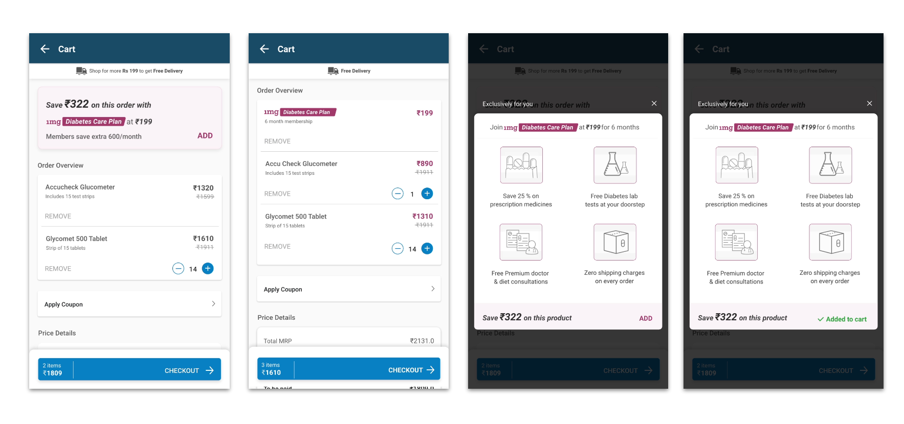
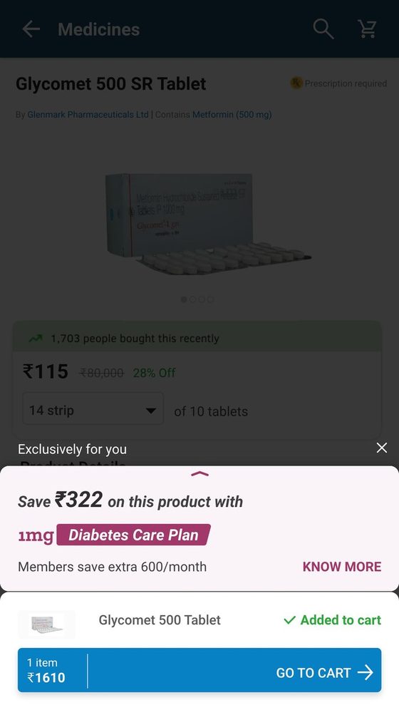
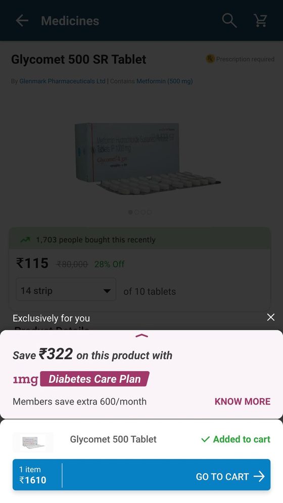
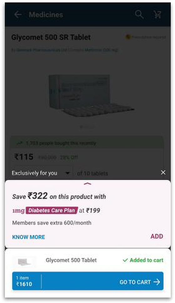
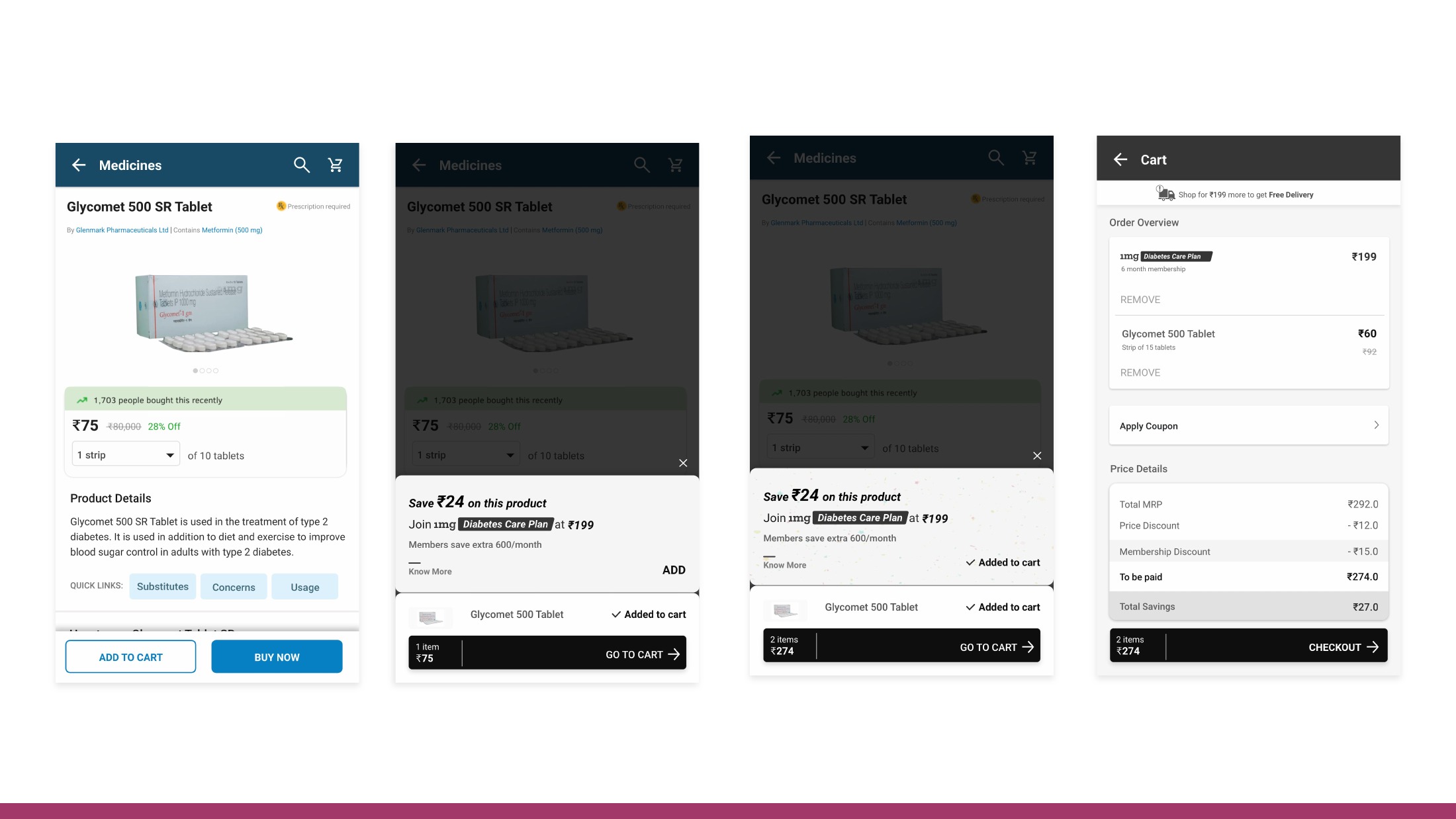
The first concept placed a collapsed card directly over the product page when a user added a diabetes medicine to cart. Arithmetic failed (saved ₹24 vs ₹199 cost).
Make the savings exceed the plan price
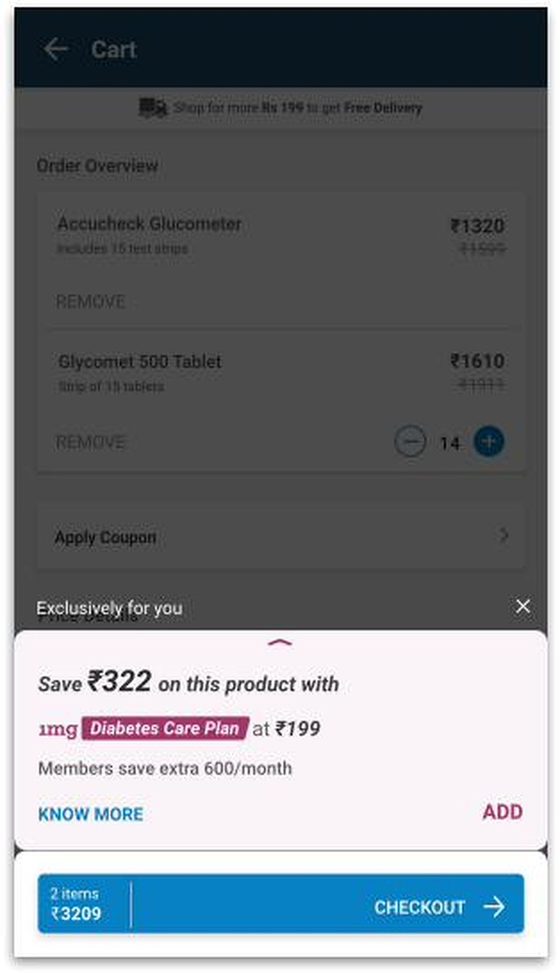
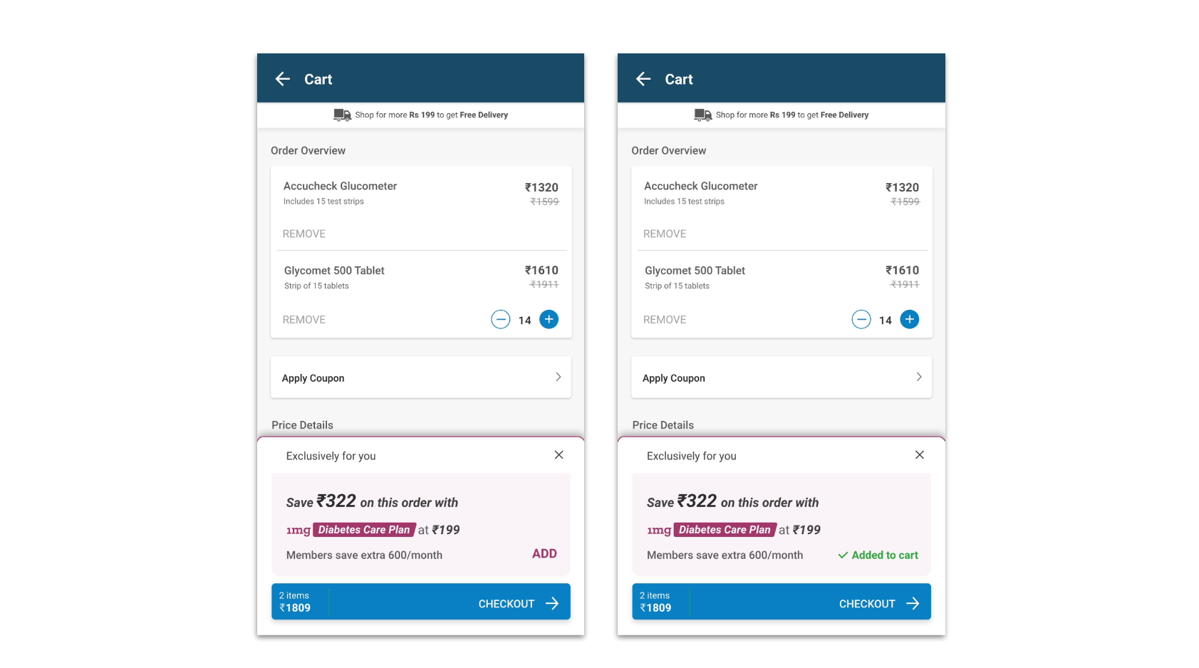
Tested highlighting total basket savings (₹322) against plan cost (₹199), but users still missed the detail drawer.
Move to cart on landing
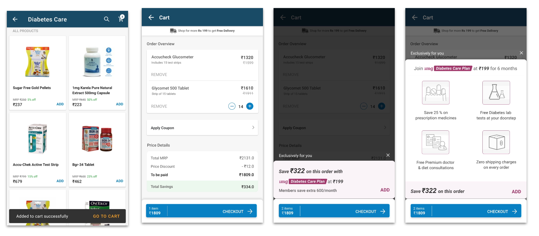
Shifted the offer card to the cart screen upon initial landing. Users ignored it as banner noise while reviewing items.
Tinted card with clear price separation
Used a colored background and distinct borders to separate the membership offer from the bill breakdown.
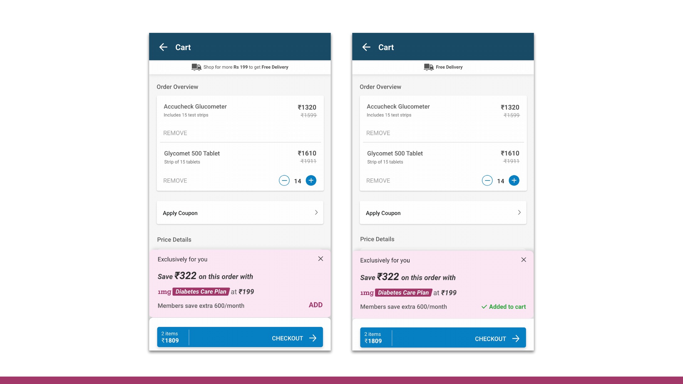
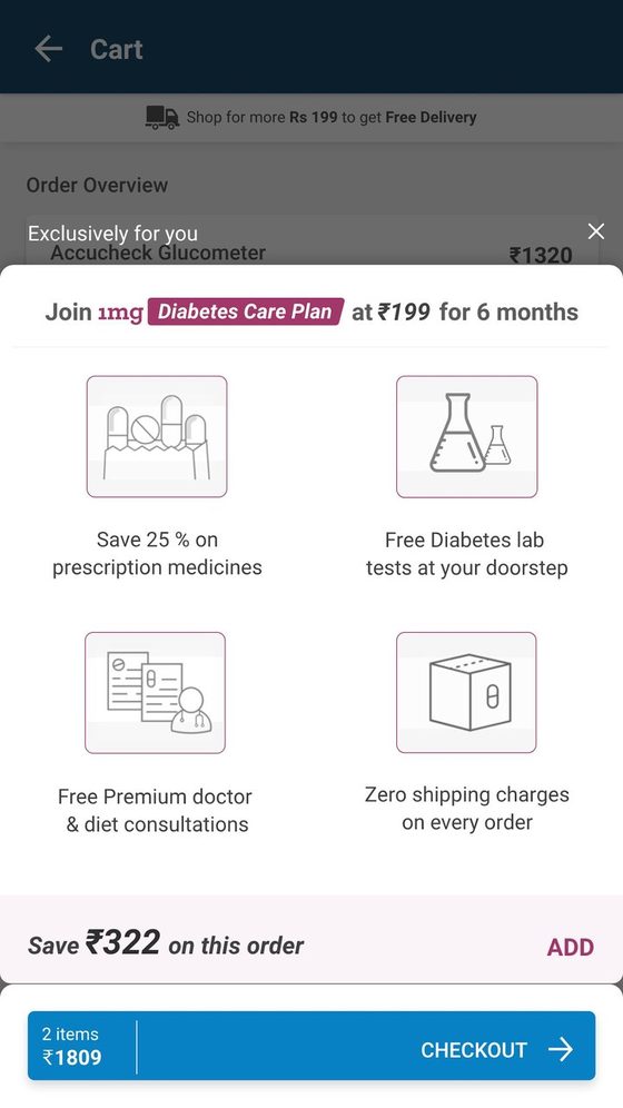
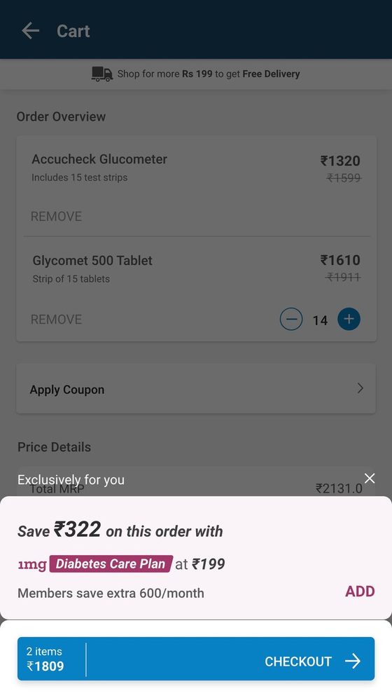
Dim the rest of the cart behind the offer
Dimmed the underlying cart when the product was added, focusing 100% of user attention on the membership value proposition.
Non-intrusive persistent banner above cart
Tested a calm, non-overlay banner above the order overview to reduce friction. Discovery dropped back down.
Interruption triggered on Checkout tap
Triggered the membership card at the exact moment the user tapped Checkout. High price sensitivity caused cart abandonment.
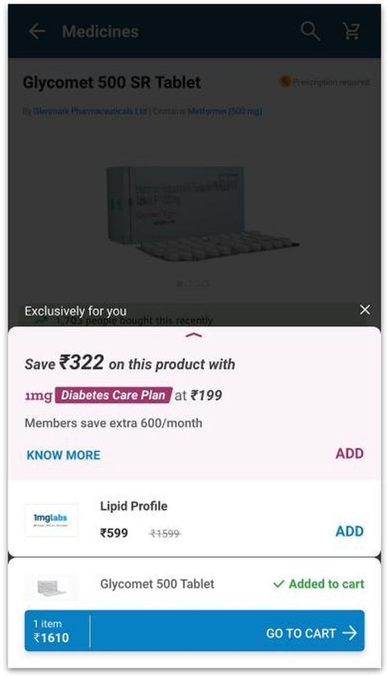
Promote "Know More" into a visible button control
Converted the small text link into a clear primary action button, driving deliberate exploration and high conversion.
Stacking HbA1c lab tests beneath the plan
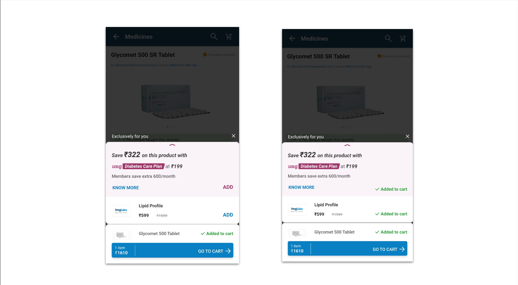
Bundled relevant diabetes lab tests directly into the membership surface for multi-product cross-selling.
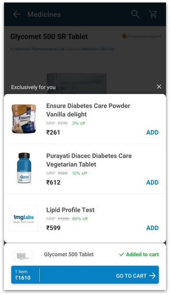
Horizontal carousel of cross-sell products
Tested a horizontal carousel for companion products. Carousels suffered from low engagement compared to vertical list cards.
Seamless cart integration with instant savings
The winning architecture that scaled membership orders from 6 to 6,000/day by aligning intent, timing, and clarity.
Hero card on the product page
Put the plan where the medicine is
If the plan appears the moment a diabetes medicine is added, will people see it — and understand what it's worth?
01 Round 01 Prototype Flow
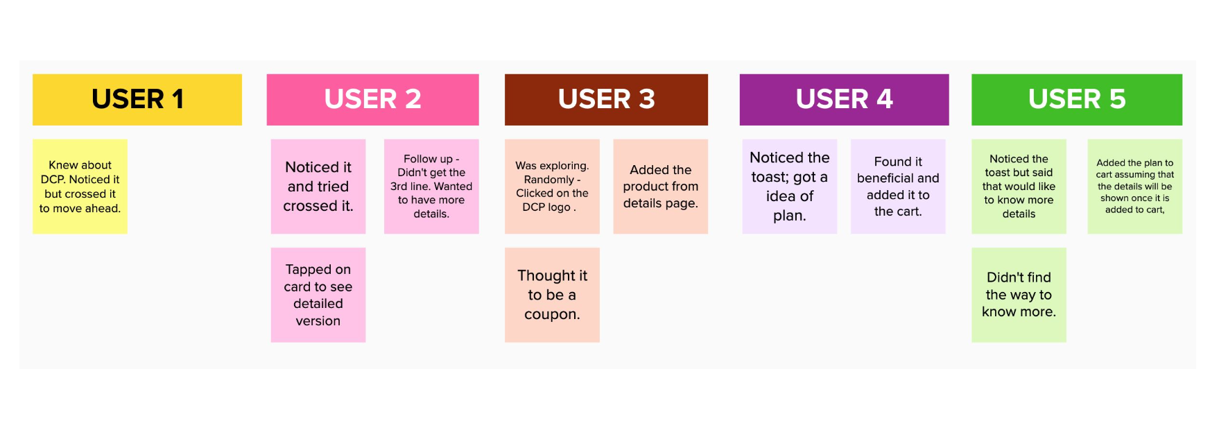
Participant board · Round 01 — seven users. Original 2019 artifact, verbatim.
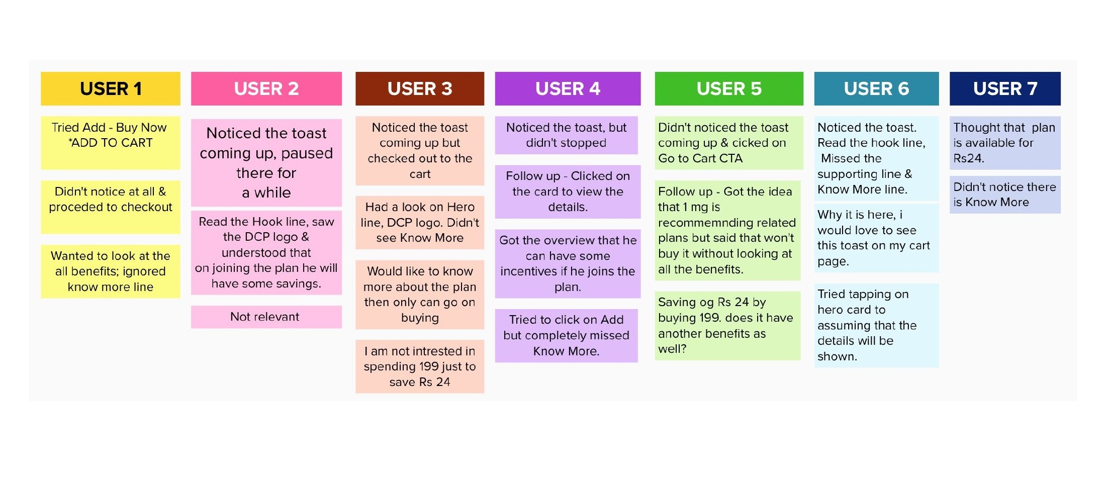
I am not intrested in spending 199 just to save Rs 24User 3
Thought that plan is available for Rs24. Didn't notice there is Know MoreUser 7
Why it is here, i would love to see this toast on my cart page.User 6
- Change
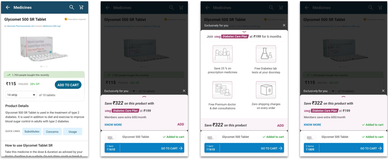
- A collapsed card animates over the product page on add — hook line, DCP badge, ₹199 price, "Know More" as a text line.
- Behaviour
- Five of seven registered the card; two walked straight past. Not one person used Know More. Several tapped the card body or the logo instead.
- Insight
- Two failures of different kinds. The arithmetic was wrong — ₹24 saved against a ₹199 plan reads as a bad deal. And Know More wasn't an affordance, it was a caption.
- Decision
- Keep the placement. Fix the value case first, because no amount of visual work rescues a bad number.
- Next
- Test the same card on a basket where the saving genuinely exceeds the price of the plan.
Hero card on the product page
Make the maths work
If the saving is larger than the price of the plan, does the offer stop being a calculation?
02 Round 02 Prototype Flow
Participant board · Round 02 — three users.
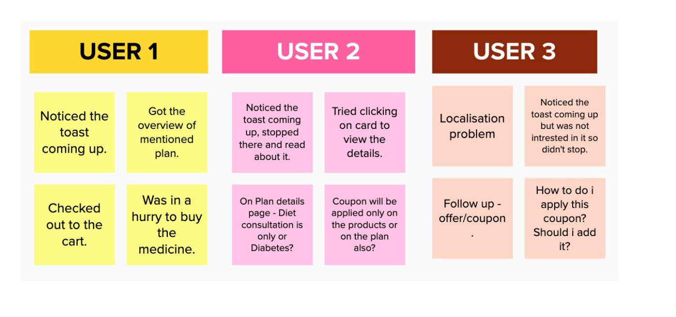
Coupon will be applied only on the products or on the plan also?User 2
How to do i apply this coupon? Should i add it?User 3
- Change
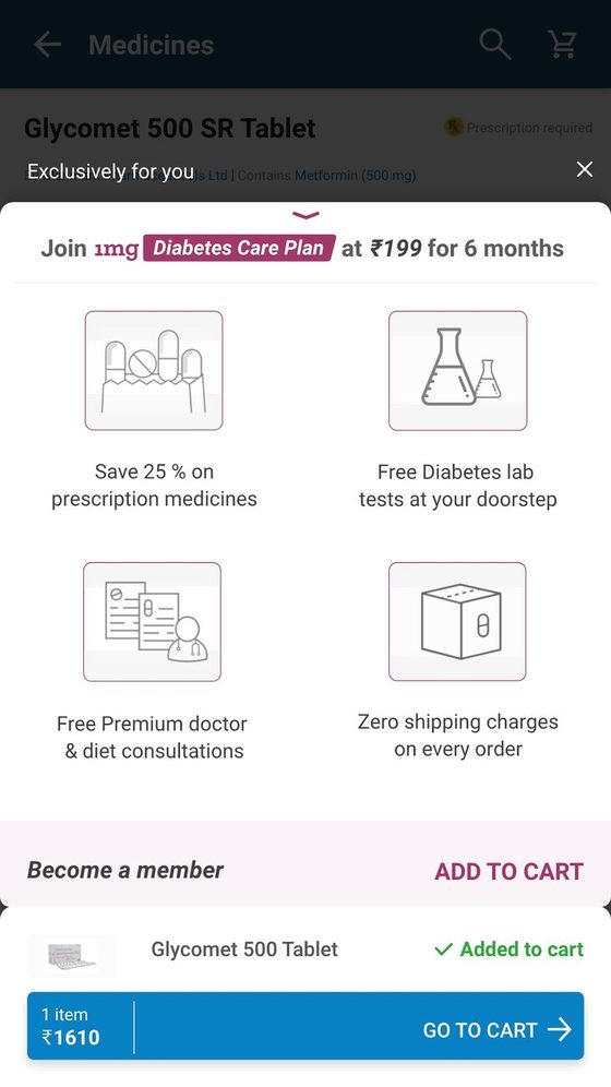
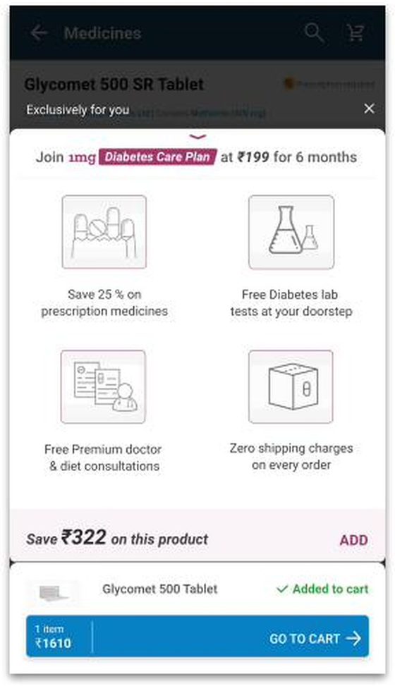
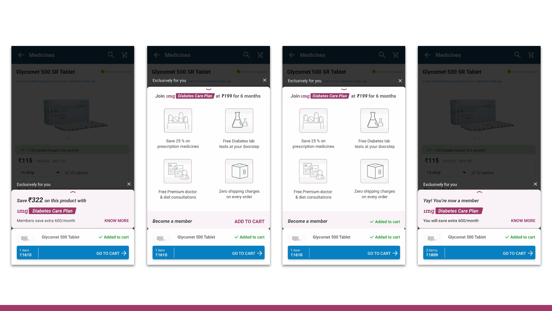
- Same placement, larger basket. The saving became ₹322 against the ₹199 plan, and an expanded benefits sheet was added behind the card.
- Behaviour
- All three noticed it. One read the whole thing and checked out. Two read the plan as a coupon and started asking coupon questions.
- Insight
- Fixing the arithmetic worked. But the card had walked into an existing mental model: everything offering a discount inside a cart is a coupon.
- Decision
- The product-page moment is viable. Before optimising it, test the surface where people already hunt for discounts.
- Next
- Move the card to the cart.
Hero card on the cart, on landing
Move to where the deals are
The cart is where people go looking for a better price. Does the same card perform better there?
03 Round 03 Prototype Flow
Participant board · Round 03 — two users.
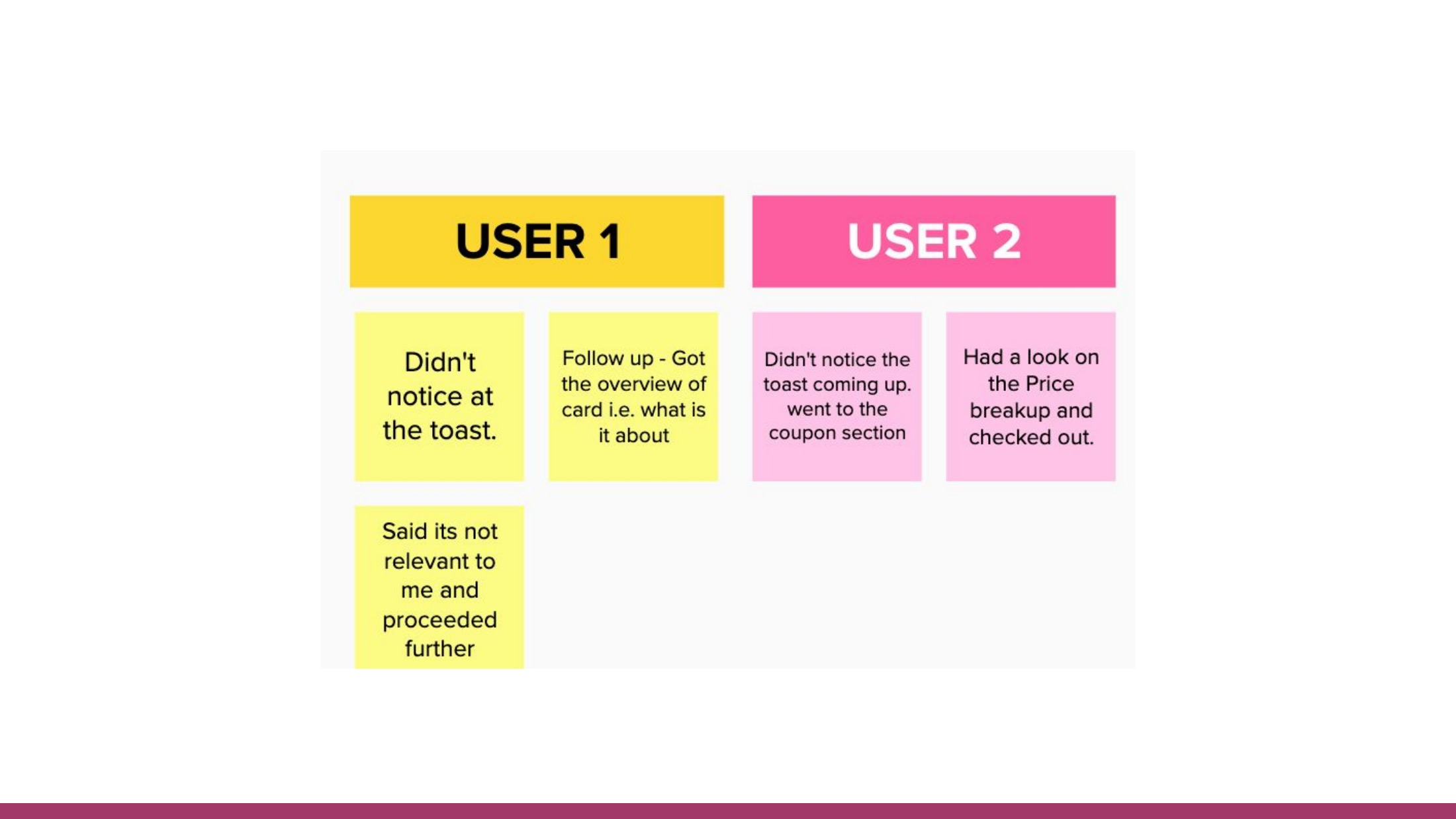
Didn't notice at the toast. […] Said its not relevant to me and proceeded furtherUser 1
Didn't notice the toast coming up. went to the coupon section. Had a look on the Price breakup and checked out.User 2
- Change
- The card moved to the cart, present on landing rather than triggered by an action.
- Behaviour
- Neither participant noticed it. Both went straight to the coupon field and the price breakdown.
- Insight
- Being on the cart isn't enough. On landing the card becomes furniture — and the cart already has its own discount ritual the card sits outside of.
- Decision
- Don't abandon the cart on two sessions. Raise the card's contrast and separation, then retest.
- Next
- Refine the treatment, same placement.
Hero card on the cart, on landing
Turn the contrast up
If the card is visually louder on the same surface, does discovery follow?
04 Round 04 Prototype Flow
Participant board · Round 04 — two users.
Didn't noticed at all, clicked on cross to cancel the toast. Asked the difference between Coupon n plan.User 1
Read the hook line, got intrested by looking at it and wanted to see more before buying the plan.User 2 — on follow-up
- Change
- Stronger tint and separation; free-delivery state resolved on add so the card produced a visible consequence.
- Behaviour
- Both missed it again on landing. One dismissed it with the cross without reading it. The other only engaged when prompted — and was then genuinely interested.
- Insight
- Two rounds, four people, zero unprompted discovery — but real interest once attention was forced. The problem wasn't the offer or the copy. It was purely attentional.
- Decision
- Stop tuning the card. Change what the page does around it.
- Next
- Dim everything else.
Greyed-out version on cart landing
Take the page away
If the rest of the cart recedes, does the card finally get seen — and what breaks once it is?
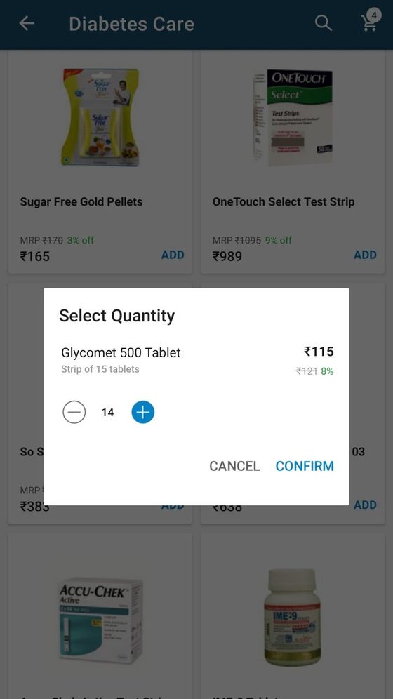
01 Category page
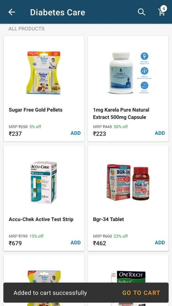
02 Added to cart
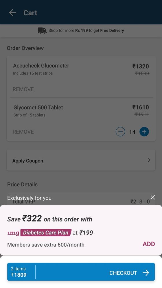
03 Background dimmed
04 Benefits expanded
Participant board · Round 05 — eight users. All eight noticed the card.
Asked from where he will see the details of DCP plan. After exploring & guessing he clicked on DCP logo, saw the details and Added the DCP to cart.User 1
Tried scrolling the card to see the detailed version.User 2
Got the DCP idea but didn't add to cart; said that there is no one diabetic on my home.User 2
- Change
- The cart behind the card was dimmed, making the card the only lit thing on the screen.
- Behaviour
- Eight of eight noticed it. Two added the plan. But nobody knew how to reach detail — one guessed and tapped the logo, two tried to scroll the card, one tapped the body. One declined for exactly the right reason: nobody in the house is diabetic.
- Insight
- Dimming solved discovery outright, in one move, after two rounds of failure. It immediately exposed the next layer: people who now wanted detail had nothing to press.
- Decision
- Hold the dimming. But before committing to interrupting people, prove a quieter permanent surface can't do the same job.
- Next
- Test the calm alternative — a banner.
Decision in full — the pivot of the sprint
- What I saw
- Four consecutive participants across two rounds walked past a card that was legible, well-placed and, in round 04, deliberately louder. One closed it without reading it.
- What I believed
- If raising contrast twice changed nothing, the card was not competing on visual weight — it was competing with the cart's own ritual. Nothing on that screen was ever asking for attention.
- What I chose
- Stop designing the card. Dim the page behind it so the cart recedes and the card becomes the only lit element on screen.
- What I traded off
- Calm. Dimming is an interruption, and I was deliberately spending some of the user's goodwill to buy attention. I refused to accept that trade on assumption — round 06 exists to test the polite alternative before I committed to it.
Banner on the cart
The polite alternative
Can a persistent, non-blocking banner do the work without interrupting anyone?
06 Round 06 Prototype Flow
Participant board · Round 06 — seven users.
Thought that Rs 199 is the minimum order to get this benefit.User 4
Noticed but didn't pause to read it.User 1
- Change
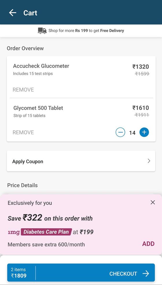
- The interrupting card was replaced with a persistent banner at the top of the cart.
- Behaviour
- Two missed it entirely; three noticed without reading. One misread ₹199 as a minimum order value. One asked whether ₹322 was a one-off saving or repeatable.
- Insight
- A passive surface loses to the cart's own tasks every time. The interruption in round 05 wasn't a stylistic preference — it was doing measurable work.
- Decision
- Return to the interrupting card. One placement question remains untested: the moment of paying.
- Next
- Trigger on Checkout instead of on landing.
After the user taps Checkout
The last possible moment
Intent to pay is the point of maximum price sensitivity. Is it also a moment people will stop at?
07 Round 07 Prototype Flow
Participant board · Round 07 — five users.
Added the plan to cart assuming that the details will be shown once it is added to cart. Didn't find the way to know more.User 5
Thought it to be a coupon.User 3
- Change
- The card was triggered by the Checkout tap rather than on landing, over a dimmed cart.
- Behaviour
- One found it beneficial and added it. Others were already leaving — one crossed it to move ahead, one tried to. And the same sentence returned: couldn't find the way to know more.
- Insight
- At the checkout tap people are committing, not evaluating. And across seven rounds the same failure had now appeared six times. Placement was no longer the problem.
- Decision
- Stop moving the card. Fix what's inside it.
- Next
- Make Know More a real control.
Know More upfront on the hero card
Give them the door
Six rounds of people hunting for detail. What happens if the way in is simply visible?
01 Know More promoted
02 Expanded view
03 Added
04 Member state
Participant board · Round 08 — six users. Five used Know More deliberately.
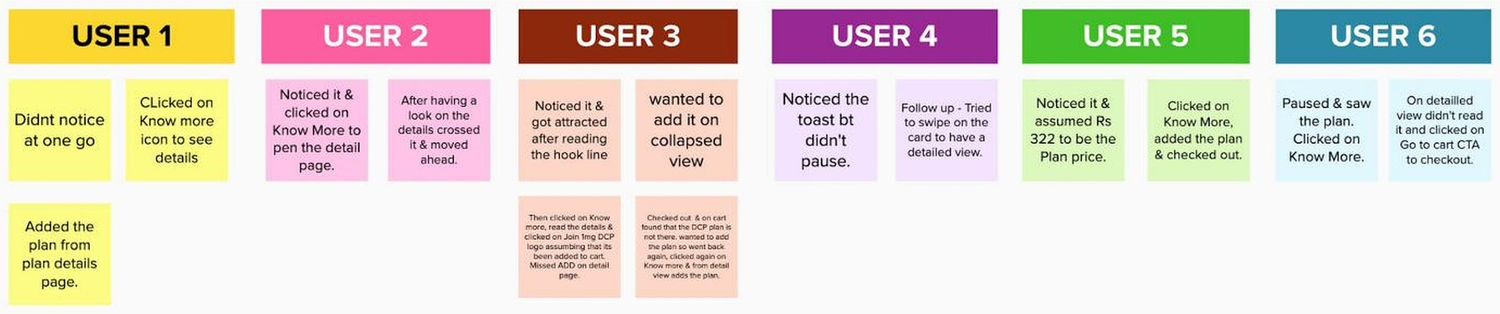
Then clicked on Know more, read the details & clicked on Join 1mg DCP logo assumming that its been added to cart. Missed ADD on detail page. Checked out & on cart found that the DCP plan is not there, wanted to add the plan so went back again, clicked again on Know more & from detail view adds the plan.User 3
Tried to swipe on the card to have a detailed view.User 4
- Change
- "Know More" was promoted from a text line to an explicit control on the collapsed card, sitting opposite ADD.
- Behaviour
- Five of six used it deliberately. The six-round detail problem closed in a single move. But the expanded view then failed the opposite way — ADD wasn't on it, and one user made a full round trip through checkout to discover that.
- Insight
- Explaining and acting are two different jobs, and both views have to do both. A view that only explains sends people backwards.
- Decision
- ADD on both the collapsed and expanded views. Swipe should open the card, because people kept trying it.
- Next
- With the plan card working, test whether a second cross-sell can share the surface.
Hero card + lab test
Can two offers share one surface?
A diabetes lab test is a natural companion purchase. Does it work stacked beneath the plan?
09 Round 09 Prototype Flow
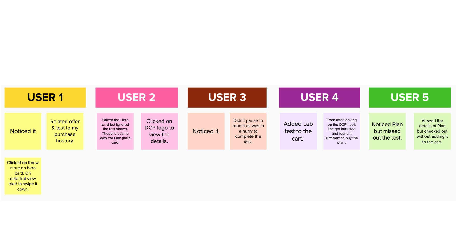
Participant board · Round 09 — five users.
Oticed the Hero card but ignored the test shown. Thought it came with the Plan (hero card)User 2
Noticed Plan but missed out the test.User 5
- Change
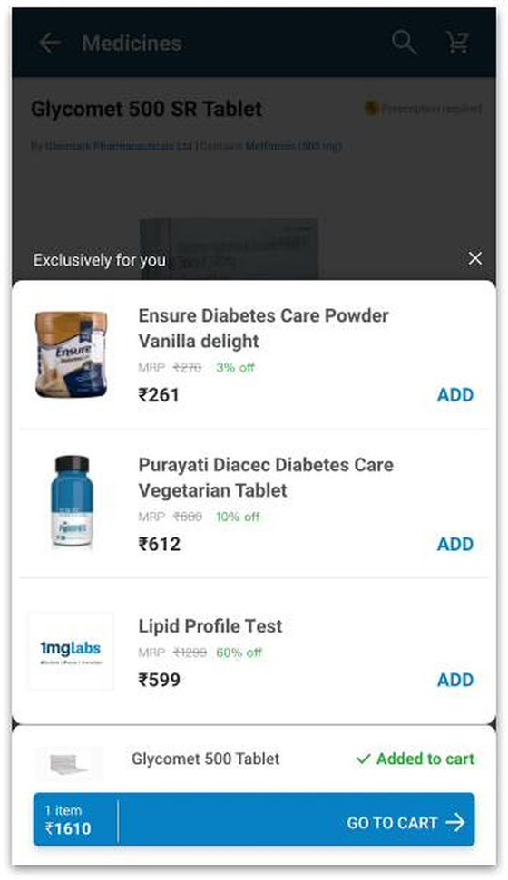
- A Lipid Profile lab test was placed directly beneath the plan card, sharing the same surface.
- Behaviour
- The test was either missed entirely or absorbed into the plan — read as something the membership already included. One added the test, then decided the plan alone was enough.
- Insight
- Two offers in one surface don't add up, they compete. The weaker one is invisible or misread as a feature of the stronger. A hierarchy problem, not an inventory problem.
- Decision
- Cross-sold products need their own surface at their own hierarchy — not a sub-slot under the membership.
- Next
- Design that surface, and test how it should be laid out.
Decision in full — where this stopped being a card
- What I saw
- A lab test placed under the plan card was either not seen at all, or read as something the membership already included. One participant added the test, then decided the plan alone was enough.
- What I believed
- The surface had become a container for two unrelated propositions. A membership and a product ask for different decisions, and stacking them makes the weaker one read as a feature of the stronger. This was a hierarchy failure, not a layout failure.
- What I chose
- Take products off the membership surface entirely and give them their own, at their own level in the page — rather than restyling the sub-slot to make it louder.
- What I traded off
- Cross-sell density. Two offers in one interruption is more revenue surface per interruption, and I gave that up. The alternative was a second offer that people were demonstrably not seeing — density that only exists in the spec, not in the session.
Products list view vs carousel view
List or carousel?
Cross-sold products now have their own surface. Which layout gets them understood — and added?
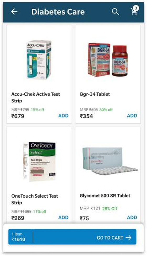
10A Product Detail Page Final Approved Architecture
10B Cart Page Final Approved Architecture
Final Approved Design · v10 Architecture — Product detail & cart integration.
In List view users were asking why I am not able to scroll in a list, in carousel view users were not swiping. They thought it just have three items.Round 10 insights
Users also mentioned that for the medicines they don't buy just because it is cheaper. Rather emphasizing on deals for cross sold products they want to make sure it will help them with their current condition. Credibility can be one of the concern incase of medicines cross selling.Round 10 insights
- Change
- The cross-sell product set was tested as a vertical list against a horizontal carousel.
- Behaviour
- People correctly read the products as related to their condition, not random. In carousel view they didn't swipe, assumed only three items existed, and tapped cards expecting navigation. More products were added from the list.
- Insight
- A carousel affords browsing; a list affords adding. And the ceiling on medicine cross-sell isn't discount size — it's credibility.
- Decision
- List view, at its own hierarchy on the product page.
- Next
- Consolidate ten rounds into a single architecture.
Three chains from evidence to decision
Ten rounds produced three findings that actually changed the architecture. Each one can be traced from a specific thing a participant did, to the change it forced, to what happened next.
Read left to right. The evidence column is verbatim from the participant boards; the response column is the screen that shipped into the following round.
Presence is not discovery
01 Behaviour
Focus was on the products, applying coupons & price breakup.
Round 04, User 2 · 0 of 4 noticed across rounds 03–04
02 Insight
The card was legible, well-placed and ignored. The cart has its own discount ritual — coupon field, price breakup — and anything outside that ritual is furniture. Raising contrast twice changed nothing, so the problem was never visual weight. It was that nothing ever asked for attention.
03 Response
Stop tuning the card. Dim the page behind it so the cart recedes and the card is the only lit thing on screen.
04 Result
8 of 8
noticed it, unprompted — up from 0 of 4. One structural change did what two rounds of visual tuning could not.
People will not commit to what they can't inspect
01 Behaviour
Didn't find the way to know more.
Round 07, User 5 · Same failure recurring in six of seven rounds
02 Insight
People tapped the logo, the card body, tried to scroll it, tried to swipe it — every guess except the one link provided. They weren't refusing the plan; they were refusing to buy six months of something they couldn't examine first. The offer was fine. The door was missing.
03 Response
Promote Know More from a caption to a real control, weighted equally against ADD so evaluating is as available as buying.
04 Result
5 of 6
used it deliberately. Six rounds of hunting closed in one change — and exposed the next problem: the expanded view explained the plan but had no way to add it.
In medicine, credibility is the ceiling — not price
01 Behaviour
Thought it came with the Plan (hero card)
Round 09, User 2 · Test missed or absorbed by most participants
02 Insight
Two offers in one surface compete rather than accumulate. And round 10 named the real constraint: people don't buy a medicine because it's cheaper — they buy it because they believe it treats their condition. Discount size is not the lever. Relevance and trust are.
03 Response
Move products off the membership card onto their own surface, as a list — full-width rows with names, prices and a per-item ADD.
04 Result
List > carousel
More products added from the list. In carousel view people didn't swipe, assumed three items existed, and tapped expecting navigation.
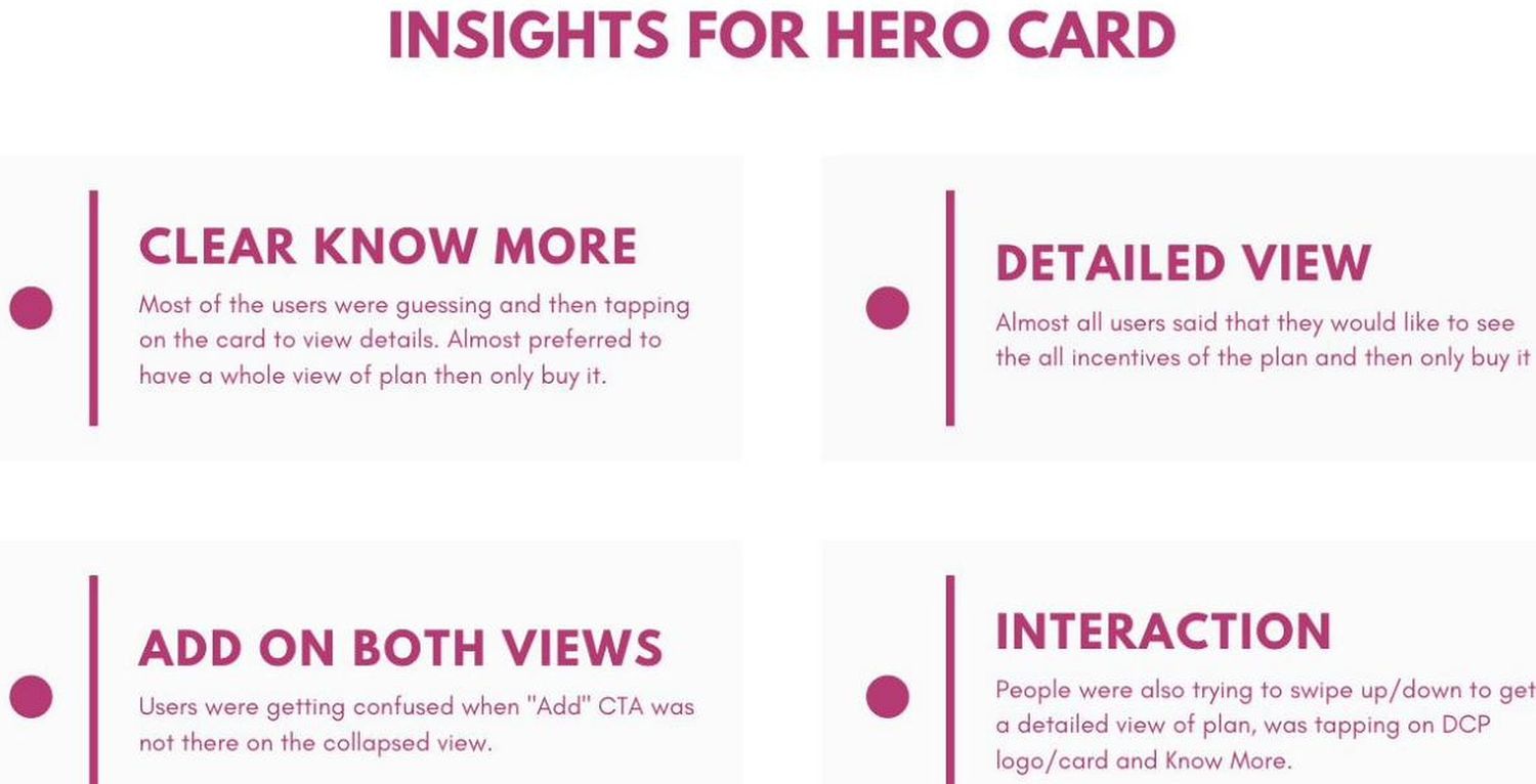
Four findings for the hero card
The study closed with four documented findings about the card itself. Each one is an observation about what people did, and the change it required. The quoted lines below are the observations exactly as recorded in the 2019 study.
01
Clear Know More
Most of the users were guessing and then tapping on the card to view details. Almost preferred to have a whole view of plan then only buy it.
Design responsePromote Know More from a caption to an explicit control on the collapsed card, so evaluating the plan stops being a guess.
02
Detailed view
Almost all users said that they would like to see the all incentives of the plan and then only buy it
Design responseA full benefits view is not optional depth — it is a precondition of the purchase. Four benefits, stated plainly, before any commitment.
03
Add on both views
Users were getting confused when "Add" CTA was not there on the collapsed view.
Design responseADD present on the collapsed and the expanded view. Whichever state someone is in when they decide, the decision has somewhere to land.
04
Interaction
People were also trying to swipe up/down to get a detailed view of plan, was tapping on DCP logo and Know More.
Design responseHonour what people already tried — swipe opens the card, and the DCP logo is a route into detail rather than decoration.
Insights for the Hero Card — original 2019 deck slide, as presented to leadership. Tap to enlarge.
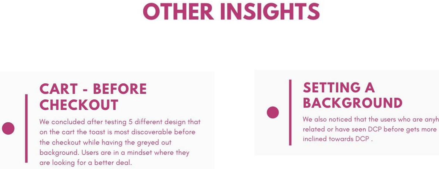
Other insights — original 2019 deck slide. Cart placement before checkout, and the effect of prior familiarity with the plan.
Which surface carries the plan
This is the decision the ten rounds were really for. Not what the card looks like — which surface owns the job, which supports it, and which one gets nothing.
A membership is only persuasive next to proof. The saving is computed against a specific basket, so the plan's argument gets weaker the further it moves from a real purchase. That single principle orders the surfaces.
Rather than maximising exposure across every surface, I focused the cross-sell where users were already demonstrating relevant intent. More placements would have meant more impressions and a weaker argument at each one.
Primary
Cart
Commit to the plan
Basket complete, saving is a real number, and the person is already hunting for a better price. Card interrupts once, before checkout, over a dimmed page.
Secondary
Product page
Understand the value
Earlier, one item, smaller saving — a weaker argument, but it catches people who never build a multi-item cart, and it's where the member price has to live afterwards.
No basket, no medicine, no number. The plan could only be advertised there, not proven.
↓ One purchase journey, two roles, no redundant exposure
Decision in full — what I chose not to build
- What I saw
- Rounds 03 and 04 showed that a plan presented outside an active purchase decision is read as furniture and skipped — even when it is legible and deliberately louder.
- What I believed
- The plan's persuasiveness is a function of proximity to a real basket. On the homepage there is no basket, no medicine and no number, so the plan can only be advertised, not proven.
- What I chose
- Two surfaces, each with a distinct job, and no homepage placement — concentrating the cross-sell where diabetes-related intent was already visible in behaviour.
- What I traded off
- Reach. The homepage is the highest-traffic surface at 1mg and I gave it up deliberately. I also did not test it — this was an argument from the evidence I had, not a finding, and I'd want to validate it before treating it as settled.
Primary
Cart, before checkout
Evidence: rounds 03–07, five designs tested
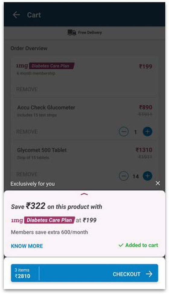
The basket is complete, so the saving is a real number rather than a projection — and this is the moment people are already hunting for a better deal. The study's own conclusion after testing five cart designs: most discoverable before checkout, with the background greyed out. Not on landing, where it becomes furniture, and not on the checkout tap, where people are committing rather than evaluating.
Secondary
Product detail page
Evidence: rounds 01, 02, 08
Earlier in the journey, with only one item to compute against, so the saving is smaller and the argument weaker — round 01 failed on exactly that arithmetic. It earns a place because it catches people who never reach a multi-item cart, and because once someone is a member, the product page is where the discounted price has to live. Supporting surface, not the primary one.
Not pursued
Homepage
Reasoned exclusion — not tested
On the homepage there is no basket, no medicine and no number, so the plan can only be advertised, not proven — and rounds 03 and 04 had already shown that a plan presented outside a purchase context gets read as furniture. I did not test it, and I'm marking that clearly: this was an argument from the evidence we had, not a finding.
The through-line: proximity to a real basket determines how persuasive the plan can be. Every placement decision in this project is downstream of that, including the one I chose not to test.
Every decision cost something
What it boughtDiscovery — 0 of 4 to 8 of 8
What it costCalm. Dimming interrupts a task in progress.
Round 05 · Dim the pageTaken, but only after round 06 tested the polite banner and lost.
What it boughtMaximum price sensitivity, at intent to pay
What it costPeople are committing, not evaluating. Some crossed it to move on.
Round 07 · Trigger on CheckoutExplored, not adopted. Before checkout beat at checkout.
What it boughtA second revenue surface per interruption
What it costThe weaker offer disappeared into the stronger one.
Round 09 · Stacked lab testRejected. One offer per surface.
What it boughtBrowsing affordance, more items in less space
What it costNobody swiped. Cards read as navigation, not as add.
Round 10 · CarouselRejected in favour of the list.
What it boughtReach — the highest-traffic surface at 1mg
What it costNo basket, no number. Advertising instead of proof.
HomepageDeprioritised — reasoned, not tested.
Four surfaces, one system
The final proposal wasn't a screen. It was a decision about which surface does which job, and what state each one has to hold.
The membership interrupts once, at the point of highest price sensitivity, with the page dimmed behind it, an explicit way in, and the ability to act from either view. Cross-sold products leave that surface and get their own. And once someone is a member, the saving stops being an offer and becomes a price.
One component, two surfaces, four states
Secondary · earlier
Product page
- Collapsed — saving, price, KNOW MORE, ADD
- Expanded — four benefits, own ADD
- Added — confirmed in cart
- Member — price replaces the offer
Understand the value
Primary · at the basket
Cart
- Collapsed — saving computed on the real basket
- Expanded — four benefits, over a dimmed cart
- Added — a visible line item in the order
- Member — entitlement, not offer
Commit to the plan
Interrupt once, never twice. Dim the page, not the card. Explain and act in every state. One offer per surface — products live separately, as a list.
Hero card on the cart
Primary surface
v10 Final Approved Architecture · Cart Page — Seamless cart integration with instant basket savings calculation.
Finding presence is not discovery → Principle interrupt once, at the basket → Architecture cart, before checkout → UI below
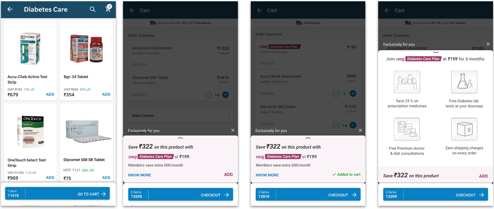
The component the whole study converges on. It appears before checkout with the cart dimmed behind it, carries the saving and the plan price, and offers KNOW MORE and ADD at equal weight. Expanded, it shows the four benefits and keeps its own add action.
01 Category
02 Before checkout
03 Added to the order
04 Expanded, dimmed cart
Hero card on the product page
Secondary surface
v10 Final Approved Architecture · Product Detail Page — Collapsed and expanded membership cards with explicit Know More and Add actions.
Finding people won't commit to what they can't inspect → Principle explaining and acting in every view → Architecture product page, supporting → UI below
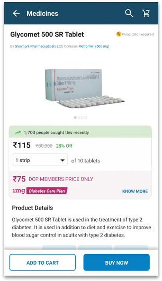
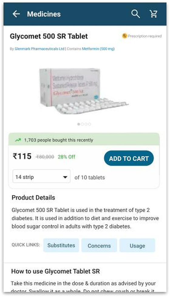
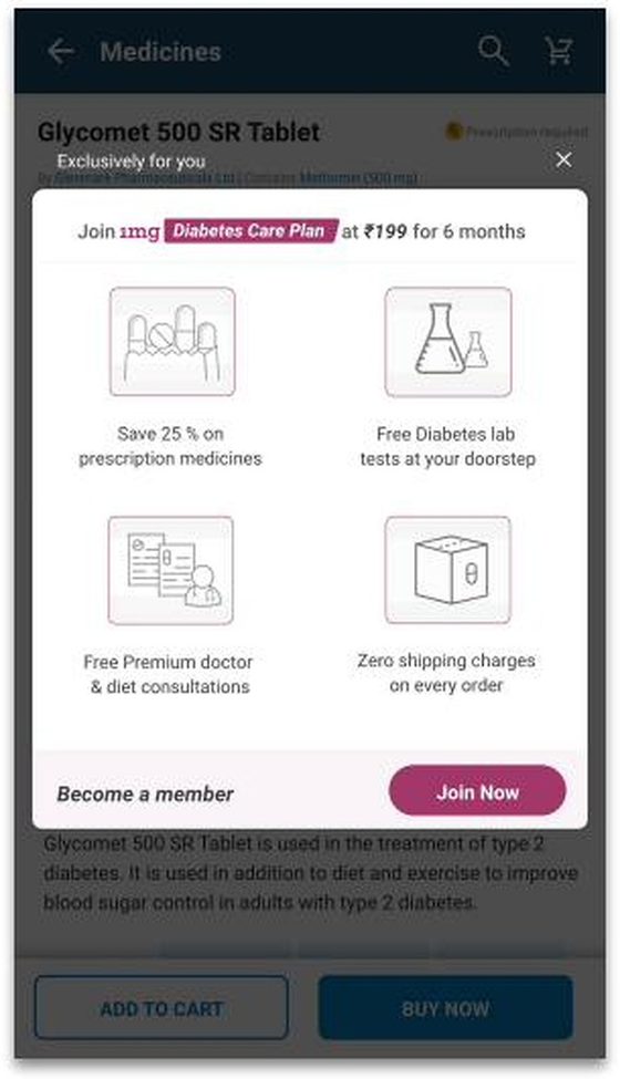
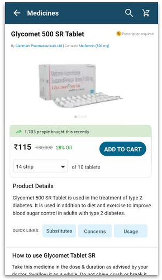
The same component earlier in the journey. Collapsed, it carries an explicit KNOW MORE; expanded, it carries the four benefits and its own ADD TO CART. After joining, the card stops selling and becomes a member confirmation.
01 Product page
02 Both actions
03 Can still act
04 Member state
Products at their own hierarchy
Separated surfaceFinding credibility is the ceiling → Principle one offer per surface → Architecture products separated from the membership → UI below
Cross-sold products leave the membership card entirely. Full-width rows, real product names, prices and a per-item ADD — the layout people actually added from, and the one that reads as a recommendation rather than as navigation.
01 Product page
02 Products as a list
After joining
Membership stateFinding the plan is only provable against a basket → Principle an entitlement is a price, not an offer → Architecture member price inline on the product page → UI below
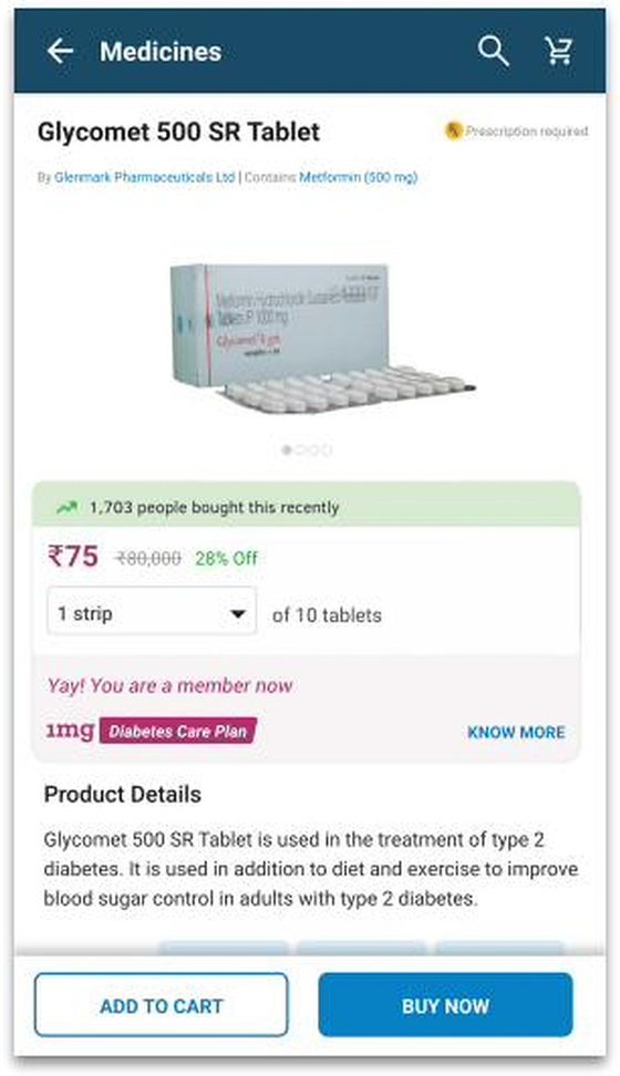
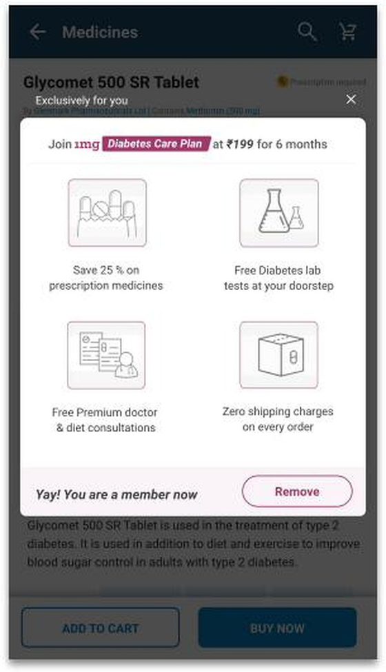
The last piece. Once the plan is a membership rather than an offer, the member price lives inline on the product page — ₹75, DCP members price only — with a persistent route back into the benefits, and the ability to leave.
01 Member price inline
02 Applied
03 Join
04 And leave
What the data shows and who it belongs to
Over the following year the Diabetes Care Plan subscription grew from roughly 6 orders a day to about 1,000, attributed to successful design interventions on the plan.
That is a programme-level outcome. It belongs to a year of work across the whole 1mg design organisation, not to one four-week sprint. What this sprint contributed is one part of it: the cross-sell architecture — the surfaces through which people encountered the plan inside the shopping flow.
I'd rather show the real number with the real attribution than claim a smaller one I could own outright.
6
Orders / day at the starting point
1,000
Orders / day approximately one year later
Both bars are drawn to true scale — at 1,000 orders a day, the starting point is a 2-pixel line. The path between the two is not in the source data, so it is not drawn. Source: Data Analytics team.
Up to3×
Quarter-on-quarter growth in mobile web and app engagement and conversion performance, from the conversion experiments — including widgets — run across the programme. Source: Data Analytics team
Programme outcome
6 → approximately 1,000 plan orders per day within a year, attributed to successful design interventions on the Diabetes subscription plan.
Up to 3× quarter-on-quarter growth in mobile web and app engagement and conversion performance from the conversion experiments, including widgets.
Source: Data Analytics team
My contribution to it
I designed and validated the cross-sell experience through which people encountered the plan inside the shopping flow — the surfaces, states and hierarchy set out in this case study.
That is one input among many across a year of work by the full design organisation. I can evidence the design decisions and the research behind them; I cannot isolate their share of the number, and I won't estimate one.
What this sprint can claim on its own
Unprompted discovery per round — participants who noticed the card before any follow-up question. Source: 2019 participant boards, reproduced in full above.
03
0 / 2
04
0 / 2
05
8 / 8
The change between 04 and 05: not the card — the page behind it.
Discovery went from zero of four to eight of eight the moment we dimmed the page — and no amount of visual tuning had achieved it in the two rounds before.
What I'd carry forward
Four things from this sprint still change how I work.
Placement is product strategy, not layout
A strong proposition in the wrong moment is invisible. The plan's persuasiveness turned out to be a function of how close it sat to a real basket — which meant the most consequential thing I designed wasn't the card, it was the decision about which surfaces carry it and which one gets nothing.
Check the arithmetic before you design the card
Round one failed on a number, not a layout. ₹24 saved against a ₹199 plan is not a design problem, and no amount of hierarchy fixes it. I now stress-test the value proposition against a real basket before I open a canvas.
When the same failure repeats, stop moving the thing
I spent rounds three through seven relocating a card whose real problem was internal. Six rounds of people saying they couldn't find the details should have redirected me sooner. Repetition in the evidence is a diagnosis, not noise — and noticing it earlier is the difference between four weeks and two.
Each round should exist because the last one raised a question
Iteration counts for nothing if the rounds are interchangeable. Round 06 exists specifically because I didn't want to accept the interruption in round 05 without testing the calm alternative against it. That's the difference between iterating and re-deciding the same thing repeatedly.
In healthcare, credibility is the ceiling — not price
The clearest thing anyone said across ten rounds was that they don't buy a medicine because it's cheaper; they buy it because they believe it helps their condition. That reframes every cross-sell in a health product from a discount problem into a trust problem.