


 Health Insurance
2019
Health Insurance
2019
Closing the Gap Between Insurance Intent & Purchase
I led the end to end UX redesign of EasyPolicy health insurance experience rearchitecting policy discovery, transparent comparison, and decision confidence to turn high-intent leads into completed sales.
We had the leads. We weren't winning the sale.
EasyPolicy's challenge wasn't simply getting people interested in health insurance. The bigger problem was what happened after that interest. Buying health insurance is fundamentally different from buying a low-consideration product. People don't arrive, pick a plan and check out.
They research. They compare. They ask people they trust. They look for reassurance.
And only then do they decide to move forward. So I reframed the original business question:
What is happening between a user's intent to buy insurance and their willingness to actually move forward?
That became the starting point for the work.
I started with the decision, not the interface
The goal wasn't to validate assumptions. I wanted to understand how people actually approach health insurance decisions, not how the industry assumes they do.
User research
I conducted an initial survey with 89 respondents to understand how people researched health insurance, what influenced their decisions, and what information they considered important.
Business & behavioural data
I worked with company data and Google Analytics to understand the existing audience, behaviour, conversion patterns, device usage and drop-offs.
Customer care insights
Customer care conversations provided another perspective, what users were asking about, where they needed help and what happened before and after they interacted with EasyPolicy.
The goal wasn't to collect more data. It was to find patterns that appeared across sources.
People weren't starting from zero
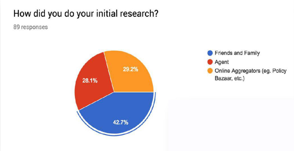
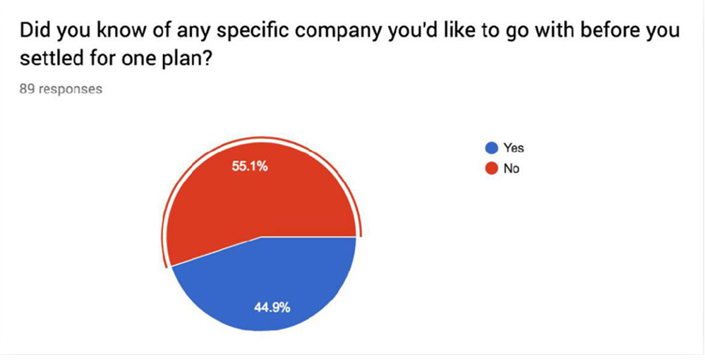
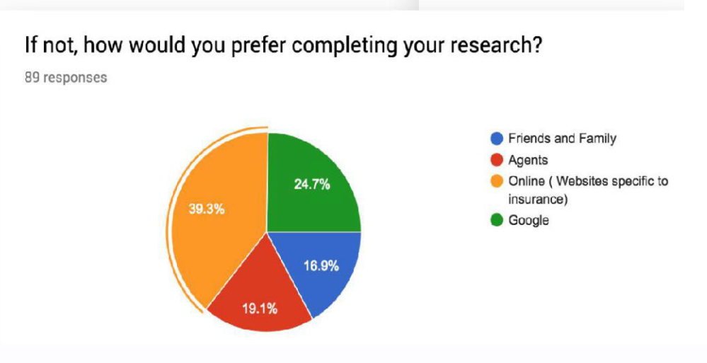
A large proportion of people weren't coming to EasyPolicy to learn what health insurance was. They had already done some homework. And the behaviour was increasingly digital: online sources and aggregators were becoming an important part of the research journey. This meant EasyPolicy wasn't necessarily competing for attention. It was competing for confidence at the point of decision.
42.7% of respondents said they initially relied on friends and family, while 29.2% used online aggregators such as PolicyBazaar and 28.1% approached an agent.
What actually influenced the decision?
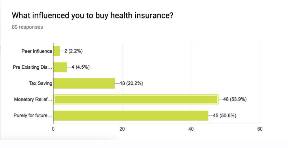
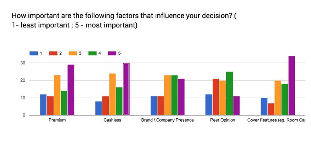
When we looked at what motivated people to purchase insurance, monetary relief and future security were among the strongest drivers. But the purchase decision wasn't purely financial. Respondents also placed significant importance on:
Coverage and benefits
Cashless facilities
Premium
Brand/company presence
Peer opinion
Specific coverage requirements
From research to behavioural models
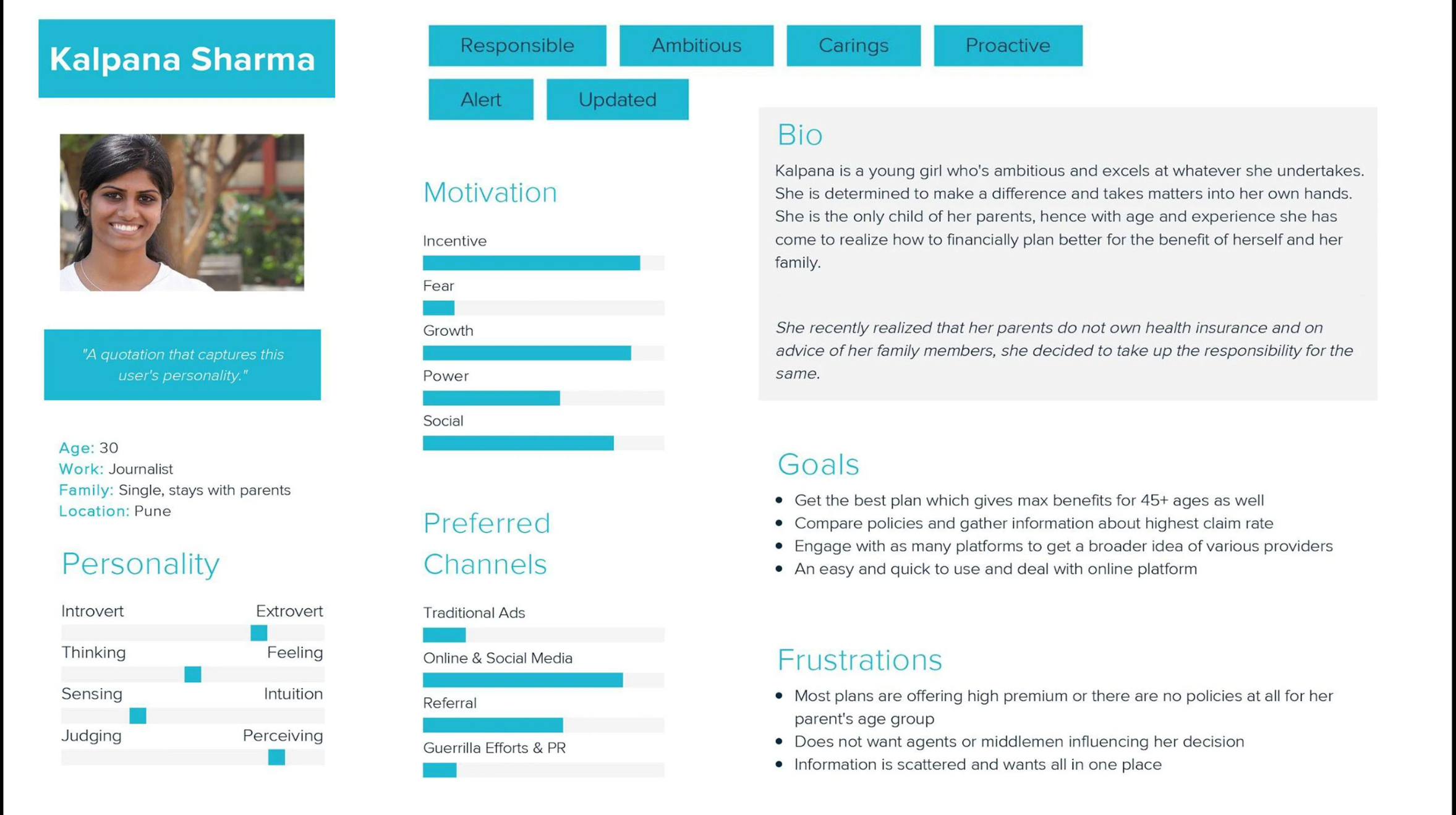
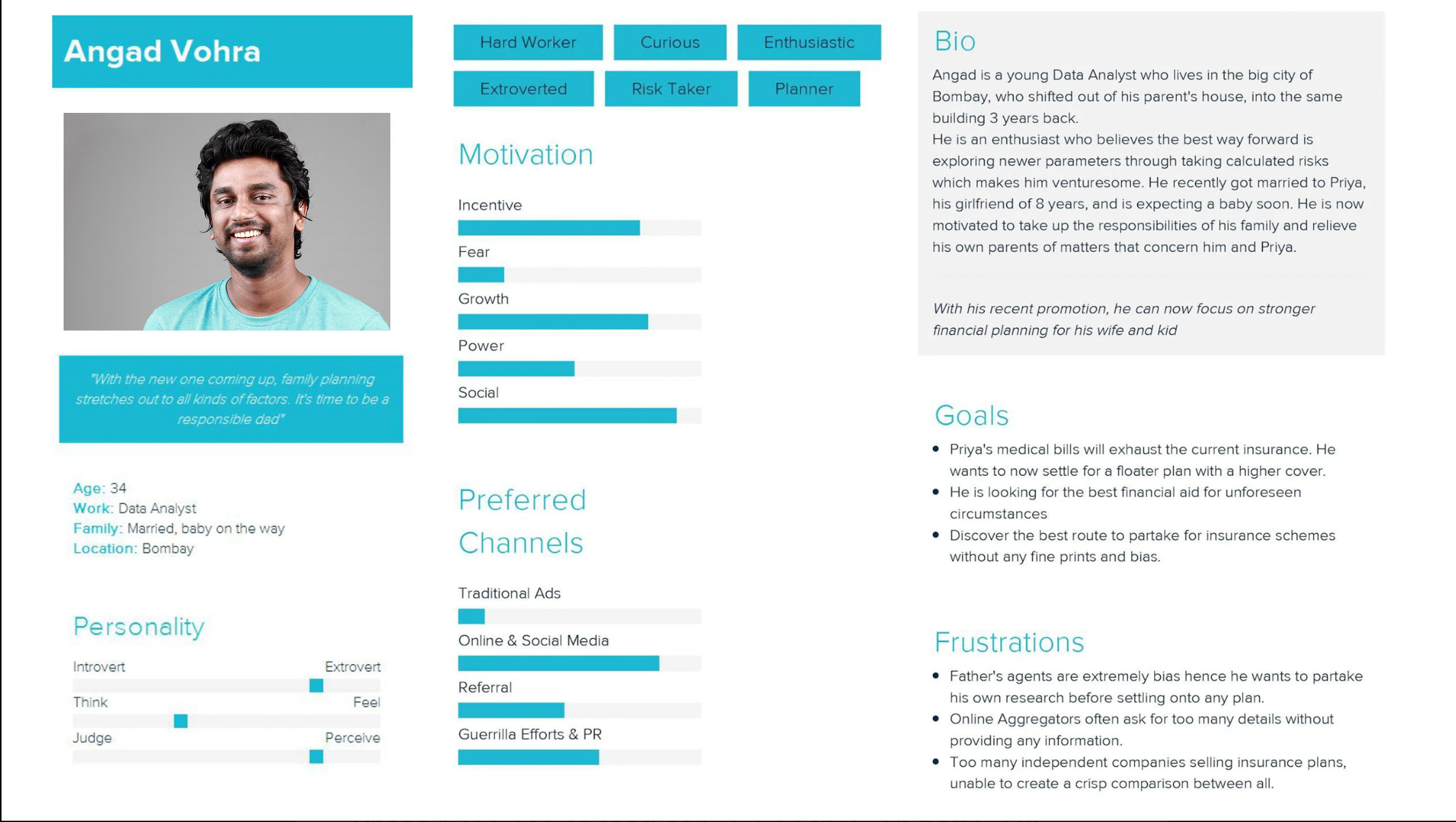
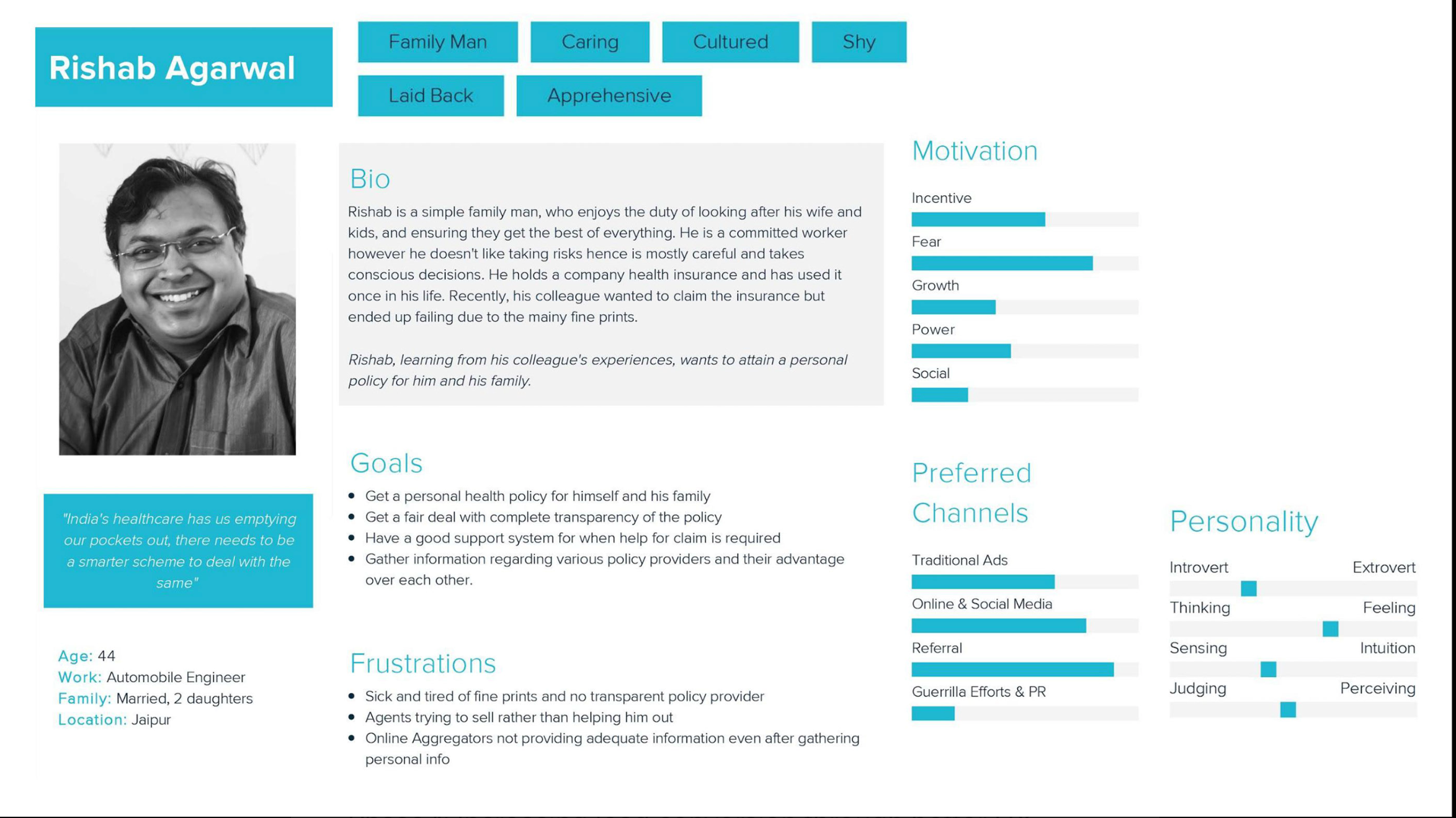
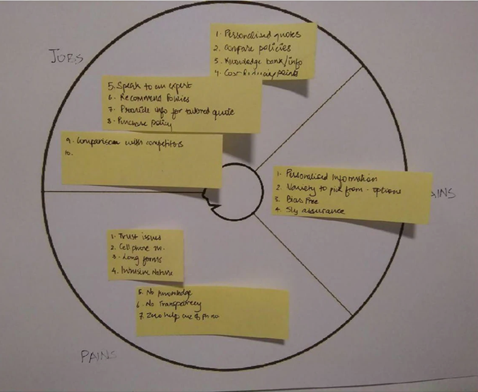
The research showed that not every visitor had the same level of knowledge or intent. We mapped users according to their jobs, pains and gains rather than treating everyone as one generic insurance buyer.
Grounded User Personas
We synthesised research findings into three distinct personas representing different intent levels, risk relationships, and decision motivations:
Trust was the biggest barrier
The qualitative research and customer-care conversations helped explain why intent wasn't translating into action. I identified six recurring friction points:
Trust
Users were hesitant to purchase health insurance completely online without enough confidence in the provider or process.
Personal information
A phone number and other personal details felt like a significant commitment.
Long forms
The amount of information required created effort before users had received enough value in return.
Lack of transparency
Users didn't always have a clear understanding of the policy, its benefits or what they were actually getting.
Missing information
Users didn't necessarily have every detail required to complete the form when they first arrived.
Broken continuity
The experience didn't adequately account for people researching across devices or returning later.
The important insight wasn't that “the form was too long.” That was only one symptom.
The deeper issue was: We were asking users to commit before we had done enough to earn that commitment.
But users also told us what they wanted
The research wasn't only about pain points. Users described the value they expected from an online insurance experience:
Personalised information
Recommendations that reflected their circumstances rather than generic policy listings.
More choice
Enough options to compare without feeling restricted to a single recommendation.
Transparency
Clear information about benefits and coverage.
Confidence in recommendation
A feeling that the options presented were based on their needs rather than commercial bias.
This shifted the design opportunity. We weren't simply trying to remove friction.
We were trying to replace uncertainty with useful information.
Each user segment navigated the ecosystem through completely different channels
Users didn't just have different needs—they had completely different paths to the product. I mapped the channel journeys across user entry points to understand where trust was built, where it broke down, and where the design could actually intervene.
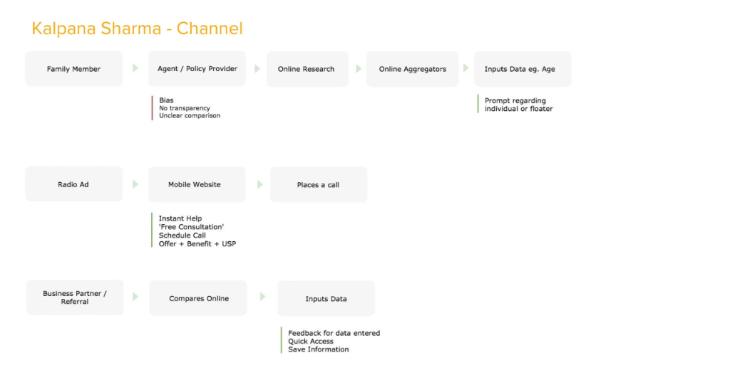
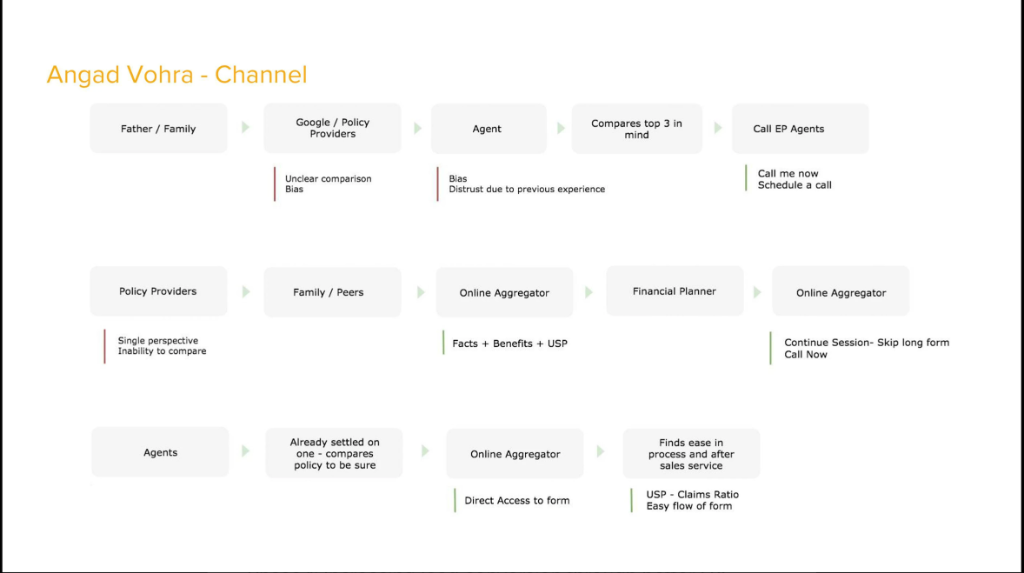
This was the turning point. The channel maps showed that users arriving from different sources needed fundamentally different onboarding. Someone coming from a Google Ad has higher intent but less context than someone referred by a family member. The architecture had to account for these entry conditions, not just the form fields.
The journey exposed the real opportunity
We mapped the mobile-web journey from the initial visit through research, comparison and lead submission. The key observation was that the experience behaved too much like a lead-capture funnel, whereas the user's mental model was closer to a decision journey.
Persona User Journey Flows
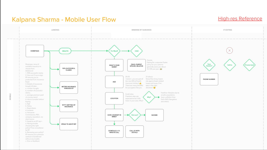
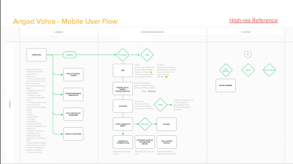
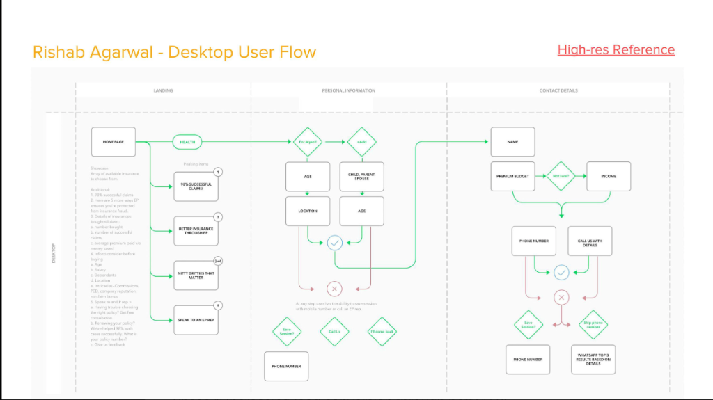
These flows weren't just screen sequences. They were decision architectures. Each branch point corresponded to a moment where users in the research had either moved forward or dropped off. The annotations captured why each question showed up at that specific moment, so the team taking this into detailed design could make informed trade-offs.
They were asking:
What do I need?
Initial orientation and understanding of health coverage requirements.
Which policy is right for me?
Filtering and comparing options tailored to their specific situation.
Can I trust this recommendation?
Evaluating transparency, claims settlement, and unbiased advice.
Am I ready to give my details?
Submitting personal information only after receiving sufficient value.
The product, however, was trying to move users toward the last question too early.
This became the central design principle for the redesign:
Give users enough confidence to take the next step—not enough information to overwhelm them.
Four Design Priorities
Educate before asking
Provide relevant information before requesting significant personal details.
Personalise the experience
Use the information users provide to make recommendations feel relevant.
Make comparison easier
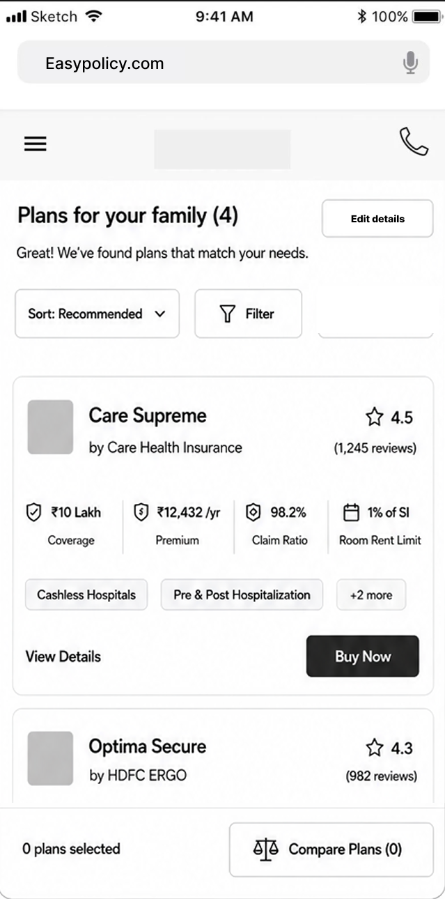
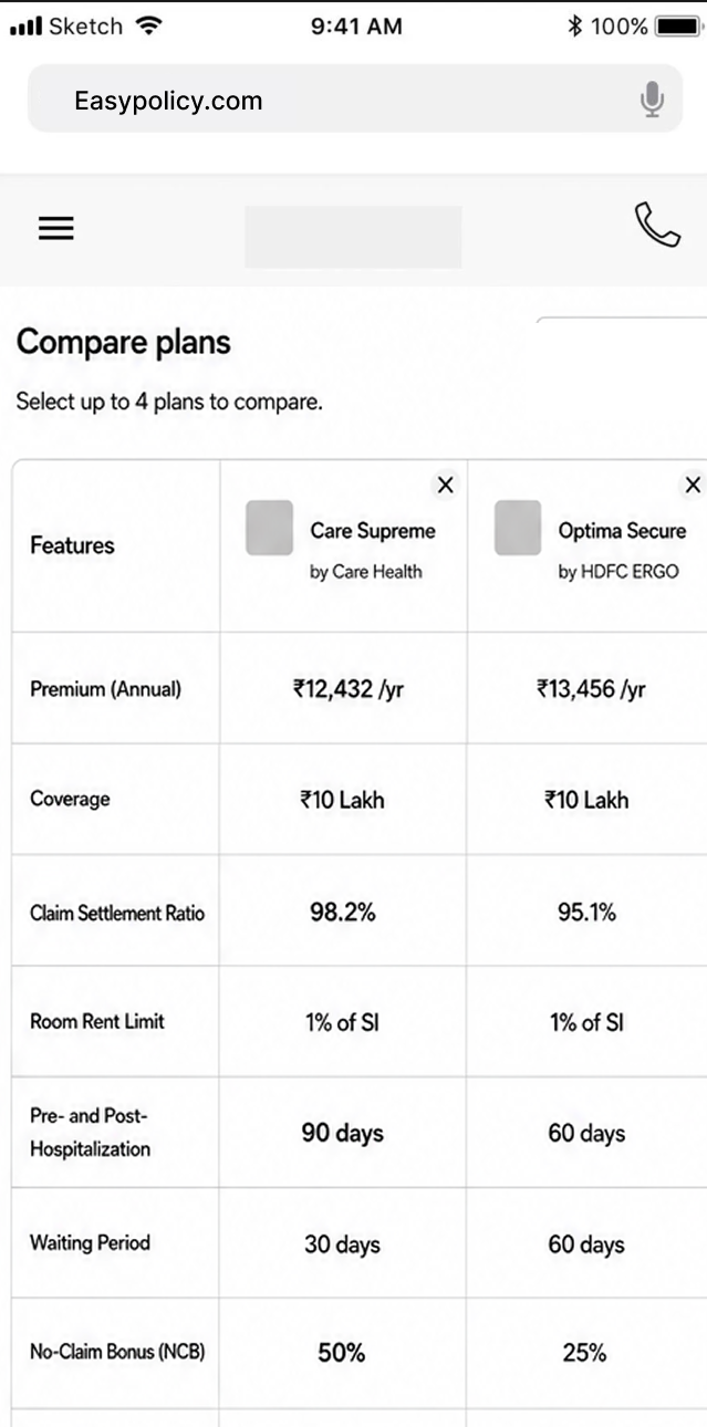
Help users understand meaningful differences between policies instead of decoding jargon alone.
Build trust throughout
Make provider reputation, recommendation logic, benefits, and next steps transparent.
Different users needed different paths to the same decision
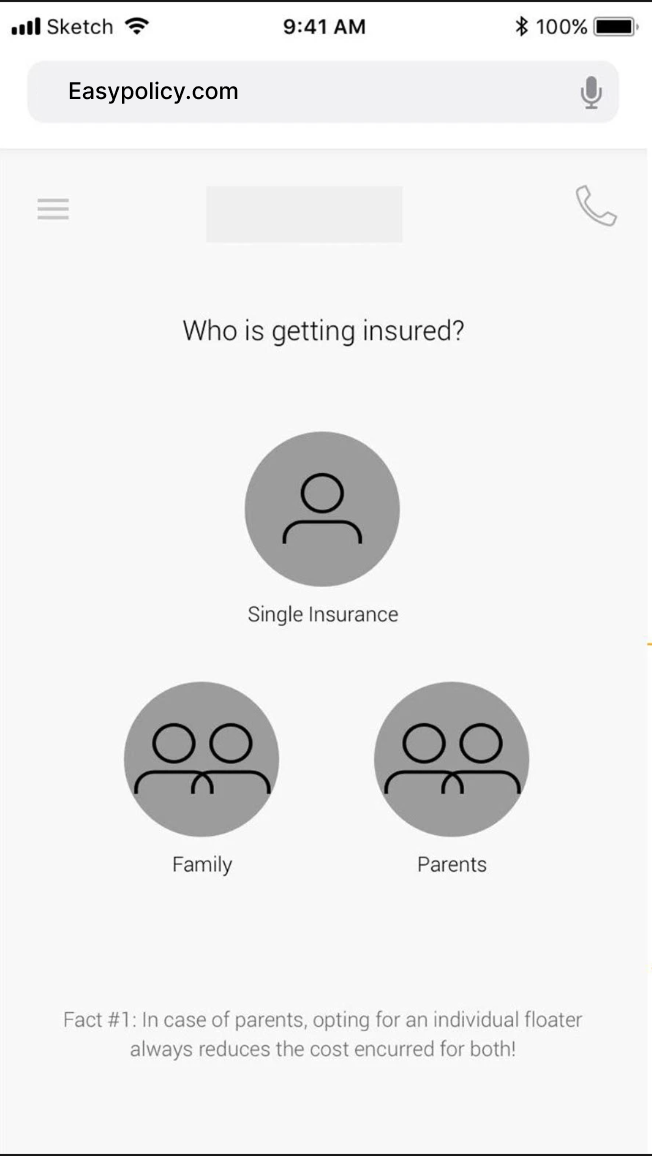
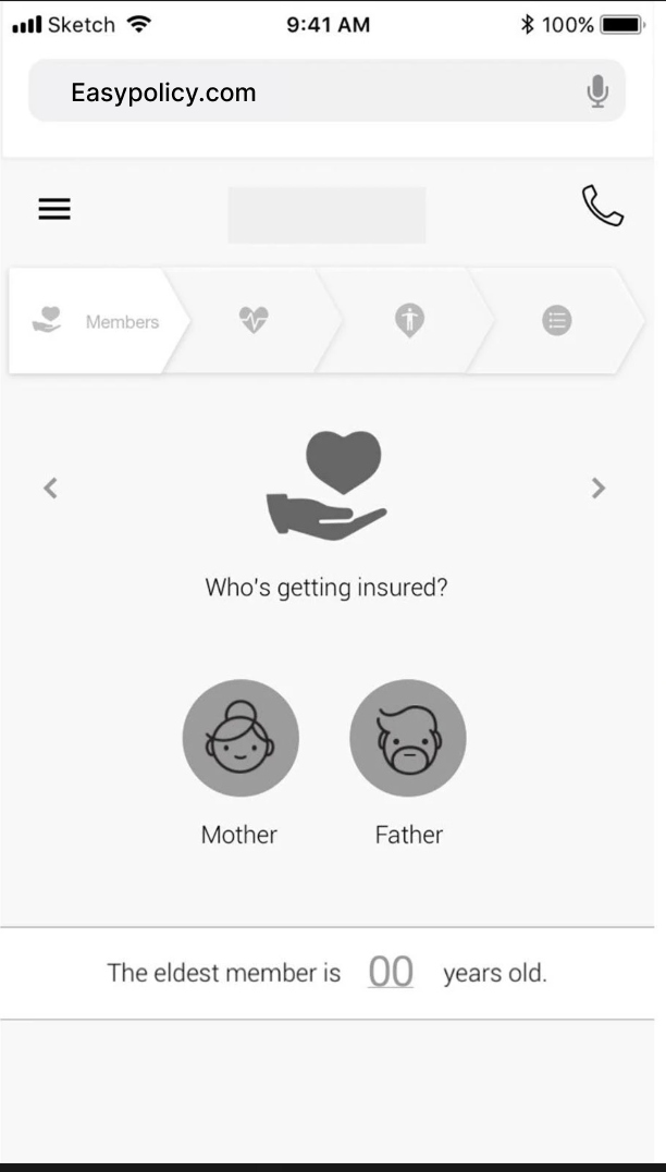
One thing was obvious from the research: users don't want to fill out insurance forms. They want a conversation that helps them figure out what they need. So I designed the architecture as a conversation builder. Structured flows for each segment (Myself, Self + Parents, Parents, Senior Citizens) that collect the right information at the right moment, in language users actually understand.
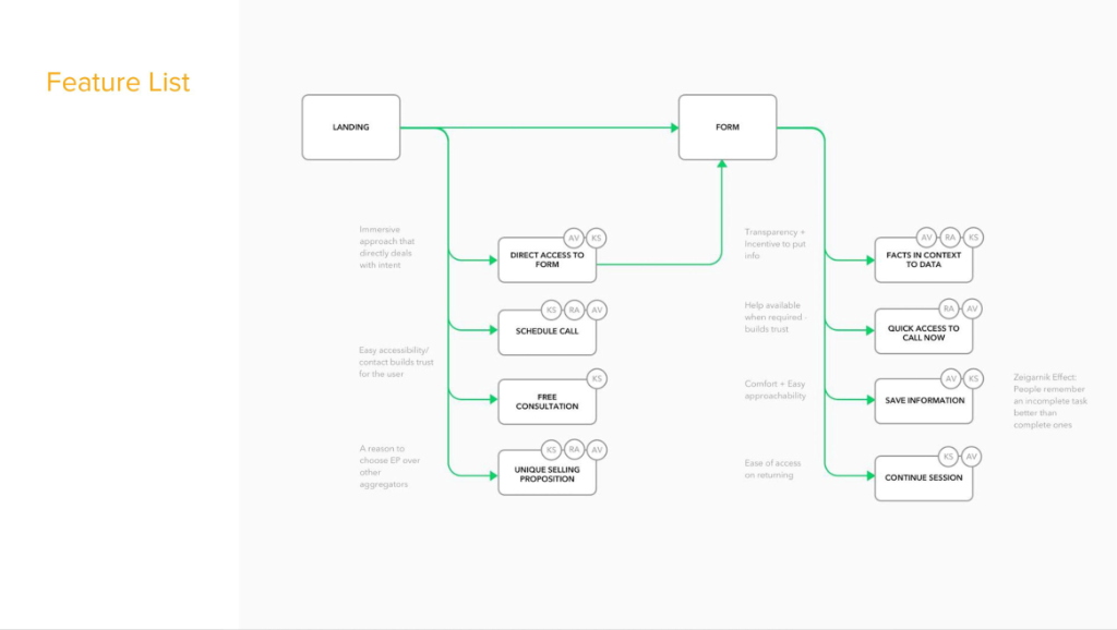
Each feature traced back to a specific persona need. “Schedule a call” was there because Kalpana needed human reassurance. “Save information” was there because Angad's research sessions spanned multiple days. The Zeigarnik effect (people remember incomplete tasks) informed the “continue session” pattern for users who left early.
Redesigning the buying experience
The redesign moved away from treating the experience as a single form. Instead, the journey was structured around guided decision-making:
Understand → Explore → Compare → Evaluate → Decide → Continue
Each stage had a specific job:
Understand
Set the context and help users understand what information matters.
Explore
Allow users to explore relevant insurance options without prematurely committing.
Compare
Surface meaningful differences between plans and benefits.
Evaluate
Provide the information and reassurance required to assess an option.
Decide
Make the recommendation and next action clear.
Continue
Reduce unnecessary effort when the user was ready to submit their details or proceed.
The intent was simple: Don't ask for more commitment than the experience has earned.
The business opportunity
This reframing also changed how we thought about conversion.
A conversion funnel isn't just: Visit → Form → Lead
For a high-consideration product, the experience needs to create enough value between those steps:
Intent → Understanding → Confidence → Commitment → Lead
That meant improving conversion wasn't necessarily about adding more persuasion. It was about removing the uncertainty preventing an already-interested user from progressing.
What I learned
The most important outcome of the project was not a particular screen. It was the shift in how we defined the problem.
We started with
“How do we increase lead conversion?”
We ended up with
“How do we help users become confident enough to make a high-stakes decision online?”
That distinction changed the work from optimising a form to redesigning the decision journey around the user.
The takeaway:
EasyPolicy didn't necessarily need to convince more people to buy insurance. It needed to do a better job helping the people who were already considering insurance make the decision.
By combining behavioural data, user research and customer-care insights, I identified the gap between user intent and product commitment and used that insight to redefine the mobile-web experience around clarity, relevance, comparison and trust.
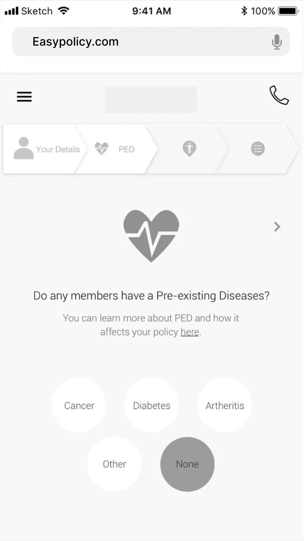
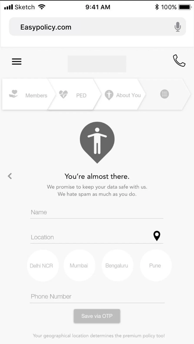
Turning the decision architecture into a usable conversation
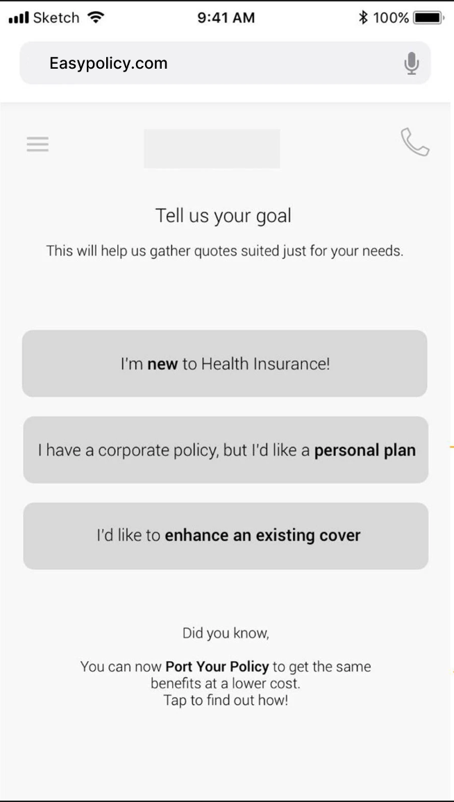
With the decision architecture locked, I translated each stage into annotated low-fidelity wireframes. Every screen documents the UX rationale: why this input pattern, why this sequence, and why this information is requested at this specific moment.
A shared understanding the team could build from
This work gave the product team three things they didn't have before: a grounded understanding of who the users are and how they think about insurance, a structured architecture that accounts for different entry points and life situations, and a screen-level blueprint with documented reasoning behind every design decision.
The research, personas, and wireframes became the reference point for visual design and development, carried forward by the broader product team.
Handed off: Research findings, JTBD synthesis, 3 grounded personas, channel maps, conversation architecture flows across 3 user segments, and 50+ annotated low-fidelity wireframes covering primary purchase, renewal, and acquisition entry points.
"She can take a complicated problem, understand the users, structure the experience, and give a product team a solid foundation to build from."