Lido Flight 4D
2018 – 2019 · Senior UX Designer, Nagarro × Lufthansa Systems
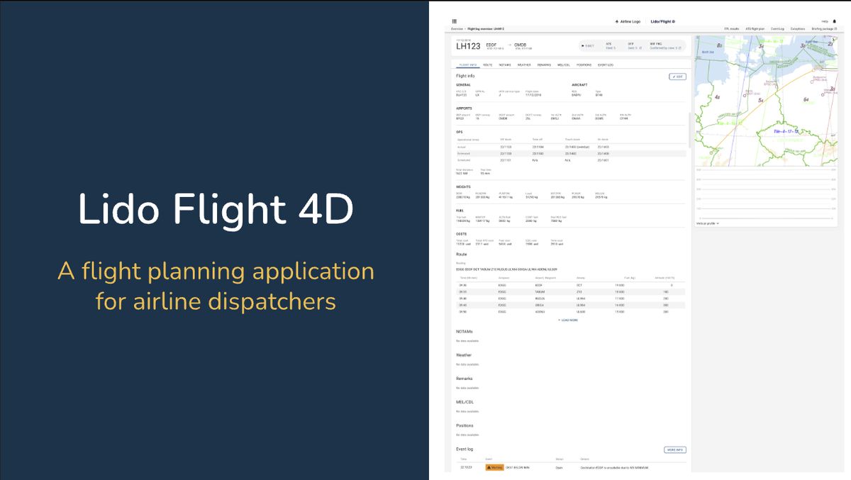
Redesigned a 25-year-old flight dispatch platform so dispatchers can inspect one flight in full detail without losing sight of the thirty-nine others they are responsible for. Slice 1 shipped to production, powering 25% of global commercial flights.
Background
Watch a dispatcher for an hour and you see the same thing dozens of times. They open a flight to check its weather, and the moment they do, the list of the other thirty-nine flights disappears. When they close it, they rebuild that picture from memory before they can move on.
Lido is Lufthansa Systems’ flight planning platform. I joined Nagarro’s team as Senior UX Designer on the rebuild for web. We set up research alongside design rather than ahead of it, and resolved the information architecture, layout and dispatcher workflows to ship the production web MVP.
The same screens serve a low-cost carrier optimising turnaround, a long-haul operator managing codeshares, and cargo operators working around payload constraints. A default that suits one of those is a quiet claim about whose work counts as typical.
My role
I was Senior UX Designer on a team with one other designer, two PMs and around a dozen engineers in India, working alongside the Lufthansa Systems product team in Gdańsk. The product had no research function when I arrived, so establishing one became part of the design job. I owned how the key questions got answered (the evidence, the options and the argument) without owning the decision about what we would build first.
- Set up research: recruitment, session protocols, moderation and synthesis, including 5 dispatcher interviews and observation of live shifts
- Reframed the brief from visual modernisation to situational awareness, and made the case with evidence
- Designed the information architecture for flight detail, and defended it when it was reopened
- Prototyped and tested: competing layouts in InVision and 6 usability sessions across 3 participant groups
- Shared, not decided: scope and the six-slice plan were set with senior leads. Wireframes and the component library were built with the Gdańsk designers
Reframing the brief
We were handed a modernisation brief. The problem was situational awareness.
We were asked to make the app look newer. But a dispatcher watches 20 to 40 flights at once, and the old app could only show one flight at a time. Checking one flight’s weather made every other flight disappear, so dispatchers held everything in memory, over and over, all shift long. A fresh coat of paint would not have fixed that.
Every decision is audited later, so mistakes are costly. Airlines need different things. And dispatchers already knew the old app by heart, so a new one could slow them down at first. The project came down to one question:
Which broke into three product questions, each being settled by opinion when I arrived:
The workspace
What stays on screen while a dispatcher works inside one flight?
The structure
Should a flight’s data be organised around the system, or around the decision being made?
The control
Who decides which flights matter: the product, or the dispatcher?
Research set up to settle decisions
No one had researched this product with its own users, so there was no backlog of findings to design from. I ran the research alongside the design work: we couldn’t afford to spend the first quarter learning before we produced anything.
Workshops first
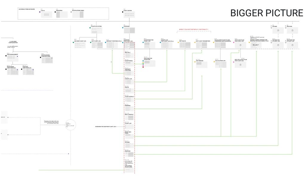
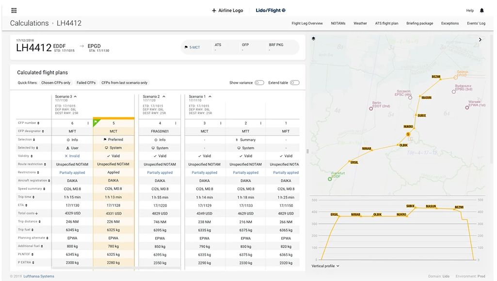
Workshops with project owners, PMs and requirement engineers aligned us on product architecture, business goals and team structure. The output was a six-slice MVP plan. Slicing by dispatcher task rather than system boundary meant we could ship one slice and learn, instead of designing all of it and shipping none. Slice 1, flight planning and monitoring, was agreed as the MVP because it is the part of the job a dispatcher is in continuously.
Three parallel research tracks
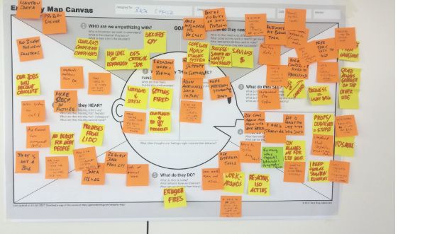
Stakeholders described a modernisation problem: the product looked dated. Dispatchers described a working problem: they kept losing their place. The two groups were describing different products. Running the tracks in parallel surfaced that gap in the first weeks, early enough to design from what we watched dispatchers do.
Ecosystem mapping
The roles around the dispatcher: pre-planner, ATC, ground
User interviews
5 airlines: EasyJet, Wizz Air, BA, Air France, Thomas Cook
Observation
Dispatchers during live shifts, on multiple monitors

The flight list was not navigation. It was situational awareness.
Three observations came out of the interviews and shift observation:
Parallel attention
They hold 20 to 40 flights at once. Any layout that shows one flight at a time works against the job.
Spatial memory
They found things by where they sat on screen, not by reading labels. Position had to stay stable.
Modals cost the overview
Opening a flight hid the list they were monitoring. This became the thing the redesign had to solve.
Put together, the flight list was doing more work than a navigation menu. It was where a dispatcher held their picture of the shift, and anything that covered it made them rebuild that picture by hand. That reframing turned a visual modernisation brief into a structural one, and it became a product constraint: the workspace has to be built around the list staying.
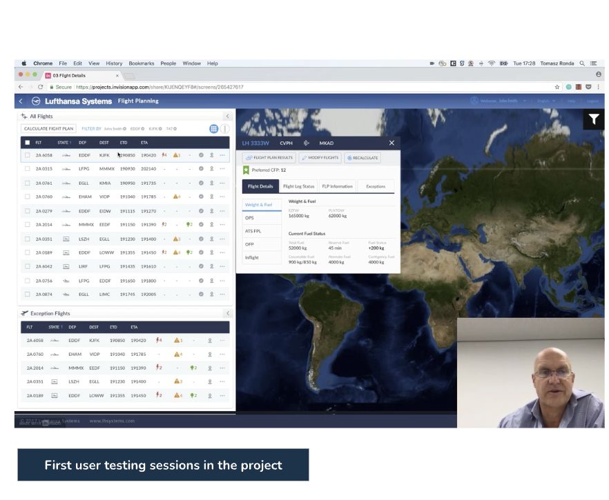
The prototype that failed
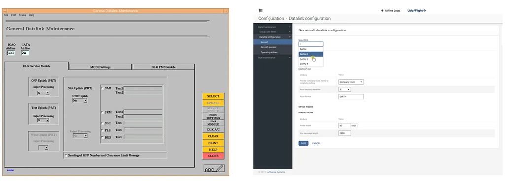
Our first prototype kept the legacy mental model and gave it a modern surface: one flight at a time, opened in a modal. It was the cheapest version of the answer the team already assumed was correct, which made it worth building first. It went into the first usability session and did not survive it.
Opening any flight covered the list, and dispatchers lost sight of everything else they were accountable for, exactly as on the desktop tool. The surface was never the problem. A modern-looking modal fails for the same reason an old one does. Catching this in session one, rather than after build, is the reason the three-panel layout exists at all.
Design iterations
Three ways to hold detail and overview at once
With the modal ruled out by evidence rather than opinion, three structures were viable: full-screen drill-down, inline expansion, and a three-panel persistent layout. We sketched all three in Design Studio sessions and argued them on paper, where changing direction is free. The three-panel layout was the only one that kept the flight list on screen while a dispatcher works inside a single flight.
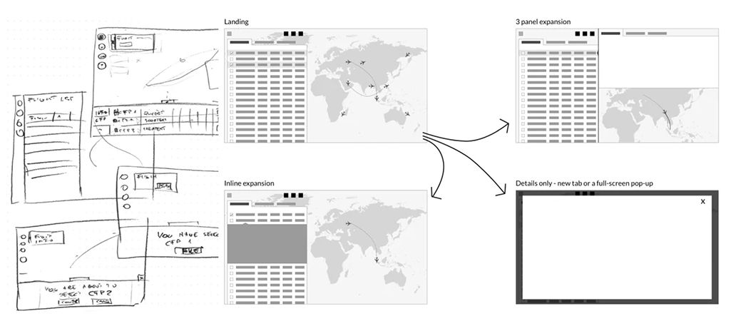
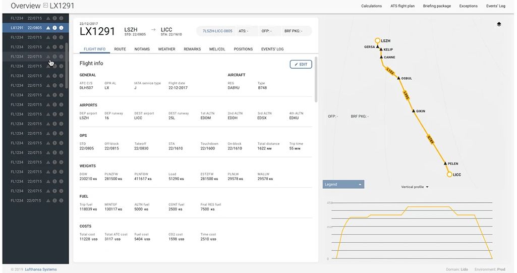
1. The workspace: list, detail and route map on screen at once
Decision. The flight list stays visible no matter what a dispatcher is doing, instead of opening a flight in a modal or full-screen view.
Why. Dispatchers track status by where things sit on screen. Any pattern that replaces the list with a detail view asks them to hold that picture in their head. Our own modal prototype failed for exactly that reason.
What happened. It shipped in the MVP and tested well across all three participant groups. It cost list width: some dispatchers asked for a larger list, and that density trade-off was still open when Slice 1 closed.
The alternative we turned down. Full-screen drill-down. Visually cleaner and simpler to build, but it buys screen space by taking away context, which is what dispatchers could least afford to lose.
2. The structure: tabs by decision, not by database
Decision. Flight detail is split into tabs by decision domain (Flight info, Route, NOTAMs, Weather, Remarks, MEL/CDL, Positions, Event log).
Why. The legacy product exposed data roughly as the database held it. In interviews, dispatchers described their work as a sequence of questions: is the route fine, what’s the weather doing, is anything on the aircraft deferred. The tabs follow that sequence.
What happened. It shipped as the detail structure in Slice 1, and it is extensible: a new data domain in a later slice becomes a new tab, not a renegotiation of the layout.
The alternative we turned down. One long scrolling page with anchors. Easier to build, but expert users don’t browse, they jump, and a scroll turns a known destination back into a search.
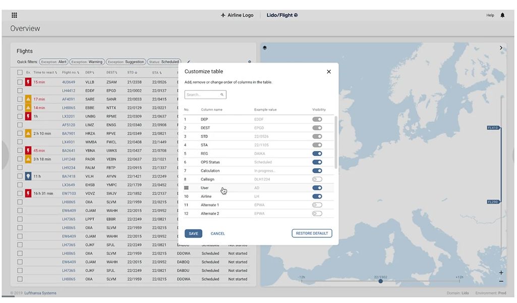
3. The control: dispatchers choose their own columns
Decision. Dispatchers pick their columns, with quick filter chips above the list and urgency carried in colour through a “time to react” column.
Why. A short-haul and a long-haul dispatcher watch genuinely different columns, because their operations put pressure in different places. With 125+ operators, no single default would survive the range.
What happened. This was the strongest result in testing. Column customisation was the most positively cited feature across the six sessions, and dispatchers described feeling more in control.
The alternative we turned down. Saved views and role-based presets. More powerful, but we observed dispatchers setting columns at the start of a shift and leaving them, so the lighter mechanism covered the real behaviour at a fraction of the cost.
Testing with three kinds of participant
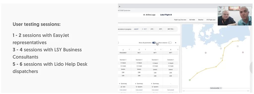
Access to real dispatchers was limited, so we recruited across three groups for six remote sessions on InVision prototypes: EasyJet for high-frequency short-haul pressure, Lufthansa Systems consultants for depth on the system, and the Lido Help Desk for day-to-day dispatching context. It still wasn’t the full range of operators, which is the main caveat on everything the sessions told us.
Halfway through, engineering moved the timeline and fuel management came off the plan while we had design work in flight. Because scope was already sliced, we dropped that slice and picked up the dashboard redesign at a sprint boundary instead of renegotiating the roadmap.
What shipped: Slice 1, in production
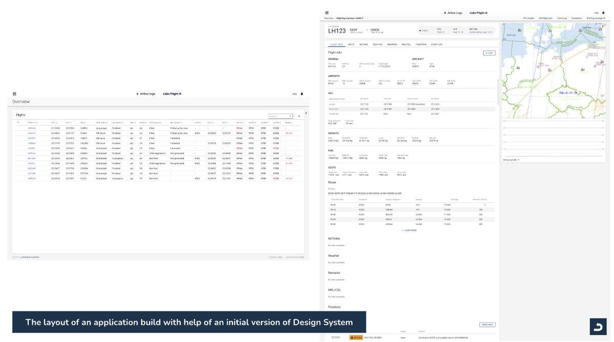
Flight planning and monitoring, chosen as the MVP because it is the slice a dispatcher is inside continuously, not because it was the easiest to build. Nothing covers the list, and the dispatcher moves to the next flight directly.
A design system for seven products
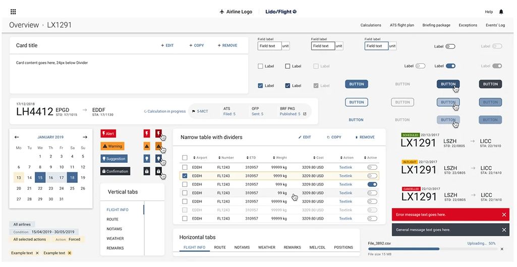
Seven products had grown up separately, so the same control could look and behave differently depending on which one a dispatcher was in. We defined the shared pieces (tables, status colour, tabs, toasts) so designers in two offices building the remaining slices would land in the same place. Built with the Gdańsk designers.
Outcome
Slice 1 shipped in 2019 and went into production. Slice 2 continued on the same research process, component library and delivery rhythm rather than starting over.
The persistent-context approach tested well in all three groups, column customisation was the most positively cited feature, and filter chips were called out for making the list faster to work through. The modal prototype failed in session one and changed the design.
The sessions sent three things into the next iteration: a larger flight list view, recalculation directly from the flight list, and more granular control over notifications.
What outlasted the slice
- A UX research practice. Recruitment, protocols, sessions and synthesis ran for the first time on Slice 1, so the next team argued from evidence rather than opinion.
- A design system at scale. Two offices, one set of patterns, decided once rather than per screen.
- Delivery infrastructure. Slice 2 began on the same research process, component library and sprint rhythm.
What I’d do differently
- Design system before screens, not alongside them. We built the library while designing the screens that used it, and the two kept drifting apart. I’d settle spacing, type, colour and core components first, even with a slower first sprint.
- Push for a wider participant range from day one. Long-haul and cargo dispatchers would have put far more pressure on the three-panel layout. I’d negotiate two or three more operator types at scoping, before committing to a layout.
- Ship with analytics. Prototype behaviour and production behaviour diverge, especially for expert users under pressure. Slice 2 had no production signal to start from.
What I learned
- Research is how you close a product question, not a phase before design. The modal prototype failing in session one was worth more than another month of interviews, because it tested a decision instead of a hypothesis. I now build the thing early so it can be wrong while being wrong is cheap.
- Expert users don’t want it simpler. My instinct was to strip the interface back, and it was wrong. For an expert user, density is not the problem. Unpredictability is.
- Designers should be in the scoping conversation. The shape of the slices determined whether there was a coherent experience to design at all.
- Write the reasoning down, not just the decision. Once the evidence travelled with the decision, reopened debates about the three-panel layout ended in minutes rather than a sprint.
In summary: the brief was to modernise a 25-year-old interface. The work turned out to be defining what the product was for: what a dispatcher should be able to hold in view, how a flight should be structured, and who decides what matters.