Airtel Thanks
2019 · Senior UX Designer, Airtel X Labs
Turned unused premium rewards into a reason to stay. Only 16% of Airtel’s Gold and Platinum customers had activated a single reward. Three months after launch, 43% had.
Background
In 2019, Jio had made switching networks as easy as swapping a SIM. Airtel’s revenue per user had fallen from ₹198 in 2016 to ₹123, and it couldn’t win a price war. So it bet on loyalty: the more you spent, the more you got back. Its 31.8 million Gold and Platinum customers were entitled to free Amazon Prime, ZEE5, Netflix and Hotstar, and Airtel paid the partner whenever a reward was claimed.
But a reward nobody uses keeps nobody. A year after launch, Thanks was barely noticed inside Airtel’s own app. People weren’t turning down free stuff. They just couldn’t see it.
The two areas I will be highlighting are:
Discovery
Help members notice what they already own, on the screens they already visit
Activation
Take the guesswork and the steps out of claiming a reward across seven partners
My role
I was the Senior UX Designer on Airtel Thanks and the only designer on the Thanks team. I owned the research, how we framed the problem, the journey from discovering a benefit to claiming it, and the partner activation flows, from the first workshop to launch.
I worked closely with PMs, engineers, data analysts and marketing. Two pieces lived on other teams’ screens, so we built those together: the Thanks card on Home with the Home team’s designer and PM, and benefits inside Recharge with the Recharge team. Idea to launch took two months.
The problem
Airtel’s best reason to stay was going unused
Only 16% of the 31.8M Gold and Platinum members had switched on even one premium reward. The rewards were real and heavily advertised. Reach wasn’t the issue either: members opened the app every month. They just weren’t getting far once they were inside.
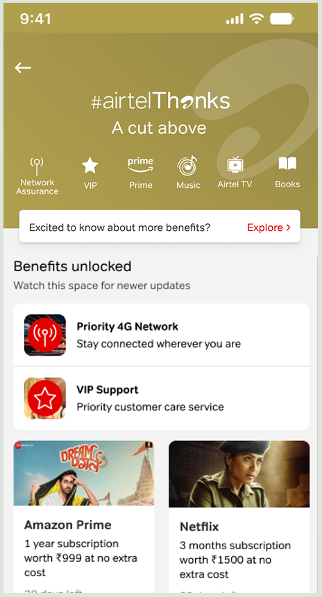
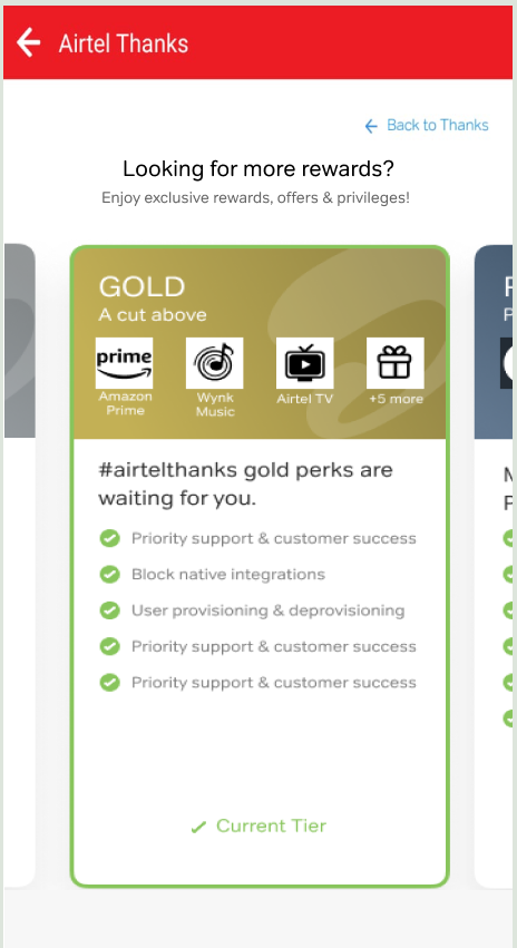
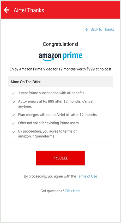
The funnel told us where people dropped. It couldn’t tell us why.
Research: why people dropped off
I took the drops out of the dashboard and into the real world. I talked to customers in Airtel stores, went through customer support conversations, and read comments under YouTube tutorials on activating Prime and Netflix through Airtel. Underneath, it was really three separate problems.
Discoverability
Some people never noticed Thanks was there.
Comprehension
Others noticed it, but didn’t understand how it worked.
Activation friction
Some tried, and the mechanics got in their way.
“I thought it was a promotional banner related to Thanks.”“Explore” read as generic banner copy. Nothing said this was something they already owned.
“They told me I get Amazon Prime, but where do I get it?”The TV ads made the promise. The app never explained it.
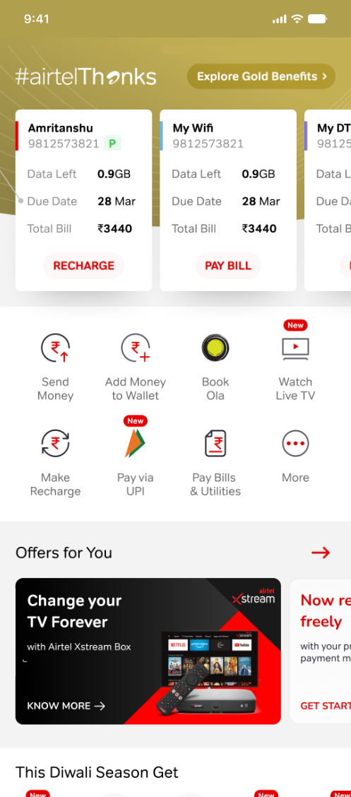
People tapped the icons above the fold, expecting them to work. They weren’t tappable.There was a lot of noise on the screen before anyone reached the real rewards, so people weren’t sure where to tap. The icons at the top looked like the way in, and nothing happened when they pressed them.
“I got the code, but I didn’t know where to put it.”Some partners had no integration, so people had to leave Airtel and type a code in themselves.
The same confusion was sitting in public. Activation tutorials on YouTube had racked up millions of views. People weren’t asking Airtel. They were asking each other, for years.
The question we designed for
The brief said “benefit activation is low.” That was the symptom. The real question was:
Constraints that shaped every call
- Two months, idea to launch. The date was locked to a marketing campaign, so I tested assumptions alongside the home build instead of before it.
- A new design system, mid-project. Switching would have put launch at risk, so we shipped on the stable component library and left the migration for the next release.
- One designer, three initiatives. I was the only designer on Airtel Thanks, Badges and Play, so I prioritized my tickets carefully without losing quality.
- Some partner integrations weren’t ready. I built code entry into the claim flow as the interim path. It stayed the weakest link in the journey.
Ideas that failed
We went through multiple concept iterations. Many looked right on paper and fell apart in front of real people, and each one shaped the final design. Here’s one of them.
Put the rewards on top
My first instinct was to give benefits the best spot on Home, above the balance and recharge card. People open a telecom app to check their balance and recharge, so utility had to stay first. Benefits needed to sit next to it, not on top of it.

Design iterations · Discovery
Put the value where people already are
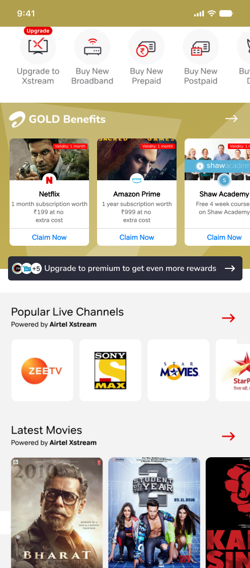
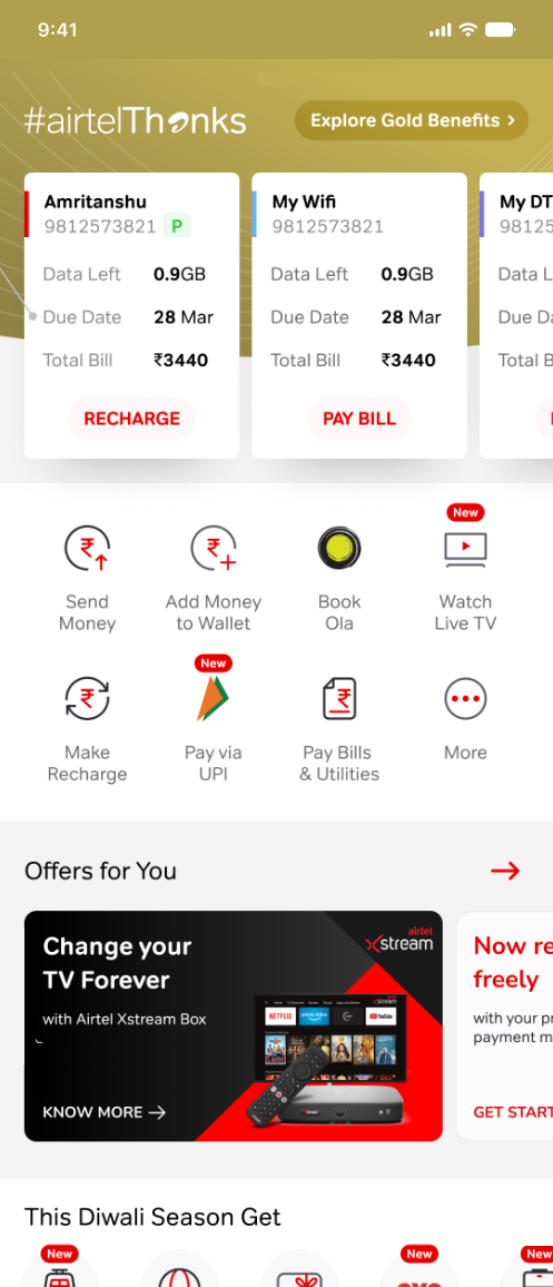
People came to the app to recharge, pay bills and check their balance. The benefits sat one tap too far away, behind a button nobody understood. So instead of asking people to go looking, we brought the benefits to the screen they already used, and for people who never opened the app, to their SMS inbox.
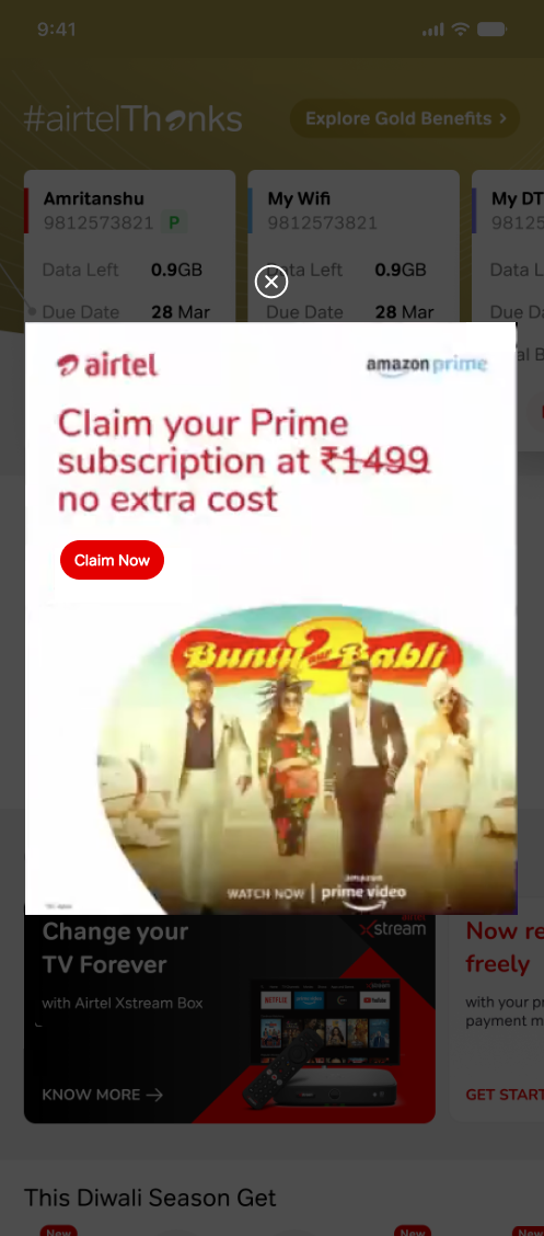
1. Name the value, bold the brand
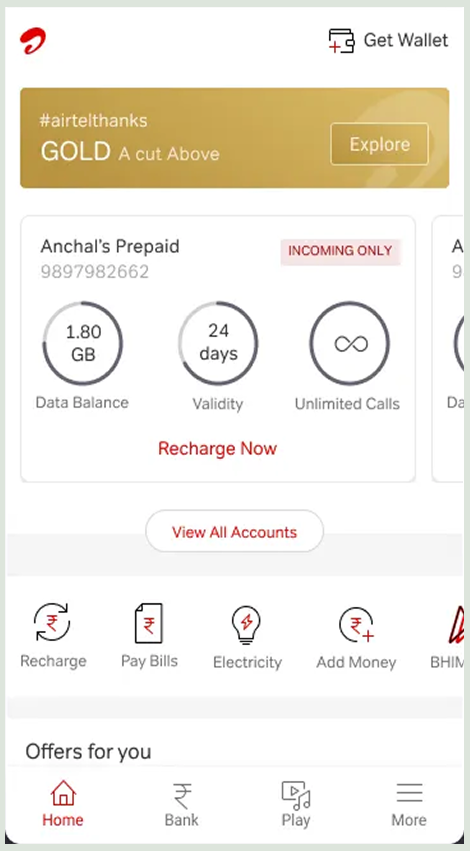
“Explore” and “GOLD A cut above” meant nothing. “Explore Gold Benefits” told people exactly what was waiting. We also carried the TV campaign’s look into the app, so someone who had just seen the ad recognised it on opening Airtel.
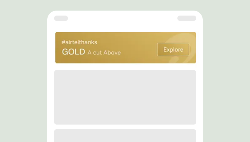 Before: ambiguous “Explore” button
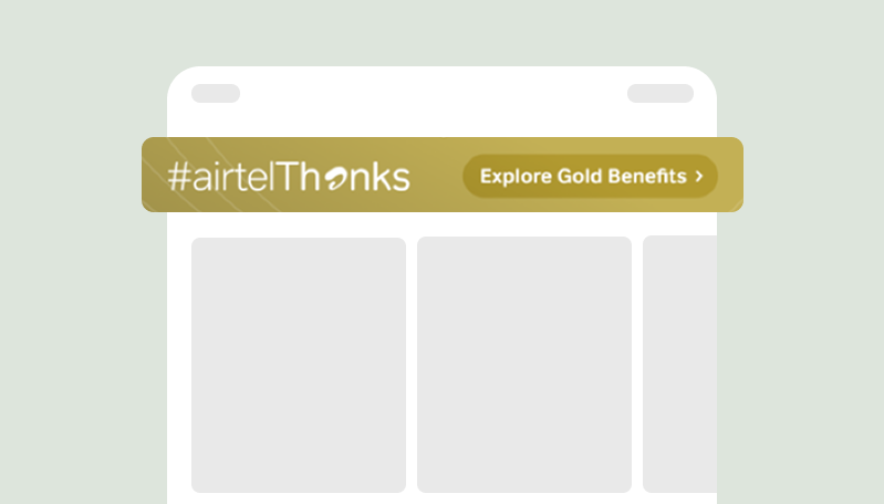 After: “Explore Gold Benefits”
Changing a few words on one button tripled click-through, from 4% to 12%.
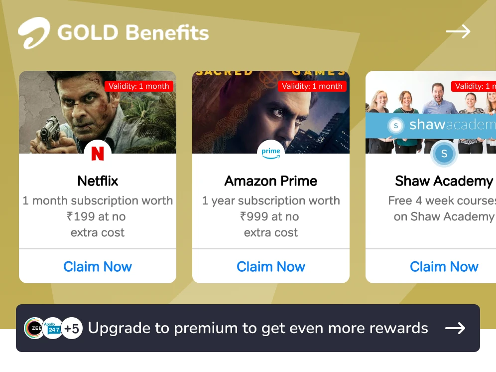
2. Let people claim without leaving Home
Each benefit got its own card on Home with a one-tap “Claim Now”, sitting beside the balance card, not above it, which was the lesson from our first failed concept.
68% of all claim traffic came through this single card.
3. Tell people before they have to ask
Some people were never going to scroll. For them, we showed their most valuable unclaimed benefit, like Amazon Prime, the moment they opened the app. If someone skipped it three times, we paused it for 30 days so it never turned into noise.
This prompt drove 15% of all traffic to the claim page.
4. Reach the people who don’t open the app
“I usually recharge through another app” came up again and again in research. Anyone without the app got a weekly SMS naming the specific benefit waiting for them, with a link to download the app and claim it. People who had the app but hadn’t opened it in a while got a push notification with the same message.
Design iterations · Activation
Having it and getting it working were two different things
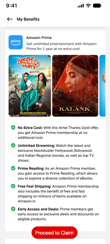
Claiming meant dealing with seven partners, each with its own sign-up rules. We introduced clearer tap targets so people never had to guess what to press, and redesigned the benefit pages to feel more inviting.
 Discover
 View benefitsClaim
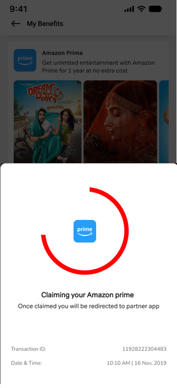 Claim progress
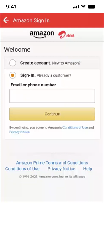 Partner activation in app
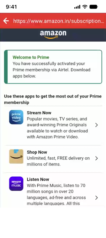 Activation confirmed
5. Cut the Thanks page down to the rewards
The old Thanks page buried the rewards under noise: network perks and support badges came before the thing people had come for. I redesigned it and removed everything that wasn’t a reward. Now the page opens with what’s trending to claim and the rewards people already have, each with one clear action: Claim Now or Manage.
Before: rewards buried under everything elseAfter: only rewards, one action each6. Switch on what’s free. Keep a claim where it costs.
Airtel’s own apps switched on automatically, since there’s no partner to pay. Amazon Prime, ZEE5, Netflix and Hotstar stayed as a claim, because Airtel only pays a partner once someone actually claims. Auto-activating Prime for every Gold and Platinum member would have meant paying for millions of memberships most people would never open. So I made that one step as small as I could.
7. Two patterns people only learn once
Phone-number partners: one tap. We activated the membership in the background, then took people straight into the partner app, or to the Play Store if they didn’t have it. Email partners: sign up without leaving. We brought the partner’s sign-up inside the Airtel app. Phone-number activation had the lowest drop-off of any path: the fewer steps between the tap and the benefit, the fewer people we lost.
8. Show what the reward is worth
Each benefit page said what it was worth and how to get it, in plain language, with one clear way to activate. Show posters and course previews made the reward feel real before anyone tapped claim.
Design iterations · Upgrade
A clear path to upgrade
Rewards kept people, but the tier decided how much they got. The old upgrade page was a carousel of big tier cards, one tier at a time, each with a generic perks list and no clear next step. The redesign changed four things:
- Tiers side by side. A compact Silver, Gold, Platinum switcher at the top, with the right tier marked “Recommended”, so people compare without swiping.
- Partner logos up front. Amazon Prime, Wynk Music and Airtel TV sit in one row, with the rest a tap away.
- Rewards, not perk lines. The generic perks list is gone. Each reward shows its poster and what it’s worth, like Amazon Prime for a year worth ₹999 or Netflix for three months worth ₹1,500, at no extra cost.
- One clear action. A fixed “Recharge with ₹299” button, so the price and the next step are always on screen.
Before: vague perks, no clear reason to upgrade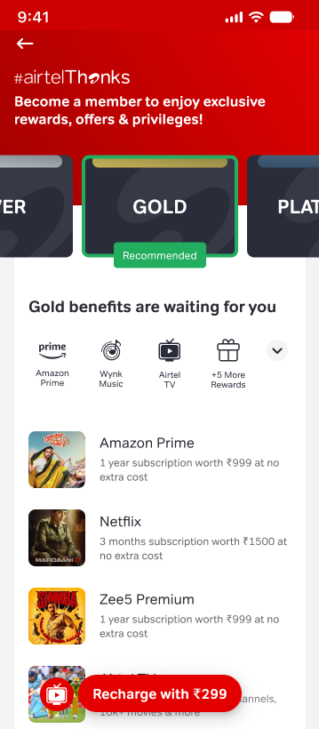 After: compare tiers, see the rewards, one clear action
Outcome
Three months after launch, compared with May 2019, Gold and Platinum members activating a premium reward went from 16% to 43%.
Over the following year, Airtel’s ARPU rose from ₹123 to ₹166, monthly active users from 30M to 40M, and data usage from 11.1GB to 16GB a month.
What happened next
Later that year, Airtel rebranded the whole app as Airtel Thanks. That was a company-level decision, much bigger than this project, but it rested on the same bet our work had just backed with data: when people can see the value, they show up for it.
Most design decisions get replaced by the next release. These didn’t. Seven years on, the Airtel app still shows benefits right next to balance and recharge, and still greets people with an offer when the app opens, the same ideas we shipped in 2019.
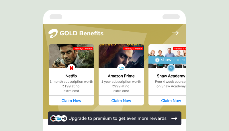 2019 · Benefit discovery introduced
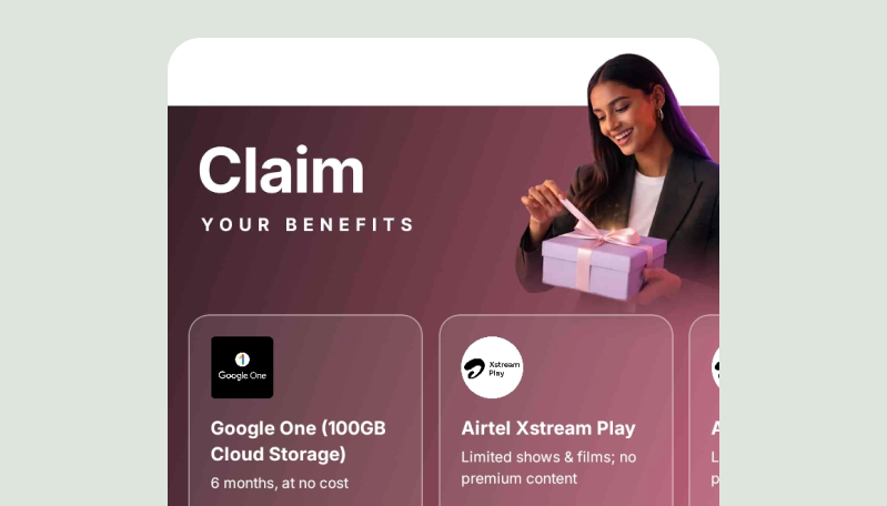 2026 · Evolved Airtel app experience
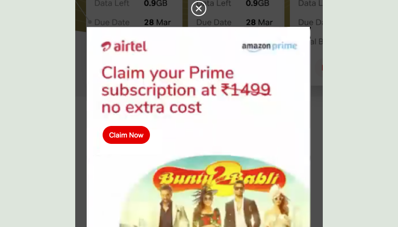 2019 · Benefit prompt on app open
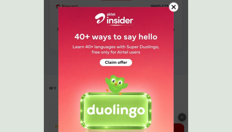 2026 · The same app-open prompt today
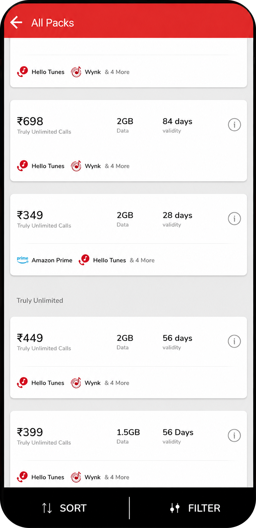
I took this further with the Recharge team through discovery, to show tier and benefits at the moment people pay. Every recharge decided which tier a person was in, but the recharge screen never said so.
What I learned
- Make existing value visible before building something new. Airtel already owned Prime, Netflix, ZEE5, Hotstar. The growth came from making value people already had impossible to miss.
- Perception beats accuracy. “Included” was technically true. It still didn’t feel active to anyone. If it doesn’t feel real to the person using it, the design hasn’t done its job yet.
- Qualitative research can rewrite the brief, not just decorate it. Store interviews turned “activation is low” into three separate problems, and changed what the plan needed to solve.
In summary: people didn’t need more rewards. They needed to see the ones they already had.