Y1
March 2025 – July 2026 · Product Design Consultant, Digital Banking and Wealth
Why people deleted a safe-investing app on day one, and the redesign that put the deposit first. Y1 launched built around a card. The day after marketing started, we called the first sign-ups. Some had come for a credit card and deleted the app. Others wanted a fixed deposit and couldn't book one with the card in the way. I took that to the CEO and designed the second version, which puts the deposit first.
Context
Background
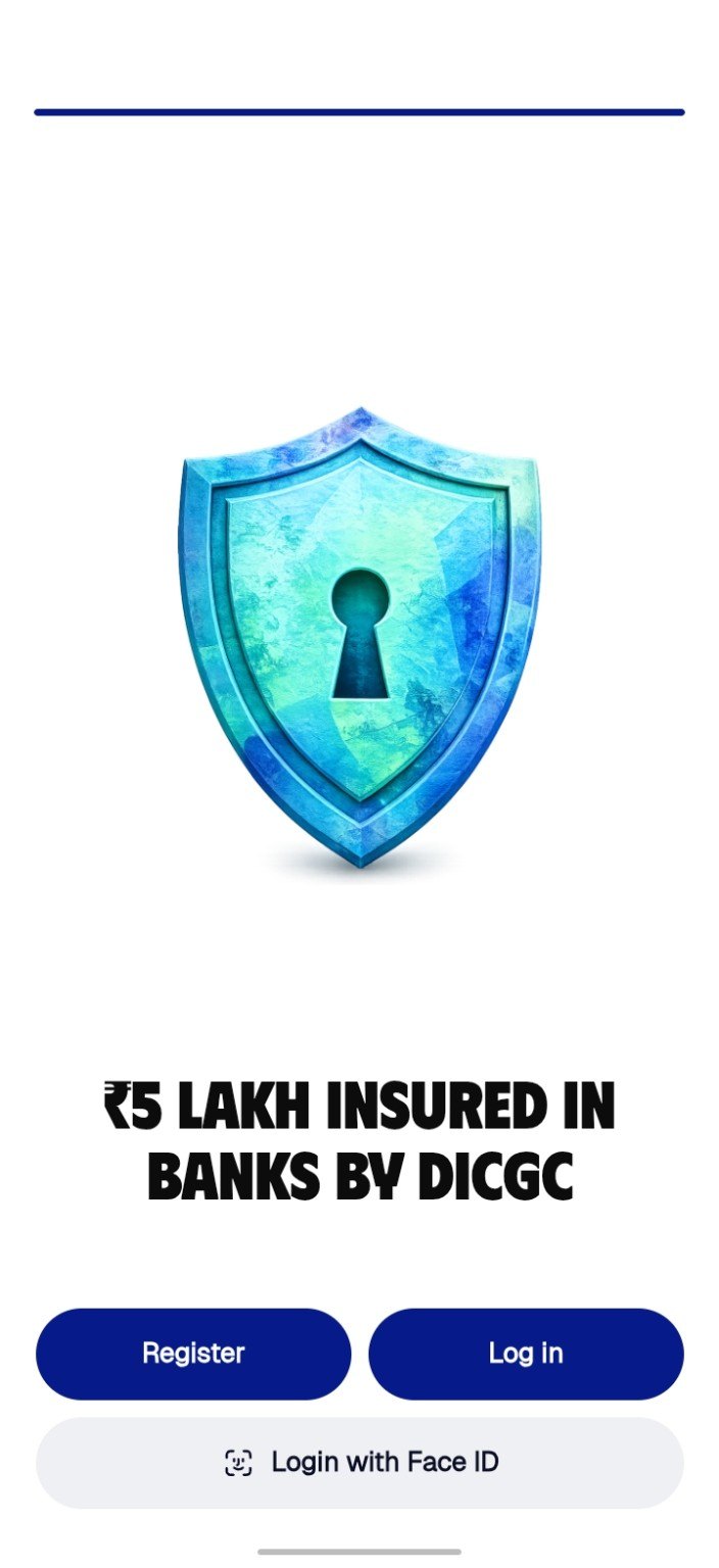
Y1 is a mobile app for fixed and recurring deposits, NPS, gold and silver. Its CEO wanted to stop a generation gambling hard-earned money on high-risk bets, and to break a myth: that safe assets can't build wealth. Smaller banks now pay more on fixed deposits, bank deposits are insured up to ₹5 lakh by DICGC, and gold, silver and NPS grow over the long term.
The first release did one thing: fixed deposits, the safe choice. Then the team started promoting it.
My role
My role
I was a Product Design Consultant for Digital Banking and Wealth, and I designed both versions of the app. In the first: the splash, the card, the goal cards, home, and JINI, the AI assistant with its FIRE calculator. In the second: onboarding, the deposit flow, the booking screen and Aadhaar verification. I also ran the follow-up calls with the first users and took the findings to the CEO.
The problem
About 50 sign-ups, then the phone calls
Day one
The team promotes the app on Instagram and Facebook. About 50 people sign up.
Day two
We call them to ask how it went. Some hang up.
8 talk
They tell us what they did next.
“…so I just deleted the application.”A first-day sign-up, on the phone the next day
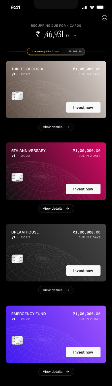
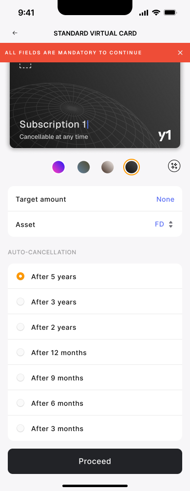
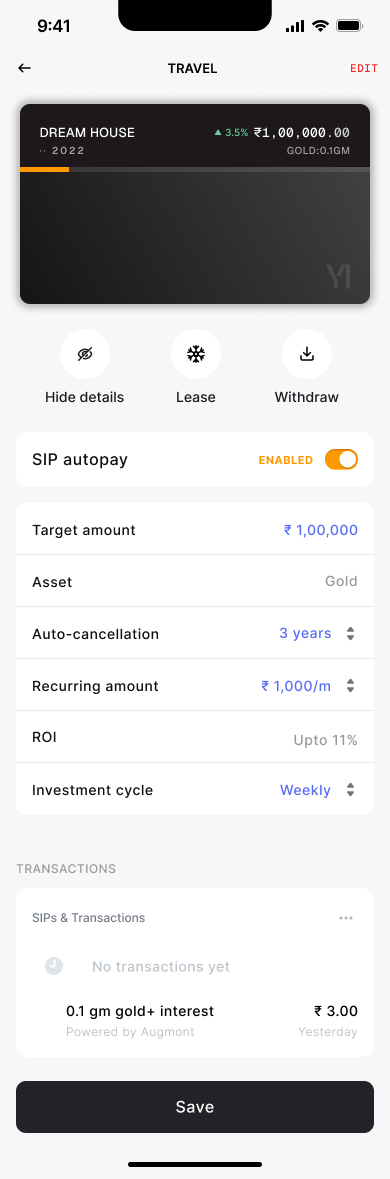
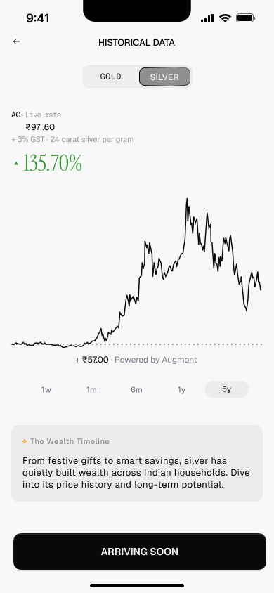
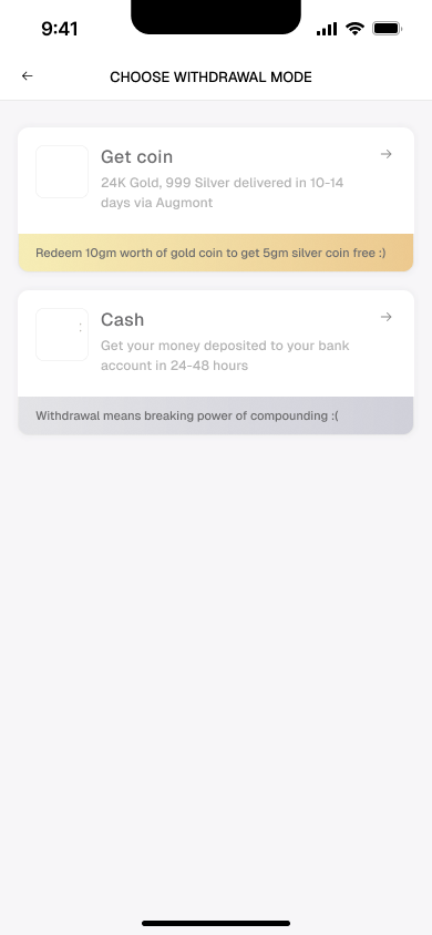
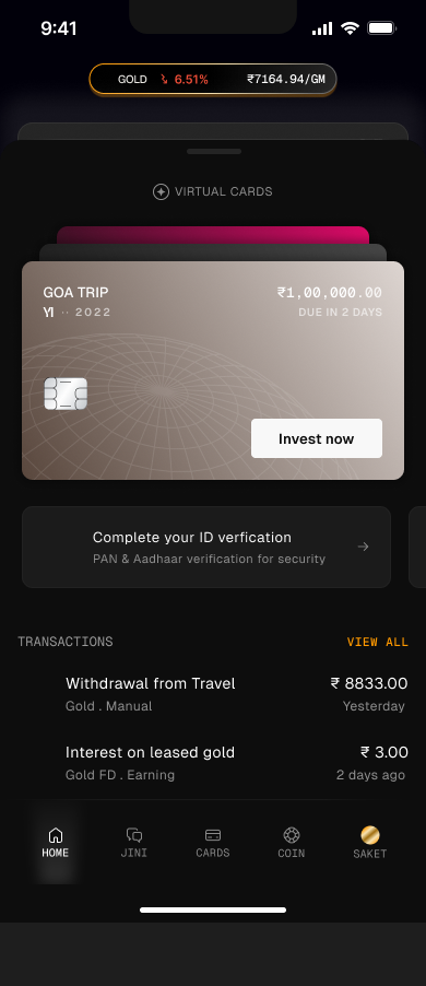
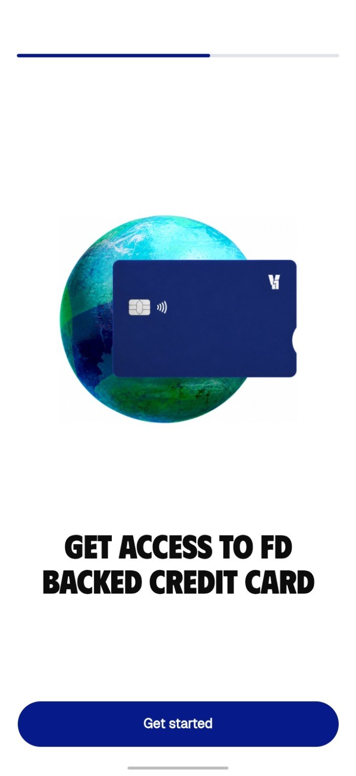
Why delete a safe app on day one? These are the first three screens I designed for the first version. The answer is in them.
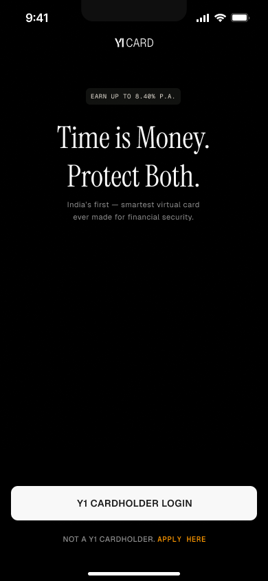
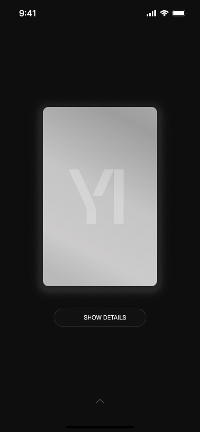
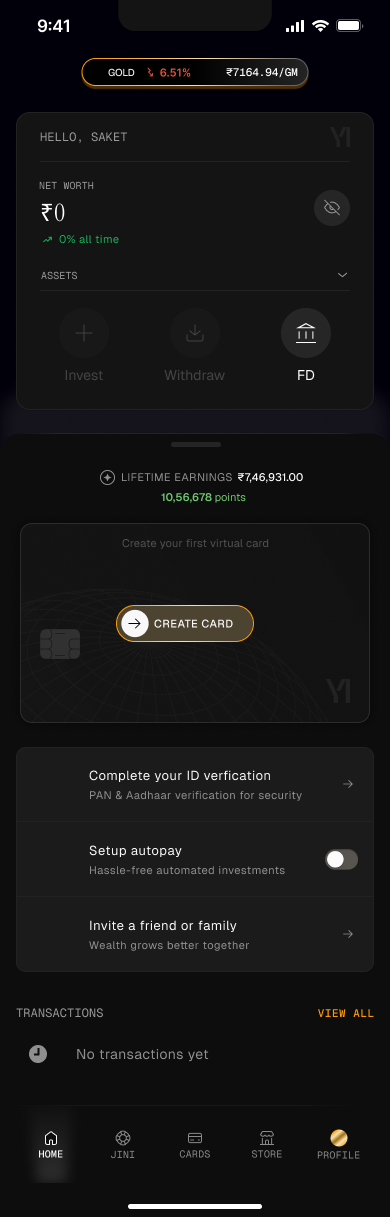
Top to bottom, that first screen says card or cardholder four times, and deposit not once.
Research
What the calls told us
The name sold a card
The company was called Y1 Card, and people read it as a card company. All 8 people on the calls said the same.
The card blocked the deposit
People who wanted a fixed deposit couldn't work out how to book it. Why invest in a card, and why was the FD asking for one?
Polite first, honest later
Six people who knew the founder said good things at first. When we kept asking, they said the journey was hectic and unclear.
“We thought it's a card provider like OneCard, so we downloaded the app, but when we checked out the application it was opposite of it, it was something else, so I just deleted the application.”A first-day sign-up
“The first thing on the application is card. But this is not the card. The card is part of this.”A friend of the founder who had booked a deposit
The card brought in people who wanted a card, and stood between everyone else and the deposit.
Why the card existed
The card carried the whole idea
The plan: set a goal, and the goal becomes a card, backed by a fixed deposit, a recurring deposit or gold. Virtual first, then a physical card you can use. Hence the name, Y1 Card. In the first version, every goal had its own card with a name, a colour, a target, an asset and an end date.
JINI, the guide I designed
To take on the myth that safe means slow, I designed JINI, an AI guide with its own tab. It starts as a FIRE calculator: five questions in a chat, then your number to retire early, shown three ways. Each persona comes with a plain explanation of what that kind of early retirement means, the sort of thing you'd otherwise need an advisor for.
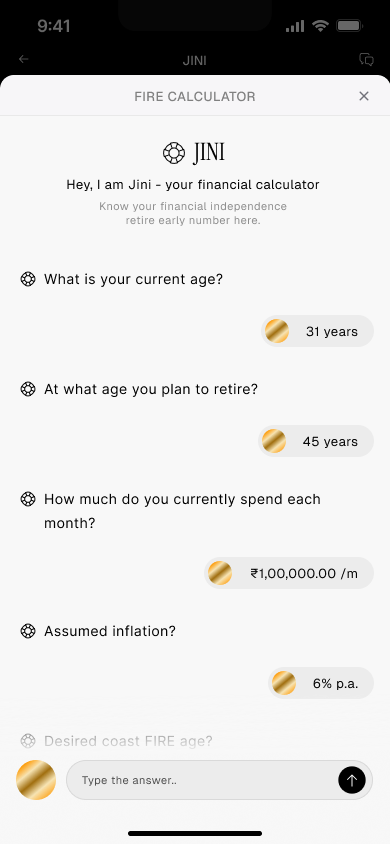
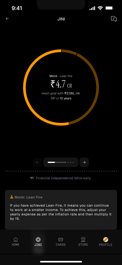
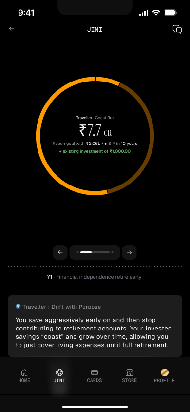
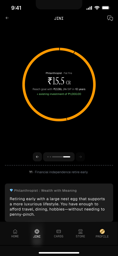
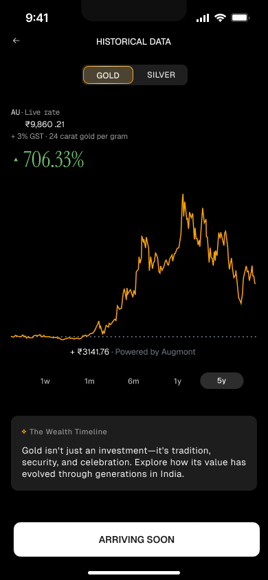
None of this was in the first release. Launch shipped fixed deposits with the card at the front. Goal cards, gold and silver, gold FD, and JINI were designed and waiting. The plan was to get the product into the market, test it, then build the rest.
Taking it to the CEO
One call changed his view. Regulation ended the card.
The CEO was firmly attached to the card. I presented the findings to him and the team. My case was about friction: one task mattered, booking a fixed deposit, and the card was stopping people doing it.
- Me: presented the findings. The card was stopping people booking a deposit.
- The CEO: didn't agree.
- Me: took him onto one of the user calls.
- The CEO: heard it himself and saw the card was difficult. He still wanted it.
- Outside: a regulatory compliance issue came up with the card, and the third party that would issue it backed out.
The card concept had to go, and the second version could start with what people actually came for.
The design
Start with what people came for
I designed the second version, the live Android app. Read against the calls, it answers each finding in turn.
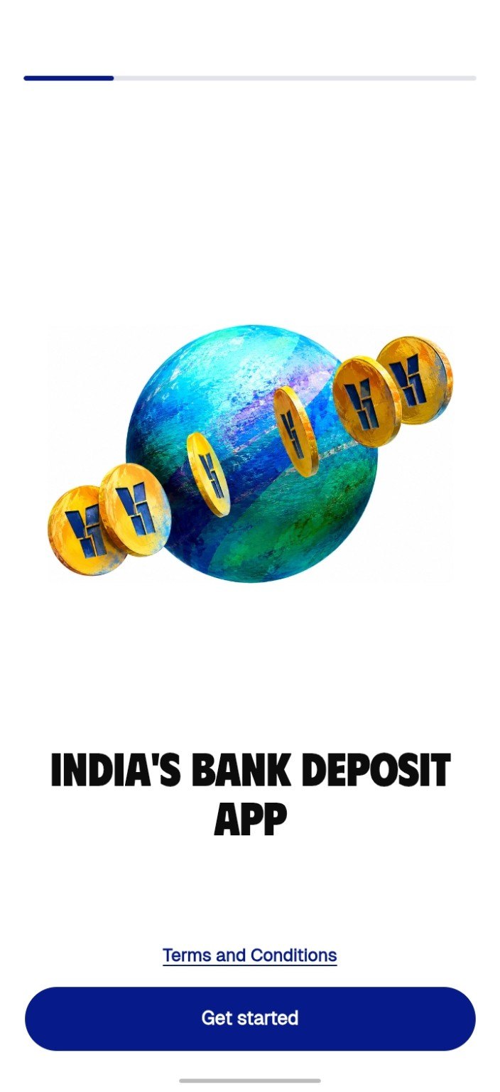
1. Say what it is
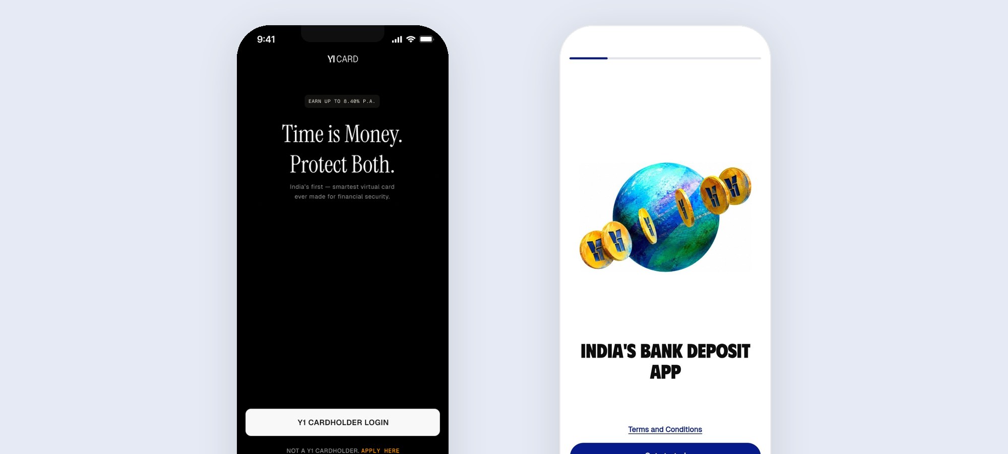
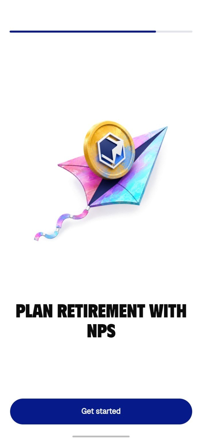
The first screen went from “Y1 cardholder login” to “India's bank deposit app.” Onboarding makes five claims, one per screen, with safety last, right before Register. The card is still there, but as screen 3 of 5 and one tab of five.

2. Ask for the amount first
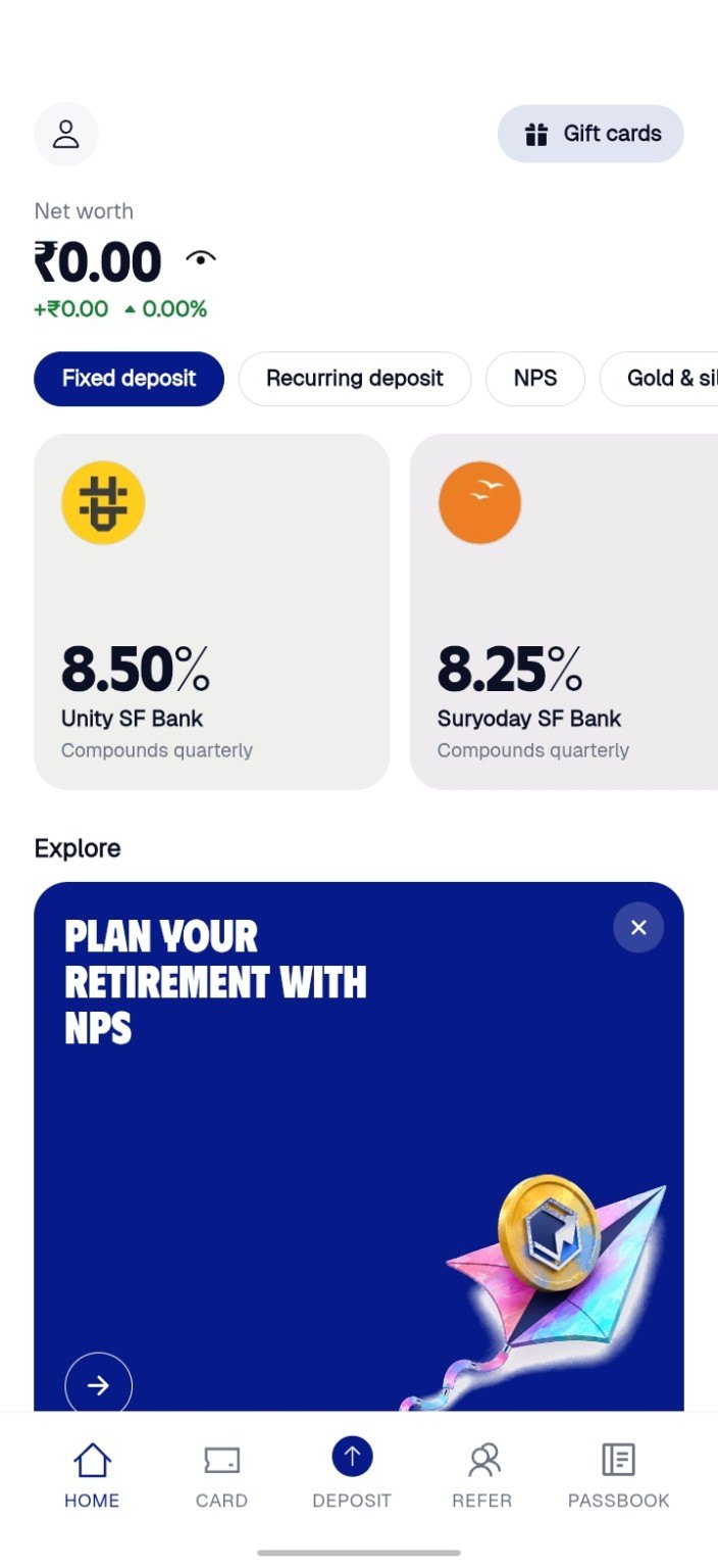
No card in the way. Home puts banks and their rates up front, with Deposit in the middle of the bottom bar. The first question is how much, then fixed or recurring, then which bank. A bank that won't take your amount stays on the list, greyed out with its minimum.
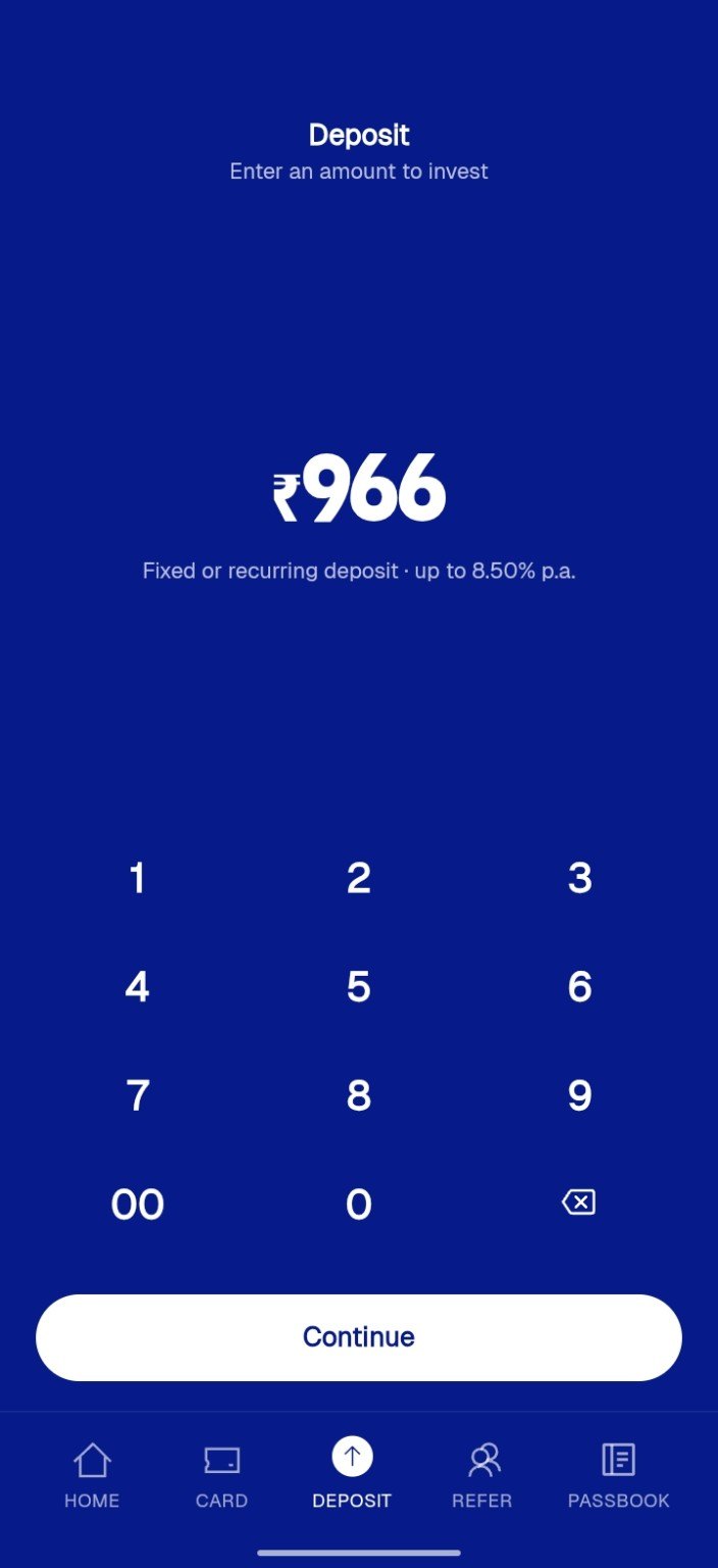
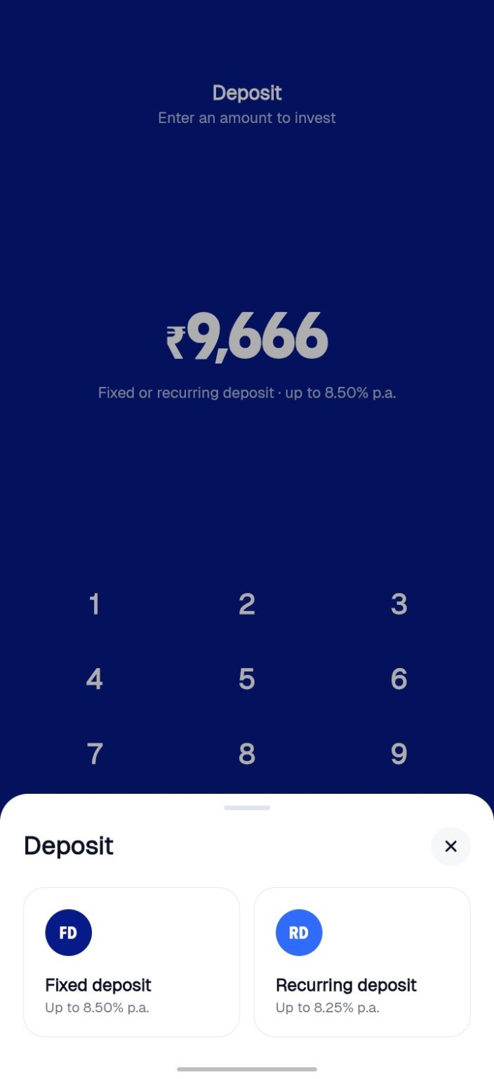
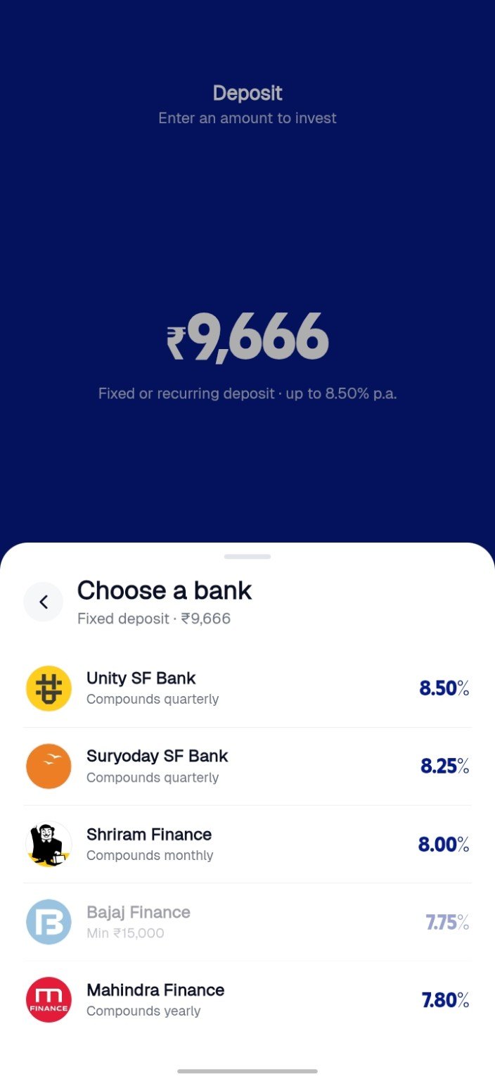
3. Say what happens next
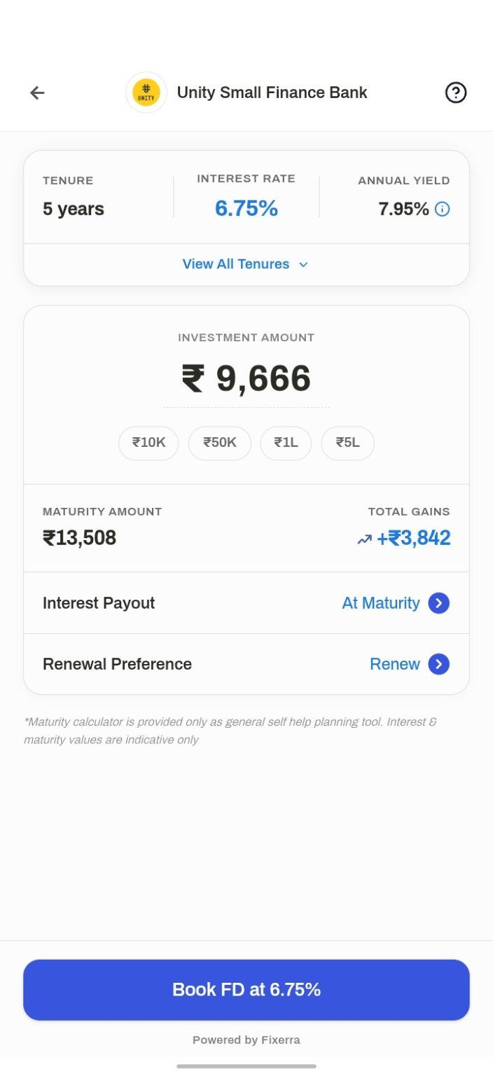
People called the old journey hectic and unclear. In the second version, the last steps say what will happen before it happens. Every screen before booking shows the “up to 8.50%” headline. The booking screen shows what you'll actually get: 6.75% for 999 days, a 7.33% annual yield, and ₹1,00,000 becoming ₹1,20,118. The button repeats the real rate: Book FD at 6.75%.
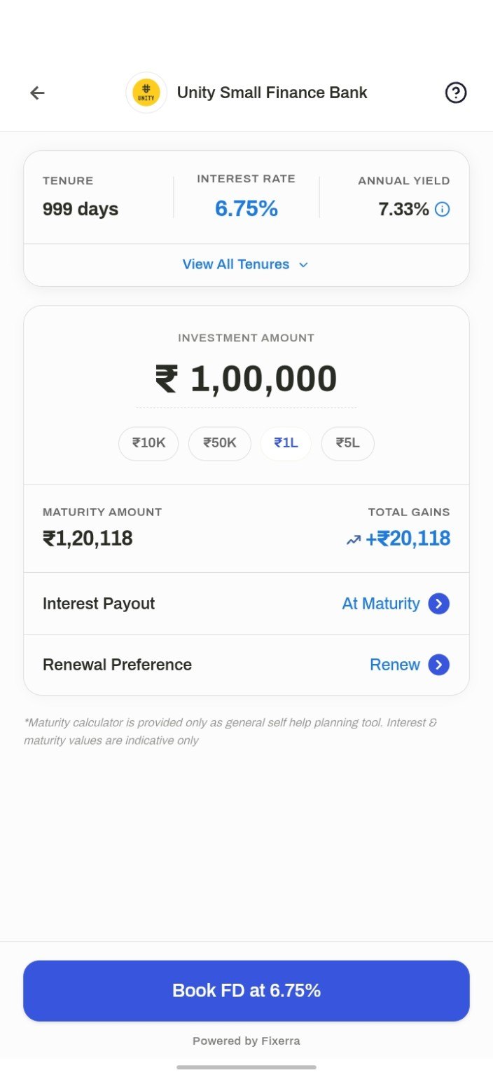
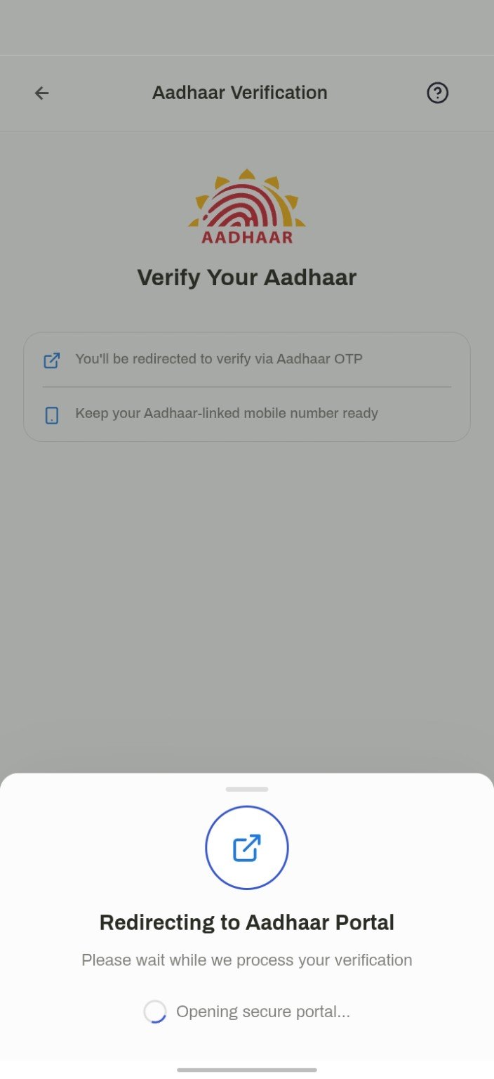
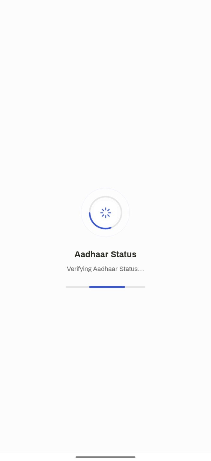
Then identity. Aadhaar verification only comes after you press Book, and the app tells you two things first: you'll be redirected for an Aadhaar OTP, and you'll need your Aadhaar-linked phone ready.
Outcome
What it added up to
I contributed to that through UX improvements focused on usability and trust.
What happened to the rest
- Gold and silver: live. They open in a partner's app inside Y1.
- JINI and the FIRE calculator: designed, not live.
- Goal cards: discarded along with the card concept.
Reflection
What I took from it
- Call people the next day. The people who deleted the app would never have shown up in a funnel with a reason attached.
- Keep asking after the compliment. Friends and family said good things until we kept asking. Then they told us it was hectic.
- Bring the decision-maker to the user. My findings didn't change the CEO's mind. One user call got further.
As one person put it: the card is part of this. It shouldn't have been the first thing.