Surbhi
—Designer
Perfecting Investor Profile
In 2012, forms and tables were the backbone for presenting large sets of data. However, by 2020, this magic had faded—users no longer wanted just raw data. They expected systems to offer insights, contextual guidance, and actionable narratives to make informed decisions effortlessly.
To comply with my non-disclosure agreement, I have omitted and obfuscated confidential information in this case study. All information in this case study is my own and does not necessarily reflect the views of company.
Background and Problem
Users were walking away & Investor profile was part of the problem.
All the data’s there but buried in cluttered forms and static tables. You spend hours digging, even after paying for a premium tool. The cost? Time, trust, and client confidence. Reflection of the problem can be seen in numbers:
Conversion rates dropped from 8% to 1%.
1.1k+ support tickets/month (for investor profile alone)
SUS Score: 48.6 (well below usable threshold)
NPS: -9.8 in 2020, signaling declining trust and satisfaction
But what is Investor Profile?
It helps financial advisors truly understand their clients personal, financial, goals, and risk appetite, so they can provide smarter, more personalized advice.
The Challenge
Make It Usable Again in 6 Months
Our goal was to realign with user needs and design a best-in-class experience. Our high level goals were to:
1. Empower advisers to deliver precise advice, work efficiently, and make confident decisions.
2. Create a platform for deeper engagement.
My Role
From October 2024 to April 2025, I designed the end-to-end Investor Profile experience for an Australian client. I worked closely with the founder, Daniel Gara, and collaborated with a cross-functional team consisting of Atul Kumar (Product Manager), Ken (SME), developers Neha, Ishant, and Devesh, Neha Kumari (QA Engineer), and Kulesh (Tech Lead).
The product was successfully launched in April 2025.
My key responsibilities were:
1. Conducting workshops and interviews to gather requirements and insights.
2. Establishing the success matrics of the project.
3. Conceptualising, designing, and testing the solutions.
4. Communicating and collaborating effectively with stakeholders and teams
The Kick off
Picking up the pieces
Without pre-existing insights, I partnered with our product and SMEs team to explore how advisers were getting around.
We tested the existing tool with 6 participants and collected different survey results. Our goals were to understand the needs & challenges our user faced.
Early Insights
Numbers were bad
The SUS, NPS and support queries made it clear. The product was a blocker, not a helper. One user put it best: “Your UI means "Ultra Irritating."
Client engagement was suboptimal
Advisors struggled to engage clients because the tool relied on dense, text-heavy data instead of visual insights."
Updating data was cumbersome
Collecting and updating data felt like a chore. Without a user-friendly way to prompt updates, engagement dropped, and operational challenges grew."
Issues with compliance
Compliance became a challenge as outdated or incomplete data made it harder to meet regulatory requirements, increasing risk for advisers and firms."
Deeper Insights
While talking to our users, we wanted to understand the true impact of the Investor Profile. By mapping how and when financial advisers use it, we uncovered something eye-opening, this tool isn’t just a step in the process; it’s embedded at every stage of financial advice.
Adviser Expectations Changed Over Time
As financial advisors increasingly rely on digital tools, their expectations have evolved. What once worked—static forms and tables—now feels clunky, slow, and outdated. With exposure to modern, intuitive applications, advisors now expect effortless, seamless workflows that keep up with their pace. But our current system? It lags behind, creating unnecessary friction instead of enabling efficiency.
It isn’t just a tool—it’s advisers first impression
Before a meeting even happens, this module shapes how advisers perceive and prepare for the client conversation.
Source of truth for downstream modules
Tool isn’t just a data collection form—it’s the foundation for every financial decision within the platform.
Ripple Effect
Digging into the data revealed major inefficiencies. Almost every adviser had to do extra documentation, manually fill in gaps, or rely on third-party tools just to make the system work. This was far from the seamless, integrated experience they expected.
"The inefficiency wasn’t just frustrating— it had real business costs, leading to lost productivity and missed opportunities.”
Prolonged Meetings
Advisers spend extra time clarifying financial data instead of focusing on strategy.
Extra Documentation
Manual workarounds are needed to fill gaps in missing or unclear data.
3rd Party Tool Usage
The tool’s inefficiencies forced advisers to rely on third-party tools like xplan, myprosperity— leading to increased operational costs.
Increased Support Dependency
The tool’s inefficiencies forced advisers to rely on third-party tools like xplan, myprosperity— leading to increased operational costs.
“...how might we help advisers & investor to engage better?”
The solution
By bridging gaps in data clarity and engagement, we empower advisers to focus on what truly matters, building trust and driving smarter financial decisions.
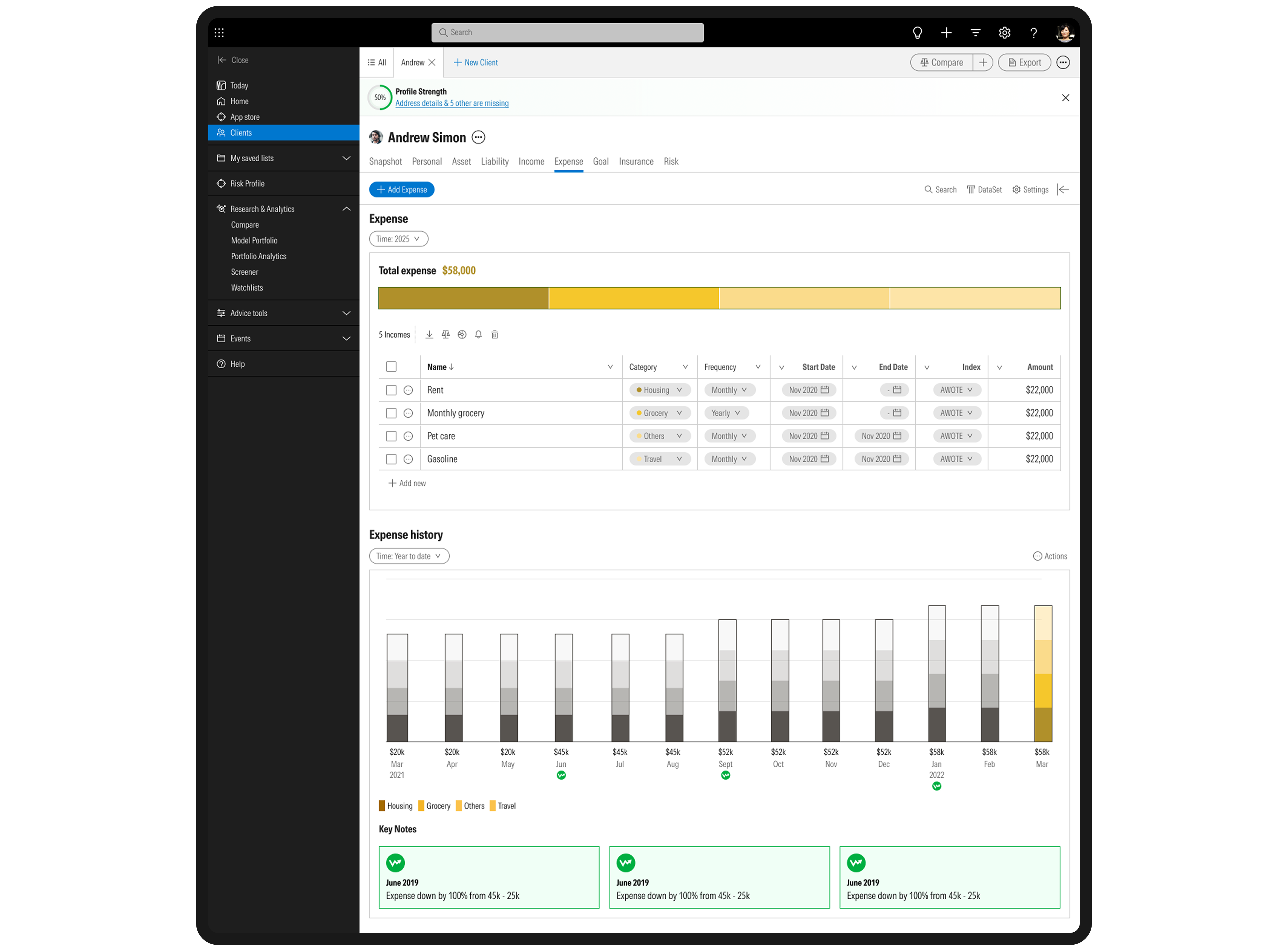
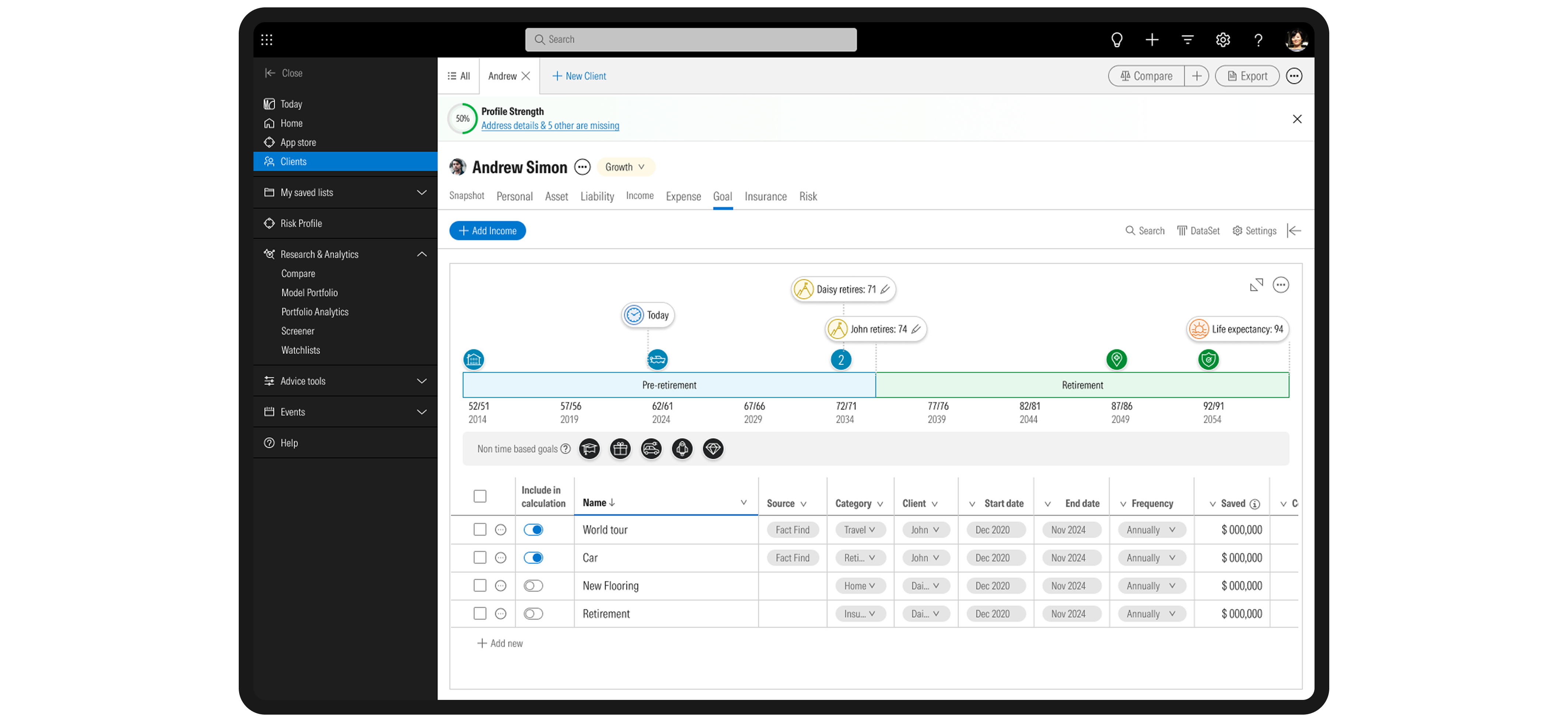

Streamlined Data Access
By redesigning it from the ground up, we’ve brought what’s relevant – personal details, asset & liability, income & Expense, insurance, goal, real-time status, and personalised actions at a glance. Everything is a one-tap way.
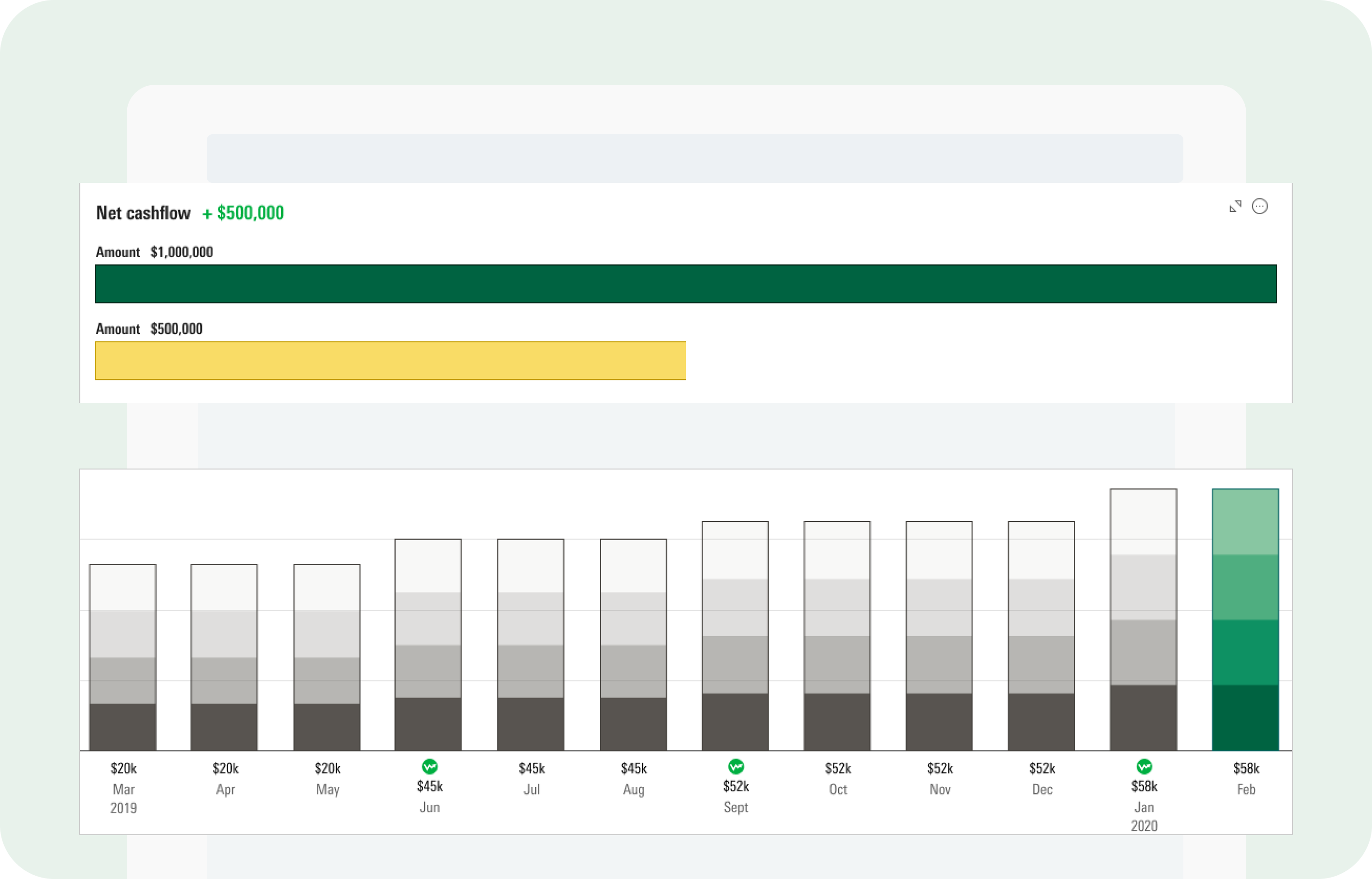
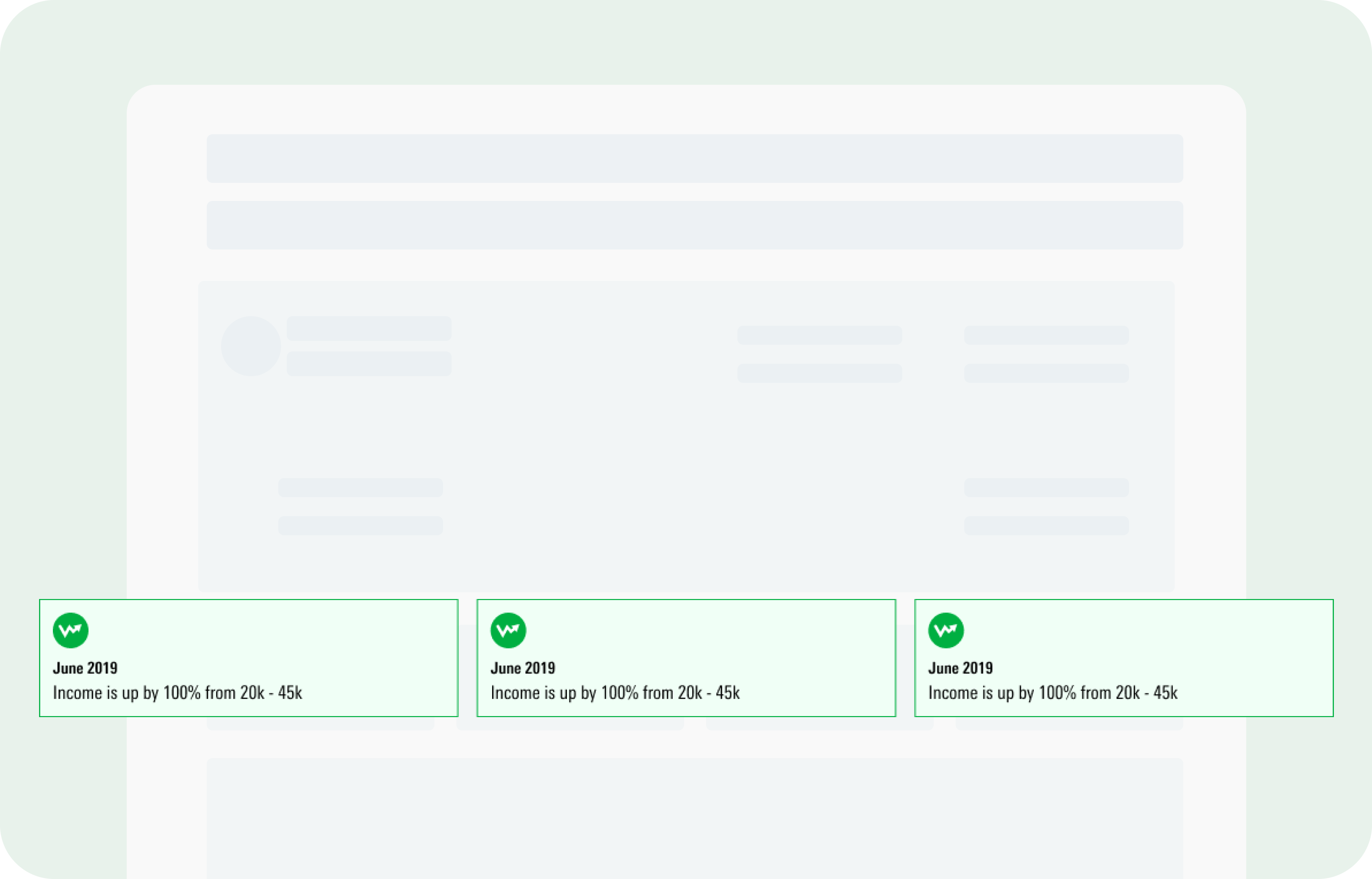
Visuals to engage better
Transforming text-heavy data into clear, visual narratives helped advisers engage clients more effectively.
Impact: This helped boost average engagement time from 1m 20s to 4m 25s. The longest active session we recorded was 45mins

Profile status
Allowing users to stay informed and help them to complete the missing pieces.
Impact: Increased completion rate of profiles from 35% to 89%.
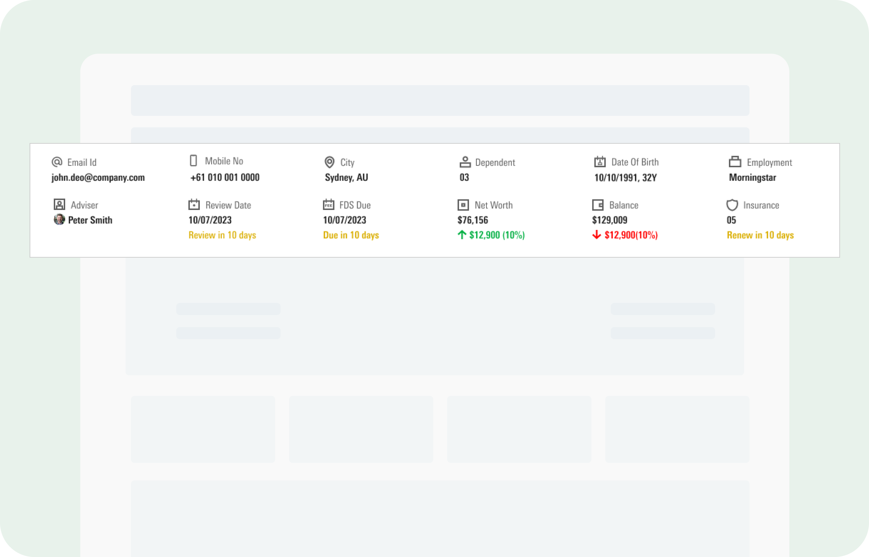
360 View
Uplifting our users life with clients' relevant information put right at a glance, fast to scan, and easy to understand.
Insights